Mind-map One
•Descargar como DOCX, PDF•
0 recomendaciones•817 vistas

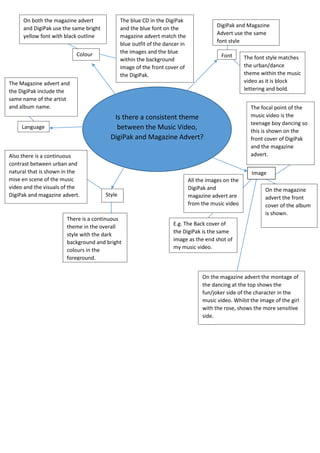
The document discusses the consistency of visual elements across a music video, magazine advertisement, and DigiPak packaging. Specifically, it notes that the yellow font, blue colors, and artist/album names are all consistently used. It also analyzes how the urban and natural themes, as well as the focus on the teenage dancer, are reflected across the different visual materials through their styles, images, and fonts.

Recomendados
Más contenido relacionado
La actualidad más candente
La actualidad más candente (20)
Similar a Mind-map One
Similar a Mind-map One (20)
Más de Angharad Wilkins
Más de Angharad Wilkins (20)
Mind-map One
- 1. On both the magazine advert and DigiPak use the same bright yellow font with black outline The blue CD in the DigiPak and the blue font on the magazine advert match the blue outfit of the dancer in the images and the blue within the background image of the front cover of the DigiPak. Colour DigiPak and Magazine Advert use the same font style Font The Magazine advert and the DigiPak include the same name of the artist and album name. Is there a consistent theme between the Music Video, DigiPak and Magazine Advert? Language Also there is a continuous contrast between urban and natural that is shown in the mise en scene of the music video and the visuals of the DigiPak and magazine advert. The font style matches the urban/dance theme within the music video as it is block lettering and bold. The focal point of the music video is the teenage boy dancing so this is shown on the front cover of DigiPak and the magazine advert. Image Style There is a continuous theme in the overall style with the dark background and bright colours in the foreground. All the images on the DigiPak and magazine advert are from the music video On the magazine advert the front cover of the album is shown. E.g. The Back cover of the DigiPak is the same image as the end shot of my music video. On the magazine advert the montage of the dancing at the top shows the fun/joker side of the character in the music video. Whilst the image of the girl with the rose, shows the more sensitive side.