
Recomendados
Más contenido relacionado
La actualidad más candente
La actualidad más candente (20)
Similar a Medi
Similar a Medi (20)
Más de Adam Skinner
Último
Último (20)
Medi
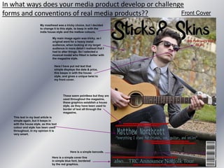
- 1. In what ways does your media product develop or challenge forms and conventions of real media products?? Front Cover My masthead was a tricky choice, but I decided to change it to this style, to keep in with the indie house style and the mellow colours. My main image again was tricky, as I original went for a heavy metal audience, when looking at my target audience in more detail I realised that I had to alter things. So I selected a musical model who fitted in better with the magazine style. Here I have put red text that simple displays the date & price, this keeps in with the house style, and gives a unique twist to my front cover. These seem pointless but they are used throughout the magazine, these graphics establish a house style, as they have been used to border of text all through the magazine. This text in my lead article is simple again, but it keeps in with the house style, as this text colour and style has been used throughout, in my opinion it is very smart. Here is a simple barcode. Here is a simple cover line in simple blue font, bordered by the red graphics.
- 2. Contents Evaluation Blue text to display the issue number and title of the magazine. I have used the same blue text that I used on the front, to keep with the house style. These again are the graphics that have been used in the magazine and now through my contents page. Here is a pull quote on my contents page, drawing people into my magazine, it is a simple punk quote from the person in the photograph below it, and this is made quite clear. This image represents the magazine perfectly, as it keeps with the indie punk style, and links with the front cover main image strongly. Here is a simple quote saying what the photo has to do with the magazine. In simple red font. I have used red text for the numbers in which the subjects are on, and blue text for the actual subjects, I have displayed this in a list. Here I have used simple blue text to write what the editor has to say, this was done simply to explain what the point of the magazine. This image is linked with a subject in the magazine, hence why I have included it in the contents. Here is an image of editor with a member of a band, this has been clearly explained in the editors paragraph above it, so its related with the magazine. Simple black text used to explain who wrote the text. Here again is a red graphic to border of the text. This is blue text bordered by a red lined graphic, to display simple the editors name. Here is simple red text to display the page number.
- 3. DPS 1 Here is my main image of my DPS, which links with another on the opposite page, which makes it look like a set of stairs, and he's on both sides of it. The image is linked with the house style, the indie slightly similar to Bob Dylan look. Here I have used the red lined graphics once again, this is border of questions from my interview, I have used them throughout this page. Here is my pull quote for my DPS, it is a typical indie quote, keeps with house style, mellow and calm. Not loud and heavy like for say Kerrang or metal hammer. The text in blue is displaying my question to the musician, in the same text used throughout the magazine. The text in red is displaying my answer from the musician, this text keeps with the house style and is clearly separated from the question to make it clear. Here is simple red text displaying the magazine title and the date.
- 4. DPS 2 Here this imagefor the opposite side of my DPS, it reflects the opposite side, to make it look surreal, and this is very unique in my opinion, as you don’t commonly see this in magazines, so I thought this would be different. Plus the photo still keeps with the house style. Here I have used the same red lined graphics, to border of text from the photo etc. Here the same as the opposite page I have written the question in simple blue text. Here my answer is displayed in the simple red text, again to keep in with the simple yet effective house style. Here I have displayed the title of the magazine and the date in simple red text.
- 5. How does your magazine represent particular social groups?? How have you represented/presented your band/artist in your magazine?? I have presented my artist in a very humble way. I haven't made him look like a heavy metal icon, I haven't made him look like a glam rocker or a punk rocker. I have photographed and portrayed him in a way that makes him look like a truly passionate musician. He looks to me like a young Bob Dylan, the angles I used were to flatter him, and make him look calm and mellow, in keeping with my target audience and my house style. I have presented him to look like a classic acoustic guitarist, he looks smart, happy & professional. In what ways do the photos of your band/artist offer a constructed representation of the band/artists personality?? The photos that I have taken of the artist ‘Matt Northcott’ offer a very strong constructed representation of him, they convey his passion and professionalism and his style of music. You can clearly see that he's not in a heavy metal band, or a punk rocker. You can clearly see his personality through the photographs. That he is a traditional musician, who plays acoustic work. These photographs of him offer a clear representation of his personality for these reasons, plus the angles used and offer different views of him, both close up, side on and distant. Allowing you to take in all his clothes hair and facial expressions, and the atmosphere around him, he's in a peaceful grassy park, this reflects his personality perfectly, just through a photograph. How does the use of pull quotes and writing (copy) in the DPS reinforce this representation?? I have used pull quotes that associate with his style, such as the Bob Dylan reference at the before the introduction to the interview perfectly links with the artist himself. The way the interview has been written again is keeping in with the concept of this, the relaxed but slightly professional interview allows the reader to see another side of the musician, the real side, and what he gets up to etc. When the interviews mentions his inspirations etc, and he quotes “John Lennon & Bob Dylan”… This reinforces the representation of the artist. It all links in with the photographs of him, and they all relate in a strong way. Every pull quote linked with him, and every piece of writing, be it interview or general, all reinforce the representation of the artists personality that you get from photos etc.
- 6. How did you attract/address your audience? (include evidence of audience feedback) Here I have took screenshots of me posting a survey monkey survey onto my Facebook. This is to ask of peoples opinions of my magazine for my evaluation. This is an example of how attracted/addressed my audience. I have attracted my audience in many different ways, I have used Facebook and MySpace to publicise my magazine, and to ask opinions of what people think of either; flat plans, designs, fonts, mastheads, photography, house style, or anything else that I need opinions or help with. These were an easy way of attracting people to my magazine, using Facebook meant I could ask friends who would be interested in the magazine style, which would mean I am asking appropriate people. I also addressed my magazine to people by using blogger. This was easy as I could post my stuff onto the blog, and post it to people or just publicise it, and let people view it at their own will. I even made it optional as to whether you leave me a comment on my work, for improvements or just general comments. This was useful as it allowed me to alter my magazine is I needed to.
- 8. I haven’t used any only tutorials, mainly as I have had experience with blogger and Photoshop before in classes. If any help was needed I would ask my lecturer, who supported me and aided me to there full capability.
- 12. Another huge aspect that I learnt was manoeuvring Photoshop, mainly as I have only ever edited photography using it, so designing a magazine on it grew greatly difficult, but using the resizing tools and layer tools proved easy after a lot of aid from my lecturers.
- 13. Lastly I feel I have improved on a learnt a lot with my writing side of things, mainly as I started the project with lots of slang words, and not very punctual phrases etc. Now I have developed many skills due to being influenced by magazines and journalists, this was a big thing for me to learn, and I feel I have accomplished it well, you can see this by reading my DPS interview with Matt Northcott.What production skills do you think you have developed?? I feel I have developed many useful production skills during this course. The main one I feel I have developed is designing. This was my first ever task where I have had to design flat plans, before actually making it. The whole design process was new to me, and I had to adapt to the new conditions, drawing a plan, posting it to my blog, then analysing it, creating it, then finally getting feedback. This whole process was difficult at first, but I feel I can now comfortably do this at any time I need to. Another key production skill I feel I have developed is editing, when its come to editing my photos I have had to edit them in a way that offer a clear representation to the magazine style. So I have made them look warm and mellow, keeping with my indie/punk style. This production skill came in handy, mainly as at first my photos looked like they were from metal hammer or Kerrang, but after developing this skill I have learnt to edit my photos to a standard that fit my magazines context. Has the project encouraged you to study A2 media?? I have decided that this project has made me want to participate in A2 media, I have found that the work I have been set to do has been both challenging and has allowed me to express myself. Mainly as you were aloud to choose music genre etc, meaning you can choose one that fits your personality.