Navigating the Deluge_ Dubai Floods and the Resilience of Dubai International...
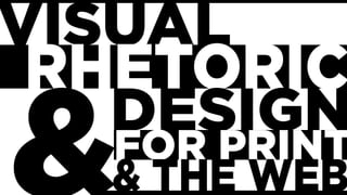
Visual Rhetoric, August 28th
1.
2. TODAY
1) Icebreaker
2) The Syllabus-questions?
3) Oh, C.R.A.P.
4) Design Task Zero: You’re in the Movies now
5) Homework
3. Icebreaker
For today I want you to tell us all your name and your
favorite visual artist.
4. The syllabus
For today, you should have read over the
syllabus and major assignments. At this
point, do you have any questions or
concerns? Ask away! Don’t be shy!
6. As funny as it is…
… making CRAP jokes, it really is a foundational premise of
design, and it’s deeply important (and thanks to our sense of
humor usually quite memorable). The letters, of course,
stand for:
Contrast
Repetition
Alignment
Proximity
7. You read about it
So I’m going to give these to you in my words,
along with a few quick examples, so you can
get a good sense of how it works.
8. Contrast
Basically stated, contrast means that things that are
similar look similar but things that are different look
clearly different. This keeps your reader from
becoming confused and creating relationships that
aren’t present.
It comes, of course, from literal contrast, the light-to-dark
or black-to-white of an image. In design it often ends
up being about color values.
9. This image is
a great
example, and
it is also a
hyperlink to a
great blog
entry on
contrast, if you
want to learn
10. Repetition
Maybe the easiest of these four concepts to
define, repetition is, just as you’d guess,
repeating something– a color, a logo, a
typeface, a type style.
It unifies and organizes.
11.
12. Alignment
Alignment is about positioning on a page.
Nothing should be put on haphazardly. There
should be a reason and a measurement that
guides where things are placed in relation to
each other.
13. The image to the right links
to a post that has some cool
reflection on alignment.
And there’s all
kinds of
alignment
going on with
the new
Windows 8
start page.
14. Proximity
Proximity is very similar in theory to
alignment, but it’s more about grouping and
use of white space.
Basically: similar things are grouped together,
different things require space.
15.
16. Activity
You should, I hope, have been thinking about starting the In-
Design tutorial. I want to stress that in this course we won’t be
spending the time to go over all of the In-Design basics, but I will
be taking you through some of the set-up as part of in-class
activities, and I will be offering at least one outside-of-class
session. You can also talk to Max and set a time to visit the CIM
lab to get some extra In-Design help.
But make sure you are working on those tutorials. They matter.
Based on exit comments and evals, not doing those tutorials was
the big difference between success and failure for the last classes.
17. But today…
I want us to use our new-found knowledge of
C.R.A.P.– which you will read a bit more of– to do a
little really basic Photoshop work in anticipation of
your very first design task. What I need you to do is
gather the following, quickly– let’s take no more than
4 minutes to do this.
1. A photo of yourself 2. A movie poster you like
18. The task
Is to put yourself into the movie poster. I will walk you
through one way to do it, on the overhead. Max and I will
circulate to help you as you work. Also feel free to ask your
classmates.
When you finish, post whatever you managed to put
together to your Tumblr.
19. Homework
Due to the holiday, we do not meet Monday.
For next Wednesday:
Read for class: Wysocki “The Multiple Media of Texts” and
“With Eyes That Think and Compose and Think,” as well as
Barthes “Rhetoric of the Image,” Benjamin “The Work of Art in
the Era of Mechanical Reproduction,” (all on Niihka) and Kress
“Reading Images”
Don’t forget your Tumblr post and design activity!