![[object Object],[object Object],[object Object],[object Object]](data:image/gif;base64,R0lGODlhAQABAIAAAAAAAP///yH5BAEAAAAALAAAAAABAAEAAAIBRAA7)
Recomendados
Más contenido relacionado
La actualidad más candente
La actualidad más candente (18)
Destacado
Similar a Tx history-ch-1.3
Similar a Tx history-ch-1.3 (20)
Más de AvantK
Más de AvantK (20)
Último
Último (20)
Tx history-ch-1.3
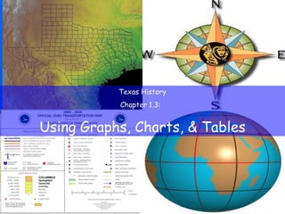
- 1. Texas History Chapter 1.3: Using Graphs, Charts, & Tables
- 3. Four Largest Texas Cities, 2000
- 4. Why are we studying this? Lists of names, facts, and statistics are often clearest when presented visually. Understanding charts and graphs is an essential skill.
- 8. Using Graphs Vertical Axis Horizontal Axis
- 10. Using Charts & Tables Pie chart —chart showing how parts of a whole are divided
- 14. Causation Chart Flow Chart Time Line Table Pie Chart Line Graph Bar Graph Usefulness or purpose Item
- 15. To show the cause and effect of an event or situation Causation Chart to show steps or a series of activities Flow Chart to show the sequence of a series of events Time Line to organize and categorize descriptive and/or statistical information Table to show how the parts of a whole are divided Pie Chart to show a trend or pattern Line Graph to compare data about different places or time periods Bar Graph Usefulness or purpose Item