
Recomendados
Más contenido relacionado
Similar a Production company
Similar a Production company (20)
Más de BeatriceYates
Más de BeatriceYates (15)
Último
Último (20)
Production company
- 2. PRODUCTION company MOUSAI RECORDS When creating our production company, we struggled with our name and as it is a crucial part of our production company, we wanted to make sure it was memorable and edgy to fit with our chosen music style. We eventually settled on Mousai Records, as Mousai is Greek for muses, who were goddesses of music, song, and dance as well as being the source of inspiration to poets. We decided this would be an apt choice, as not only does it give our company a powerful connotation but also fits in with the type of company we are.
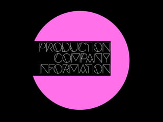
- 3. PRODUCTION LOGO For our production logo, we decided to make it modern and bold to fit with our chosen music genre. We settled on using a neon pink graffiti drip with a sans serif font overlapping. The reason for this being that the neon links with the bright, neon colours often found in night clubs and at festivals, thus linking it again with the genre. Additionally, we chose this specific font as it has a modern edge to it but at the same time has a retro feel to it, again linking to the history of house music.
- 4. Twitter Page Facebook Page