

Recomendados
Más contenido relacionado
La actualidad más candente
La actualidad más candente (18)
Destacado
Similar a Skills dev'
Similar a Skills dev' (20)
Skills dev'
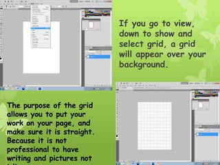
- 1. If you go to view, down to show and select grid, a grid will appear over your background. The purpose of the grid allows you to put your work on your page, and make sure it is straight. Because it is not professional to have writing and pictures not
- 2. I found a font of text that I wanted of ‘dafont.com’ And pasted it Into my photo- shop document. I then found an Image of a Splash In wa- ter and placed this on my document also. I placed my image behind the writing that I have chosen and made sure that the layer of the splash image was behind the writing.
- 3. By making the colour of the writing green it is a brighter colour and is easy distinguishable in comparison to the colour in the background of the writing. When I select colour range I am able to take a sample of the green and select the writing that is green.
- 4. After the words are selecting, they will appear to have ‘marching ant’s around them, which are flashing lines to let you know that it is highlighted. After this, put the splash image over the writing and when you copy and paste, the image will have copied the splash into the shape of the writing.
- 5. I have to put a barcode in the bottom right hand corner to make the magazine look more professional and I have chosen a background colour that contrasts strongly with the colour of the masthead and I’ve also made it this colour as it will suit the theme of the magazine nicely as it is aimed towards young girls into pop and boy groups.
- 6. I have placed the image of the boy group over the front cover. They are individual images of each member in the group and I have placed them over each other to make the most of the room I have available on my front page.
- 7. I have added cover lines onto the front cover to inform the reader of what is featured in the magazine. They have been put in bright colour that will go nicely with the house style and are bright and noticeable.
- 8. I have added a banner at the bottom of the page which will make it easier to read the extra cover stories featured. Normally the most exciting headlines would be in a box like this at the bottom of the page. I have also added a price at the top of the page. This makes it look more professional as any normal magazine would be expected to have a price on the cover.
- 9. It is important that all the lines of the stores and pictures are in line and not in different sections as this makes a magazine look less professional so if you go into view at the top of the options bar of photoshop and click extras, a grid will appear which will make it easy for you to line your images and text up.
- 10. Once an appropriate colour is selected for my contents page I can then start to add images onto it. But, it is important that the colour scheme stay as relevant as possible on your contents to your front cover. This is why I chose a bright blue. I then began to add appropriate image to my contents page, these would have to be images that would relate to the stories that will be featured throughout the magazine.
- 11. It is often a nightmare when you decide what images you want together as a group, but when you want to slightly move them, they all move apart from each other. It is easy to fix this so that the images are bound together so they move together and can still be separated if you change your mind later. This can be done by holding control and selecting each piece you want to link. Then by right clicking your mouse and selecting ‘link layers’, these images are now bound together to move around as one layer.
- 12. I have added bars onto the page to separate the images and the separate information. This will also give the page a sense of a structured layout and look more professional. I have also added the title ‘contents’ so that it is easy to see what page it is and what purpose It serves.