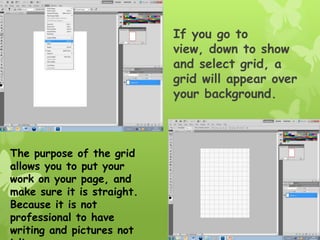
1. If you go to
view, down to show
and select grid, a
grid will appear over
your background.
The purpose of the grid
allows you to put your
work on your page, and
make sure it is straight.
Because it is not
professional to have
writing and pictures not
2. I found a font of text
that I wanted of
‘dafont.com’ and pasted
it into my Photoshop
document. I then found
an Image of a Splash In
water and placed this on
my document also.
I placed my image behind
the writing that I have
chosen and made sure
that the layer of the
splash image was behind
the writing.
3. By making the colour of the
writing green it is a brighter
colour and is easy
distinguishable in comparison
to the colour in the
background of the writing.
When I select colour range I
am able to take a sample of
the green and select the
writing that is green.
4. After the words are
selecting, they will
appear to have
‘marching ant’s around
them, which are
flashing lines to let you
know that it is
highlighted. After
this, put the splash
image over the writing
and when you copy and
paste, the image will
have copied the splash
into the shape of the
writing.
5. I have to put a barcode in the
bottom right hand corner to make
the magazine look more professional
and I have chosen a background
colour that contrasts strongly with
the colour of the masthead and I’ve
also made it this colour as it will suit
the theme of the magazine nicely as
it is aimed towards young girls into
pop and boy groups.
6. I have placed
the image of
the boy group
over the front
cover. They
are individual
images of
each member
in the group
and I have
placed them
over each
other to make
the most of
the room I
have available
on my front
page.
7. I have added cover
lines onto the
front cover to
inform the reader
of what is
featured in the
magazine. They
have been put in
bright colour that
will go nicely with
the house style
and are bright and
noticeable.
8. I have added a banner at
the bottom of the page
which will make it easier to
read the extra cover stories
featured. Normally the most
exciting headlines would be
in a box like this at the
bottom of the page.
I have also added a price at the
top of the page. This makes it
look more professional as any
normal magazine would be
expected to have a price on the
cover.
9. It is important that all
the lines of the stores
and pictures are in line
and not in different
sections as this makes a
magazine look less
professional so if you go
into view at the top of
the options bar of
Photoshop and click
extras, a grid will appear
which will make it easy
for you to line your
images and text up.
10. Once an appropriate colour
is selected for my contents
page I can then start to
add images onto it. But, it
is important that the colour
scheme stay as relevant as
possible on your contents to
your front cover. This is
why I chose a bright blue. I
then began to add
appropriate image to my
contents page, these would
have to be images that
would relate to the stories
that will be featured
throughout the magazine.
11. It is often a nightmare
when you decide what
images you want
together as a
group, but when you
want to slightly move
them, they all move
apart from each other.
It is easy to fix this so
that the images are
bound together so they
move together and can
still be separated if you
change your mind later.
This can be done by holding control and selecting each piece you
want to link. Then by right clicking your mouse and selecting ‘link
layers’, these images are now bound together to move around as one
layer.
12. I have added bars onto the page
to separate the images and the
information. This will also give
the page a sense of a structured
layout and look more professional.
I have also added the title
‘contents’ so that it is easy
to see what page it is and
what purpose It serves.
13. I have also added a sub heading
‘features’ to separate the
sections of the contents as to
whether the stories featured
are something that are regular
or a feature to the magazine.
I am now starting to add
images to the contents page.
These will have to be
relevant to the stories that
are featured in the
magazine. It is important
not to overload the contents
page with too much text or
too many images.
14. I am starting to
add more images
to the contents
page which will be
matched with the
stories throughout.
I have also put
two darker blue
boxes on either
side of the main
image. This is to
break up the page
and make it more
professional. I
Another area now just for the cover stories. This havemake it easier
will divided the
to navigate around my magazine. Each picture has page up moreone of
a number in so
its corners, this is so that when the readers see the images, is
that there they
will know what page it is on without having to read through all the
stories featured.
15. I can now start to add
stories, headings and
descriptions into my
contents page. I would
ideally place the
pictures near to the
relevant stories, and
move them into
separate categories to
make it clearer and
more professional. All
that is left now to
do, is to organise the
images and writing
around the contents.
16. For the front cover of my music
magazine I have taken a photo of
the made model who is going to be
heavily featured throughout my whole
magazine. I have taken a close up
shot of the artist as it is rare that
you would see a magazine with her
legs and body shown, this way, it
means that we can focus more on the
face of the artist and see her facial
expressions more. I also think that
this makes the image look more
personal and it is getting up close.
I have stolen the theme to the well
known magazine ‘Vogue’ and used the
same style and design with my
magazine. I added the
words, music, lifestyle, and fashion
to my masthead to outline what kinds
of a magazine it is. Hopefully, having
a masthead like this will add a sense
17. I have added a bar code, price
and issue number to the magazine
in the bottom right hand
corner, this will make it look more
professional. I would not be
acceptable to not have a bar code
on my magazine. It has to be
small but not hidden so this is the
ideal place as it is the only thing
featured on the right hand side
of the front cover.
I have added a banner to the
bottom of the page to make it
easier to read up stories. It
is normal for a banner to be
either at the top or bottom of
a magazine front cover and
because I have a masthead
positioned to the very top of
the page, so I decided to
have the banner at the bottom
18. I can now begin to
add the stories
onto my front
page. It is
important to have
the names of the
artists in bold and
in a bigger font
than the rest of
the writing, and
the name of the
artist featured on
the front page
should be the
biggest. I have
made sure that
none of the
To have writing covering the faces of artists. writing goes over
the face of the
artist pictured as
it is very
unprofessional
19. For my contents page I
have added an image of
the main artist of my
magazine in the centre of
the page. I have
feathered the edges of
the picture to make it look
less harsh and sharp and
make it blend in with the
background.
I have started to add the
other images on my page now
and positioned them around
the page away from each
other. It would not look
professional if all the images
were lined up right next to
each other. I have also put a
border around each of the
images, this is make them look
20. I have added lines to separate
the different sections of story.
This will separate what is a
feature, and cover story, or a
regular. It also makes it look
professional if the areas are
clearly sectioned off and breaks
up the page making it look less
boring.
I have also made a ‘follow us on’
box, so that it is
professional, and is something
that you would normally see in a
real magazine. I have made a
Facebook, twitter, and MySpace
wed address so it looks genuine.
21. Next, I made subheadings for
the regulars, features and cover
stories. They are in three
separate areas on the contents
page. This makes it easy for
them to be easily distinguished
Now I can put in the stories. I
put the stories that were on the
front cover in the section for
cover stories on the right hand
side. I put in the regulars in the
left, e.g. things like reviews.
And then features, including
things like fashion advice, and
interviews with artists and
bands.
22. Lastly, I added page
numbers and captions
into each of the
pictures, this will
give people an insight
into what to expect
from that page
because it will
normally include a
quote,