1. Magazine Front
covers
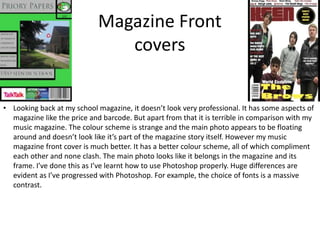
• Looking back at my school magazine, it doesn’t look very professional. It has some aspects of
magazine like the price and barcode. But apart from that it is terrible in comparison with my
music magazine. The colour scheme is strange and the main photo appears to be floating
around and doesn’t look like it’s part of the magazine story itself. However my music
magazine front cover is much better. It has a better colour scheme, all of which compliment
each other and none clash. The main photo looks like it belongs in the magazine and its
frame. I’ve done this as I’ve learnt how to use Photoshop properly. Huge differences are
evident as I’ve progressed with Photoshop. For example, the choice of fonts is a massive
contrast.
2. Magazine Contents
Pages
• Looking back at my school magazine contents page I'm honestly embarrassed with it. It’s
pretty much a grid. It shares very little aspects in common with a genuine magazine. It had
article titles and page numbers. That’s basically all that can be seen hinting it is a magazine
contents page. However looking at my music magazine, It’s much better. It looks like a
genuine magazine contents page. It shows all the aspects of one: Masthead: realistic page
numbers; pictures; Links and subscription info. I've achieved this, by eventually learning how
to use Photoshop in a way that gives positive outcomes when using the tools. The page
numbers are also unrealistic on my school contents page as 1) the only seem to go to 10 and
2) the layout is just strange. As well as this the school contents is missing a masthead and
pictures.