
Recomendados
Recomendados
Más contenido relacionado
Destacado
Destacado (9)
Similar a 5 things I know about UX by going to the toilet
Similar a 5 things I know about UX by going to the toilet (20)
Último
Último (20)
5 things I know about UX by going to the toilet
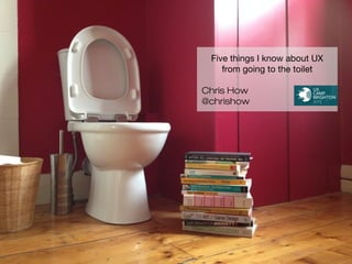
- 1. Five things I know about UX from going to the toilet Chris How @chrishow
- 2. Design should solve problems not create them Southern Railway train toilet
- 3. Design should solve problems not create them Southern Railway train toilet
- 4. Design should solve problems not create them Southern Railway train toilet
- 5. Design should solve problems not create them Brighton Dome
- 6. Design should solve problems not create them Pop up urinals in Westminster, London. Image: http://www.travelblogexchange.com/profiles/blogs/move-over-portapotty-urilift
- 7. Design should solve problems not create them Image: Richard_Hicks http://farm5.staticflickr.com/4103/5019016839_da9579c733_o.jpg
- 8. The importance of semiotics in communication and design Harbour Inn, Lyme Regis
- 9. The importance of semiotics in communication and design Harbour Inn, Lyme Regis
- 10. The importance of semiotics in communication and design The River Cafe, London
- 11. The importance of semiotics in communication and design The River Cafe, London - viewed using colour blind simulator at http://www.colsim.com/
- 12. The importance of semiotics in communication and design Mathaf: Arab Museum of Modern Art, Doha, Qatar
- 13. The importance of semiotics in communication and design Mathaf: Arab Museum of Modern Art, Doha, Qatar
- 14. The importance of semiotics in communication and design Tavern in Freiburg, Germany. Image: http://news.asiantown.net/r/9847/i/1/4/41378
- 15. The importance of semiotics in communication and design The Hunter S, London Image: http://barchick.com/barchicks-best-loos/
- 16. Intuitive interfaces visually integrate instructions into the design Possible Design Agency, London
- 17. Intuitive interfaces visually integrate instructions into the design Knights' Grove Nursing and Residential Home, Southampton
- 18. Intuitive interfaces visually integrate instructions into the design Thurrock motorway services
- 19. Intuitive interfaces visually integrate instructions into the design Thurrock motorway services
- 20. Intuitive interfaces visually integrate instructions into the design East Coast Railways train toilet
- 21. Intuitive interfaces visually integrate instructions into the design East Coast Railways train toilet
- 22. Intuitive interfaces visually integrate instructions into the design East Coast Railways train toilet
- 23. Game play is powerful in changing user behaviour Schiphol airport, Amsterdam, Netherlands
- 24. Game play is powerful in changing user behaviour Schiphol airport, Amsterdam, Netherlands
- 25. Game play is powerful in changing user behaviour Max Ball - Infant toilet training balls
- 26. Successful design meets a real need in the audience Find toilets app from http://www.elbatrop.com/Image: © Image under a free license by Placeit
- 27. Successful design meets a real need in the audience Find toilets app from http://www.elbatrop.com/Lexil Satis toilet with My Satis Android app
- 28. Thanks for listening @chrishow Image: Degilbo http://farm7.staticflickr.com/6092/6297104716_97ece34910_o.jpg
Notas del editor
- So why the need for the sign?
- Because when you use the toilet the flush button becomes invisible . . .
- How can an engineering company spend millions on carriage design and get the toilets so badly wrong?
- The location, context, materials and shape make this sink look more like a urinal.
- The revealing toilet makes an adaptive city based on how humans interact with the city.
- Sainsbury’s last year introduced a narrower toilet roll and reduced transport emissions and costs as they could transport more rolls in each lorry. Challenging conventions by leads to better design.
- Semiotics or the communication and meaning of signs is key to many digital interfaces. In toilet design you often get confronted with a difficult choice - which door to go in? Made more difficult with increased anxiety of needed to pee and potentially impaired decision making ability once you’ve had a few pints. The designer is not helping in task completion or reducing time on task.
- This is the female toilet, which may make more sense if you could see both doors next to each other to help in the choice paradox. The added graffiti is a good indication of user feedback that should be acted upon.
- The River Cafe in London removes any labels and just goes for colour - which you need to interpret in the context of your culture . . .
- And is made really difficult if you are red/green colour blind like 9% of the population.
- When done properly the wayfinding can become embedded in your brand.
- The consistency of signage and brand assets really help in making sense of the building. Easy to understand, easy to find but not dominating.
- This public toilet in Friedburg raises question about form leading function but has a sense of delight in the design . Whereas when semiotics go wrong . . .
- At what point in the design process did anyone think pissing into a women’s mouth would embody the brand’s values?
- You can’t do a UX talk without talking about affordance of buttons and labels.
- This is from a care home for people with dementia. Lots of buttons that all do the same thing. Why not one button?
- Here’s what looks like a flush button but when you look closer . . .
- You can’t press it, even though it is raised and button like. The addition arrow draws attention to an action you don’t need to take.
- The instructions and call to action are meters away from the button to press.
- The sequence of the buttons and the illumination of the second action to take is poor interaction action.
- Then to top it all the anxiety with public toilets of have I locked the door is increased with two sets of identical instructions.
- When a transfer of a fly was introduced at Schiphol Airport 20 years ago spillage rates dropped 80 percent. A change like that, of course, translates into major savings in maintenance costs and shows a design coming from an psychological understanding of how men think.
- Maybe the new transfer of a golf flag is a form of A/B testing.
- Gamification however relies on an understanding of the rules. If anyone has kids you may be familiar with this aid to toilet training, you pee on the ball it spins round and you learn through play. Apart from my nephew who appeared from the toilet holding the pee soaked ball to show what he had done.
- Design should solve a need in the user. There alot of apps to find public toilets that variously use open data sets from councils with improvements suggested to the data by users. Its a great example of solving needs with the device you have on you and improving the data with user generated input.
- The opposite of simple is the Satis toilet in Japan. An over-engineered solution with more features than necessary.
- Australia’s most popular brand of toilet paper uses the inside of the tube to introduce some brand humour.