
Recomendados
Más contenido relacionado
Último
Último (20)
Destacado
Destacado (20)
Cover page analysis AS Media
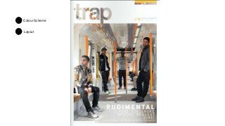
- 2. Masthead • The masthead has been done cleverly on this cover and has the main image behind it. However in this instance the background image causes the masthead to fade into the background because of the white train and white bleed/border. The masthead itself suggest high quality content ‘Trap’ the connotations drawn from this are you will be trapped in the magazine which connotes that the magazine is addictive and interesting. The text is in all lower case which suggest that the magazine doesn’t follow the standard layout or abide by any rules.
- 3. Main Image • The setting of the image suggests the style of the magazine, an underground train brings the connotation of underground or urban music. As well as this you get the impression the people are trapped inside the train because of their body language and the man on the left gazing out the window.
- 4. Colour Scheme • The colours used give a modern look to the train and magazine. This gives the impression of a young target audience and a modern style of music. The people are all wearing at least one item of dark clothing to make them stand out from the background. The connotation I get from this is that they do not follow any trends they have their own style like the magazine. However the white text on the bottom of the page is hard to read as it fades into the background s the train is a similar coulour.
- 5. Layout • The cover doesn’t follow the usual set up for a cover of a magazine, there are no cover lines on the left third this suggest that the magazine targets a more modern/young audience. The text in the bottom right hand corner edges towards the corner of the page, I think this entices the reader to turn over the page and read further into the magazine. The lack of a barcode would suggest this is an online magazine this supports the idea that its audience would be young as they are more likely to go online to read a magazine.