SlideShare una empresa de Scribd logo
1 de 4
Our main focus on this front cover is this young man, he looks very handsome and attractive to bring in the sellers, he has stubble on his face which represents his character could be mischievous but we feel the main attraction is brought in by his eyes, the whites of his eyes are very white and clear and his eye brows seemed to be darken which could he is a villain but then The title “TOTAL FILM” is in clear bold letters for the readers to see easily, the colour is white which is very pure and stand out to the readers and sellers on a shelf. Also being the name FILM it is clearly obvious what genre the magazine is. We will include a very bold header onto our magazine cover to make this as realistic as possible. Also above the M the issue number, date, price of the magazine and their website which readers can log onto, the size of the text isn’t very big and may become a problem to some readers so we shall learn from this and make sure all our text is clear and in a suitable readable size.<br />His smile on his face to connote he is being happy but we feel it is more of a devious smile as if in the film he plots something and creates trouble. We also feel that because the way the light is shining on him in some places it is darker/lighter than others, this shows he has a good side and bad side.This section down the left hand side is a selling point for the magazine as it promotes other films and new releases and more information about what will be in the magazine to interest the readers, it also has their website again at the bottom which is advertisement for them, having the writing down the sides in capital letters keeping to the theme as “TOTAL FILM” is in capitals this shows the importance of what they are writing and also to make the words bolder and appeal to more to their target audience.1028700278130<br />These sections of text in white and grey are to aid the advertising of what else is in the magazine, the bolder sections of text are to make the little paragraph stand out to attract attention from the buyer, although we felt that using the colour white, it doesn’t necessarily stand out from the background so we will avoid this on our magazine. The red bold writing at the top we feel works really well making a statement at the top of the cover advertising recent film releases, the letters are in red which is a contrasting colour to make it bolder but also the size of text is bigger to help also stand out we will be using this idea.<br />The colour scheme is white, grey, black white and red, we have a silent film which means our photo will also be in black and white and we liked the lighting on this photo and hope to include this into ours with charlotte having a lighter side and Joe maybe a bit darker tones of light, we feel the white writing of little paragraph’s doesn’t work as the text needs to be a lot more clearer but the layout of this magazine has given us ideas.These two sections of the front cover are for advertising purposes, there are four different front covers to collect which will set the buyers off in a competition to collect all four and this ahs the red colouring around it which links in with the text at the top of page, the “WORLD EXCLUSIVE” section is also red and bold to attract the audience but the “STAR TREK” text is on a black background of the young mans t-shirt and with the white writing this makes this stand out clearly to the buyer and the world “coolest” being underlined which excite the reader in wanting to no more about the film and then go and watch it. Also the barcode is on the right hand side out of the way which doesn’t take up to much room, we like where the bold writing is placed saying “STAR TREK…” and we hopefully through drafts be able to incorporate this.<br />Here we can see three people, two young men and young women, they are stood in height order, but we feel the young man in the middle is preventing something happening between the girl and the other man, the first man we felt has a lighter side to him and he doesn’t have many dark shadows over his face, the second man which is in the middle we felt had a shower around the edge of his face which made us think he has a dark side to him and in theThe title of this “TOTAL FILM” cover has a special effect to it compared to the other one, as they are advertising the new “New Moon” Twilight film the text has a blurred effect making the text represent a moon colour and light when its in the sky at night. Underneath the M is the date, issue number, price and their website for advertisement, we all really this effect as it represents the film they are advertising extremely well and gives the reader a sense of style and introduces them to feel and idea of the new New Moon Twilight film.<br />Film we think he tries to cause trouble between the other two characters; he also has his back turned to the other man which connotes there is going to be conflict between the two characters but also his body language seems to be protective over her as he has his right arm over her body as if to stop her from getting to the other man. The women on the right hand side is being held back from the middle man, she has her hand resting on his arm, she is the only one looking directly at the camera which grabs our attention to look at her. There costume is very casual, jeans and a top which represents them being young adults, there facial expressions are serious and are not smiling which shows this film isn’t comedy the story line is going to serious but we feel with the women being involved there could be some romance involved between the two men and the women and this could be the conflict which occurs in the film. Both the men are looking at the girl which connotes to us the film is heavily enrolled about her and she is one of the main characters.895350278130<br />These sections of text stick to two main colours a peach colour and white, the “new moon” text has a similar effect to the “TOTAL FILM” it represents the moon with the use of blurring the edges and making a shadow and from the back drop of the photo we can see this film is set out side in the moonlight hence the title of the film. The other sections of text show advertisement to draw the attention to the audience about what it is in the magazine, the “PLUS!” section also directly locates and informs the readers what else will be in the magazine. This front cover they do not use bold on many fonts’s only the words in peach have this effect which we didn’t like, we prefer text to stand out and be bold to the readers as its a selling point.<br />The background and colours of the costume on this front cover are very dull they use a dark colour scheme, and the colour for the font is very uplifting as its white and peach which is contrasting with the dull colours which makes the text stand out to the buyers. We don’t like where the barcode is we felt it was too central to everything and we won’t be having the barcode placed there, also we feel there is a big gap where the arrow is pointing which we don’t want to have on our front cover, we want to have a filled cover with lots of impact and no big gaps like this cover. Having free posters as an extra incentive to buy the magazine was an idea we are hoping to use as this would make our magazine look more realistic.<br />These sections of text are placed around the iron man which will gain attention as the buyer takes his eye off the main focus, they are to advertise more about the magazine and what other interesting articles/reviews/posters we expect to be in the magazine, the font stays in the colour scheme and they use a shape in blue to highlight what they are advertising and then using the white coloured font to emphasise the text, we felt that the text should have been bolder and we will avoid that when we create our front cover.The title of this magazine is usually in a red font but in this particular front cover they have adapted the style of the font to match and represent the film they are advertising which is “iron man 2” the effect on the font is like a lightning bolt/bolts shooting through the text with an electric blue colour, this is representing the film and we feel in a energetic way and that this film will be an action packed film full of entertainment. There is also a shadow behind the text which adds to the effect of the text giving it more of a back drop, above the M is the date and price of the magazine which is clear to reader as they can locate this quickly as it’s simple.<br />They have kept to a small colour scheme just using blue/black/white/silver which fits with the dark background which seems to have mist around it to show the darkness where the iron man has come from, which gives us a sense of scariness and danger and also as the iron man is red we felt this creates a sense of danger around him as he takes up the majority of the front cover, this effect we liked in particular but for our front cover we will hopefully have more of the background being shown to show setting. This is the main focus of the front cover and we feel this has been done brilliantly, the photo is clear and crisp and has a stunning effect, even though the head of the iron man is cover the title of the magazine we felt this gained effect as his eye line is directly under the text which draws in attention to the reader. The photo is very central both his shoulders skin the edge of the page and along with his posture we feel the impact they have created is brilliant because he has a stern sense around him and connotes he will bring a lot of energy to the film and the story line is based around him, the electric blue light in his chest gives us a sense he is alive and ready to go which also connotes again an action packed film full of entertainment. The smile on his face gave us a sense of evil as it’s very jiggered around his face.933450212725<br />This section we felt worked very well and hope to include a similar idea in our work, the text is very central and we felt it has an impact which continues on from the photo, the text that says “IRON MAN 2” is very similar to the “EMPIRE” text, both are white/blue colours that stand out from the dark background and the colour of the iron man,  the slogan we felt really worked under the title of the film as it sets a sense a genre to the audience as they use the word “enemies” and “attitude” this represents a action packed film which will include violence and conflict between characters. Having the slogan in a grey colour we felt represents metal, as the iron man is made form metal but is red/gold, also the font colour is black which makes it look formal we felt and as there are full stops between every two words we felt they were making a statement by using them.  The “PLUS!” section we really liked because they have been clever by adding arrows between the boxes which tells the reader to open to the page and read on, also they have used small but clear photos of three more films they will be looking out which we felt worked well because the reader can see clearly what else is in magazine and this will help make a choice if to buy it or not, we are hoping to include this section into our magazine.<br />The compass we felt has part of the main focus on this front cover and represents the name of film very well and has relevance, the compass is not only in the title of the film but it is gold but the attention to detail has added to the genre of fantasy as around the edge of the compass are figures/gods/objects/symbols to represent the story. As the hands on compass are all pointing in different directions this could show the story line is set in different places and also the characters look to this compass for guidance as this is usual idea of a compass. We liked this idea and thought we could place a big clock to represent our school teenagers being late.The title in this particular front cover has been brought forward in front of the compass which works really well as the red is a contrasting colouring as both sections are still clear to the reader what they are and represent.  On the E there looks to be a flying angel/witch looking down on the main action which could show this character spends most of there time in the sky looking down upon them. <br />962025296545<br />These two sections of text show the readers what else will be in the magazine and drawing them in to buy the magazine, at the top of the page it states this is a collectors edition which we felt would be a selling point of the magazine for this week, the text at the bottom of the page highlight what else be in the magazine and the other films they will covering, the font colour keeps in the initial colour scheme a darker more vibrant gold and then a lighter gold also which both we felt were bold to audience and could be seen to bring in the buyers.The other main focus on this front page is the three characters, the little girl at the front is staring straight at the camera whilst holding the camera which we feel works as the buyer can see both side of the compass and its gold not only on the inside but on the outside to. The little girl we feel could be a main part and it could be her compass as she is the on holding on to it. The other two characters and both mirroring each other stances except the lady is looking into the camera which an evil look in the eye which could show she wants the compass and could be against the other two characters which causes conflict in the film and the little girl is heavily involved in this.<br />Again in this front cover that have kept to a small colour scheme, gold/white/red, there are very small sections red but we felt they stand out and we will try to include this into our front cover, but between the two EMPIRE magazines we would like to include the other front cover PLUS! Section as we felt this highlights what else is in the magazine and with the arrows pointing to turn the page this brings in the buyers and they will intrigued and want to carry on reading in the magazine.Their costume we felt is set back in time and is very formal which we are hoping to use for our character Charlotte, we felt the costume would be representing the films time period and their class, they are dressed as a higher class citizen and in the older days class was very highly recognisable and class mattered. The background of this front cover looks like a fantasy world, blue sky and what looks to be snowy mountains which we assumed the action will take most of his place here. The words “the movie that will reinvent fantasy” is a big statement and we feel that the compass will live up to this expectation and the film will revolve around it.<br />
Front Cover Research

Más contenido relacionado

La actualidad más candente

How effective is the combination of your ancillary texts and main product?
How effective is the combination of your ancillary texts and main product? How effective is the combination of your ancillary texts and main product?
How effective is the combination of your ancillary texts and main product?
nadibadi993
 
Film magazine cover research
Film magazine cover researchFilm magazine cover research
Film magazine cover research
rachaelallen93
 
NME Cover Analysis
NME Cover AnalysisNME Cover Analysis
NME Cover Analysis
LukaMedia
 
Evaluation of front covers
Evaluation of front coversEvaluation of front covers
Evaluation of front covers
NeedhamJ1000
 
Analyzing print products
Analyzing print productsAnalyzing print products
Analyzing print products
annabelchughes
 
NME Cover Analysis
NME Cover AnalysisNME Cover Analysis
NME Cover Analysis
LukaMedia
 
NME Cover Analysis
NME Cover AnalysisNME Cover Analysis
NME Cover Analysis
LukaMedia
 
Homework double page spread 2
Homework double page spread 2Homework double page spread 2
Homework double page spread 2
JadeOckerby
 

La actualidad más candente (20)

How effective is the combination of your ancillary texts and main product?
How effective is the combination of your ancillary texts and main product? How effective is the combination of your ancillary texts and main product?
How effective is the combination of your ancillary texts and main product?
 
Q2
Q2Q2
Q2
 
Ancillary text research
Ancillary text researchAncillary text research
Ancillary text research
 
Film magazine cover research
Film magazine cover researchFilm magazine cover research
Film magazine cover research
 
Magazine cover analysis
Magazine cover analysisMagazine cover analysis
Magazine cover analysis
 
NME Cover Analysis
NME Cover AnalysisNME Cover Analysis
NME Cover Analysis
 
front cover
front coverfront cover
front cover
 
Evaluation of front covers
Evaluation of front coversEvaluation of front covers
Evaluation of front covers
 
Film magazine cover
Film magazine cover Film magazine cover
Film magazine cover
 
Magazine cover analysis
Magazine cover analysisMagazine cover analysis
Magazine cover analysis
 
Analyzing print products
Analyzing print productsAnalyzing print products
Analyzing print products
 
Recovered file 1
Recovered file 1Recovered file 1
Recovered file 1
 
NME Cover Analysis
NME Cover AnalysisNME Cover Analysis
NME Cover Analysis
 
NME Cover Analysis
NME Cover AnalysisNME Cover Analysis
NME Cover Analysis
 
Front cover analysis
Front cover analysisFront cover analysis
Front cover analysis
 
Music Magazine - Textual Analysis
Music Magazine - Textual AnalysisMusic Magazine - Textual Analysis
Music Magazine - Textual Analysis
 
Media Evaluation
Media EvaluationMedia Evaluation
Media Evaluation
 
Magazine front cover analysis
Magazine front cover analysisMagazine front cover analysis
Magazine front cover analysis
 
Detailed Film Poster Analysis
Detailed Film Poster Analysis Detailed Film Poster Analysis
Detailed Film Poster Analysis
 
Homework double page spread 2
Homework double page spread 2Homework double page spread 2
Homework double page spread 2
 

Destacado

Music research for our short film
Music research for our short filmMusic research for our short film
Music research for our short film
Danielle Rippengill
 
Attachment D Adjunct Faculty Evaluation
Attachment  D  Adjunct  Faculty  EvaluationAttachment  D  Adjunct  Faculty  Evaluation
Attachment D Adjunct Faculty Evaluation
djmarshall
 
Attachment H Utilization Of The Lesson Plan
Attachment  H  Utilization Of The Lesson PlanAttachment  H  Utilization Of The Lesson Plan
Attachment H Utilization Of The Lesson Plan
djmarshall
 
Attachment E Instructional Observation Instrument
Attachment  E  Instructional  Observation  InstrumentAttachment  E  Instructional  Observation  Instrument
Attachment E Instructional Observation Instrument
djmarshall
 

Destacado (10)

Storyboards
StoryboardsStoryboards
Storyboards
 
Music research for our short film
Music research for our short filmMusic research for our short film
Music research for our short film
 
Attachment D Adjunct Faculty Evaluation
Attachment  D  Adjunct  Faculty  EvaluationAttachment  D  Adjunct  Faculty  Evaluation
Attachment D Adjunct Faculty Evaluation
 
Attachment H Utilization Of The Lesson Plan
Attachment  H  Utilization Of The Lesson PlanAttachment  H  Utilization Of The Lesson Plan
Attachment H Utilization Of The Lesson Plan
 
Short Film Review Table
Short Film Review TableShort Film Review Table
Short Film Review Table
 
Key Concepts Essay
Key Concepts EssayKey Concepts Essay
Key Concepts Essay
 
Attachment E Instructional Observation Instrument
Attachment  E  Instructional  Observation  InstrumentAttachment  E  Instructional  Observation  Instrument
Attachment E Instructional Observation Instrument
 
Media Evaluation
Media EvaluationMedia Evaluation
Media Evaluation
 
My Short Film Review
My Short Film ReviewMy Short Film Review
My Short Film Review
 
Front page drafts
Front page draftsFront page drafts
Front page drafts
 

Similar a Front Cover Research (20)

Ancillary task research ROMANCE
Ancillary task research ROMANCEAncillary task research ROMANCE
Ancillary task research ROMANCE
 
Annoytation of magazine cover
Annoytation of magazine coverAnnoytation of magazine cover
Annoytation of magazine cover
 
Poster analysis
Poster analysisPoster analysis
Poster analysis
 
Market analysis hjgj
Market analysis hjgjMarket analysis hjgj
Market analysis hjgj
 
Magazine Analysis Two
Magazine Analysis TwoMagazine Analysis Two
Magazine Analysis Two
 
Magazine analysis 2
Magazine analysis 2Magazine analysis 2
Magazine analysis 2
 
JZ Evaluation
JZ EvaluationJZ Evaluation
JZ Evaluation
 
Contents pages
Contents pagesContents pages
Contents pages
 
Film magazine research
Film magazine researchFilm magazine research
Film magazine research
 
Magazine cover's analysis
Magazine cover's analysisMagazine cover's analysis
Magazine cover's analysis
 
Textual Analyasis
Textual AnalyasisTextual Analyasis
Textual Analyasis
 
Presentation2
Presentation2Presentation2
Presentation2
 
Analysis of magazine front covers
Analysis of magazine front coversAnalysis of magazine front covers
Analysis of magazine front covers
 
Film ink magazine analysis
Film ink magazine analysisFilm ink magazine analysis
Film ink magazine analysis
 
Media mag plan
Media mag planMedia mag plan
Media mag plan
 
Poster analysis
Poster analysisPoster analysis
Poster analysis
 
Film poster analysis
Film poster analysisFilm poster analysis
Film poster analysis
 
Magazine Analysis
Magazine AnalysisMagazine Analysis
Magazine Analysis
 
FIlm Magazines
FIlm MagazinesFIlm Magazines
FIlm Magazines
 
Flim magazine analysis
Flim magazine analysisFlim magazine analysis
Flim magazine analysis
 

Más de Danielle Rippengill

Más de Danielle Rippengill (13)

Process Of Creating The Clock
Process Of Creating The ClockProcess Of Creating The Clock
Process Of Creating The Clock
 
Charlotte's photo's for the poster
Charlotte's photo's for the posterCharlotte's photo's for the poster
Charlotte's photo's for the poster
 
Our Madness Font Research
Our Madness Font ResearchOur Madness Font Research
Our Madness Font Research
 
Music Research For Our Short Film
Music Research For Our Short FilmMusic Research For Our Short Film
Music Research For Our Short Film
 
Poster Analysis
Poster AnalysisPoster Analysis
Poster Analysis
 
Blog Brief
Blog BriefBlog Brief
Blog Brief
 
pictures of our settings around the school
pictures of our settings around the schoolpictures of our settings around the school
pictures of our settings around the school
 
Questionnaire to help our research
Questionnaire to help our researchQuestionnaire to help our research
Questionnaire to help our research
 
Feed Back Sheet from our pitch
Feed Back Sheet from our pitchFeed Back Sheet from our pitch
Feed Back Sheet from our pitch
 
Pics from my short film review
Pics from my short film reviewPics from my short film review
Pics from my short film review
 
Treatment For Monday Morning Madness
Treatment For Monday Morning MadnessTreatment For Monday Morning Madness
Treatment For Monday Morning Madness
 
my initial project description
my initial project descriptionmy initial project description
my initial project description
 
Monday Morning Madness Pitch
Monday Morning Madness PitchMonday Morning Madness Pitch
Monday Morning Madness Pitch
 

Último

Call Girls Bellandur ☎ 7737669865☎ Book Your One night Stand (Bangalore)
Call Girls Bellandur ☎ 7737669865☎ Book Your One night Stand (Bangalore)Call Girls Bellandur ☎ 7737669865☎ Book Your One night Stand (Bangalore)
Call Girls Bellandur ☎ 7737669865☎ Book Your One night Stand (Bangalore)
amitlee9823
 
Zirakpur Call Girls👧 Book Now📱8146719683 📞👉Mohali Call Girl Service No Advanc...
Zirakpur Call Girls👧 Book Now📱8146719683 📞👉Mohali Call Girl Service No Advanc...Zirakpur Call Girls👧 Book Now📱8146719683 📞👉Mohali Call Girl Service No Advanc...
Zirakpur Call Girls👧 Book Now📱8146719683 📞👉Mohali Call Girl Service No Advanc...
rajveermohali2022
 
CHEAP Call Girls in Malviya Nagar, (-DELHI )🔝 9953056974🔝(=)/CALL GIRLS SERVICE
CHEAP Call Girls in  Malviya Nagar, (-DELHI )🔝 9953056974🔝(=)/CALL GIRLS SERVICECHEAP Call Girls in  Malviya Nagar, (-DELHI )🔝 9953056974🔝(=)/CALL GIRLS SERVICE
CHEAP Call Girls in Malviya Nagar, (-DELHI )🔝 9953056974🔝(=)/CALL GIRLS SERVICE
9953056974 Low Rate Call Girls In Saket, Delhi NCR
 
Call Girls In Warangal Escorts ☎️7427069034 🔝 💃 Enjoy 24/7 Escort Service En...
Call Girls In Warangal Escorts ☎️7427069034  🔝 💃 Enjoy 24/7 Escort Service En...Call Girls In Warangal Escorts ☎️7427069034  🔝 💃 Enjoy 24/7 Escort Service En...
Call Girls In Warangal Escorts ☎️7427069034 🔝 💃 Enjoy 24/7 Escort Service En...
HyderabadDolls
 

Último (20)

Model Call Girls In Velappanchavadi WhatsApp Booking 7427069034 call girl ser...
Model Call Girls In Velappanchavadi WhatsApp Booking 7427069034 call girl ser...Model Call Girls In Velappanchavadi WhatsApp Booking 7427069034 call girl ser...
Model Call Girls In Velappanchavadi WhatsApp Booking 7427069034 call girl ser...
 
Almora call girls 📞 8617697112 At Low Cost Cash Payment Booking
Almora call girls 📞 8617697112 At Low Cost Cash Payment BookingAlmora call girls 📞 8617697112 At Low Cost Cash Payment Booking
Almora call girls 📞 8617697112 At Low Cost Cash Payment Booking
 
Call Girls Bellandur ☎ 7737669865☎ Book Your One night Stand (Bangalore)
Call Girls Bellandur ☎ 7737669865☎ Book Your One night Stand (Bangalore)Call Girls Bellandur ☎ 7737669865☎ Book Your One night Stand (Bangalore)
Call Girls Bellandur ☎ 7737669865☎ Book Your One night Stand (Bangalore)
 
Call Girls Panaji Just Call 8617370543 Top Class Call Girl Service Available
Call Girls Panaji Just Call 8617370543 Top Class Call Girl Service AvailableCall Girls Panaji Just Call 8617370543 Top Class Call Girl Service Available
Call Girls Panaji Just Call 8617370543 Top Class Call Girl Service Available
 
📞 Contact Number 8617697112 VIP East Sikkim Call Girls
📞 Contact Number 8617697112 VIP East Sikkim Call Girls📞 Contact Number 8617697112 VIP East Sikkim Call Girls
📞 Contact Number 8617697112 VIP East Sikkim Call Girls
 
College Call Girls Pune 8617697112 Short 1500 Night 6000 Best call girls Service
College Call Girls Pune 8617697112 Short 1500 Night 6000 Best call girls ServiceCollege Call Girls Pune 8617697112 Short 1500 Night 6000 Best call girls Service
College Call Girls Pune 8617697112 Short 1500 Night 6000 Best call girls Service
 
Zirakpur Call Girls👧 Book Now📱8146719683 📞👉Mohali Call Girl Service No Advanc...
Zirakpur Call Girls👧 Book Now📱8146719683 📞👉Mohali Call Girl Service No Advanc...Zirakpur Call Girls👧 Book Now📱8146719683 📞👉Mohali Call Girl Service No Advanc...
Zirakpur Call Girls👧 Book Now📱8146719683 📞👉Mohali Call Girl Service No Advanc...
 
VIP Model Call Girls Vijayawada ( Pune ) Call ON 8005736733 Starting From 5K ...
VIP Model Call Girls Vijayawada ( Pune ) Call ON 8005736733 Starting From 5K ...VIP Model Call Girls Vijayawada ( Pune ) Call ON 8005736733 Starting From 5K ...
VIP Model Call Girls Vijayawada ( Pune ) Call ON 8005736733 Starting From 5K ...
 
Verified Trusted Call Girls Ambattur Chennai ✔✔7427069034 Independent Chenna...
Verified Trusted Call Girls Ambattur Chennai ✔✔7427069034  Independent Chenna...Verified Trusted Call Girls Ambattur Chennai ✔✔7427069034  Independent Chenna...
Verified Trusted Call Girls Ambattur Chennai ✔✔7427069034 Independent Chenna...
 
Model Call Girls In Pazhavanthangal WhatsApp Booking 7427069034 call girl ser...
Model Call Girls In Pazhavanthangal WhatsApp Booking 7427069034 call girl ser...Model Call Girls In Pazhavanthangal WhatsApp Booking 7427069034 call girl ser...
Model Call Girls In Pazhavanthangal WhatsApp Booking 7427069034 call girl ser...
 
Call Girls Manjri Call Me 7737669865 Budget Friendly No Advance Booking
Call Girls Manjri Call Me 7737669865 Budget Friendly No Advance BookingCall Girls Manjri Call Me 7737669865 Budget Friendly No Advance Booking
Call Girls Manjri Call Me 7737669865 Budget Friendly No Advance Booking
 
CHEAP Call Girls in Malviya Nagar, (-DELHI )🔝 9953056974🔝(=)/CALL GIRLS SERVICE
CHEAP Call Girls in  Malviya Nagar, (-DELHI )🔝 9953056974🔝(=)/CALL GIRLS SERVICECHEAP Call Girls in  Malviya Nagar, (-DELHI )🔝 9953056974🔝(=)/CALL GIRLS SERVICE
CHEAP Call Girls in Malviya Nagar, (-DELHI )🔝 9953056974🔝(=)/CALL GIRLS SERVICE
 
Call Girls In Warangal Escorts ☎️7427069034 🔝 💃 Enjoy 24/7 Escort Service En...
Call Girls In Warangal Escorts ☎️7427069034  🔝 💃 Enjoy 24/7 Escort Service En...Call Girls In Warangal Escorts ☎️7427069034  🔝 💃 Enjoy 24/7 Escort Service En...
Call Girls In Warangal Escorts ☎️7427069034 🔝 💃 Enjoy 24/7 Escort Service En...
 
VIP Model Call Girls Koregaon Park ( Pune ) Call ON 8005736733 Starting From ...
VIP Model Call Girls Koregaon Park ( Pune ) Call ON 8005736733 Starting From ...VIP Model Call Girls Koregaon Park ( Pune ) Call ON 8005736733 Starting From ...
VIP Model Call Girls Koregaon Park ( Pune ) Call ON 8005736733 Starting From ...
 
VIP Model Call Girls Budhwar Peth ( Pune ) Call ON 8005736733 Starting From 5...
VIP Model Call Girls Budhwar Peth ( Pune ) Call ON 8005736733 Starting From 5...VIP Model Call Girls Budhwar Peth ( Pune ) Call ON 8005736733 Starting From 5...
VIP Model Call Girls Budhwar Peth ( Pune ) Call ON 8005736733 Starting From 5...
 
Kolkata Call Girls Service ❤️ at @30% discount Everyday
Kolkata Call Girls Service ❤️ at @30% discount EverydayKolkata Call Girls Service ❤️ at @30% discount Everyday
Kolkata Call Girls Service ❤️ at @30% discount Everyday
 
Jodhpur Park ( Call Girls ) Kolkata ✔ 6297143586 ✔ Hot Model With Sexy Bhabi ...
Jodhpur Park ( Call Girls ) Kolkata ✔ 6297143586 ✔ Hot Model With Sexy Bhabi ...Jodhpur Park ( Call Girls ) Kolkata ✔ 6297143586 ✔ Hot Model With Sexy Bhabi ...
Jodhpur Park ( Call Girls ) Kolkata ✔ 6297143586 ✔ Hot Model With Sexy Bhabi ...
 
Call Girls Bhandara Just Call 8617697112 Top Class Call Girl Service Available
Call Girls Bhandara Just Call 8617697112 Top Class Call Girl Service AvailableCall Girls Bhandara Just Call 8617697112 Top Class Call Girl Service Available
Call Girls Bhandara Just Call 8617697112 Top Class Call Girl Service Available
 
Borum Call Girls Service ☎ ️93326-06886 ❤️‍🔥 Enjoy 24/7 Escort Service
Borum Call Girls Service ☎ ️93326-06886 ❤️‍🔥 Enjoy 24/7 Escort ServiceBorum Call Girls Service ☎ ️93326-06886 ❤️‍🔥 Enjoy 24/7 Escort Service
Borum Call Girls Service ☎ ️93326-06886 ❤️‍🔥 Enjoy 24/7 Escort Service
 
𓀤Call On 6297143586 𓀤 Sonagachi Call Girls In All Kolkata 24/7 Provide Call W...
𓀤Call On 6297143586 𓀤 Sonagachi Call Girls In All Kolkata 24/7 Provide Call W...𓀤Call On 6297143586 𓀤 Sonagachi Call Girls In All Kolkata 24/7 Provide Call W...
𓀤Call On 6297143586 𓀤 Sonagachi Call Girls In All Kolkata 24/7 Provide Call W...
 

Front Cover Research

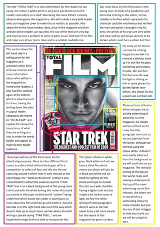
  • 1. Our main focus on this front cover is this young man, he looks very handsome and attractive to bring in the sellers, he has stubble on his face which represents his character could be mischievous but we feel the main attraction is brought in by his eyes, the whites of his eyes are very white and clear and his eye brows seemed to be darken which could he is a villain but then The title “TOTAL FILM” is in clear bold letters for the readers to see easily, the colour is white which is very pure and stand out to the readers and sellers on a shelf. Also being the name FILM it is clearly obvious what genre the magazine is. We will include a very bold header onto our magazine cover to make this as realistic as possible. Also above the M the issue number, date, price of the magazine and their website which readers can log onto, the size of the text isn’t very big and may become a problem to some readers so we shall learn from this and make sure all our text is clear and in a suitable readable size.<br />His smile on his face to connote he is being happy but we feel it is more of a devious smile as if in the film he plots something and creates trouble. We also feel that because the way the light is shining on him in some places it is darker/lighter than others, this shows he has a good side and bad side.This section down the left hand side is a selling point for the magazine as it promotes other films and new releases and more information about what will be in the magazine to interest the readers, it also has their website again at the bottom which is advertisement for them, having the writing down the sides in capital letters keeping to the theme as “TOTAL FILM” is in capitals this shows the importance of what they are writing and also to make the words bolder and appeal to more to their target audience.1028700278130<br />These sections of text in white and grey are to aid the advertising of what else is in the magazine, the bolder sections of text are to make the little paragraph stand out to attract attention from the buyer, although we felt that using the colour white, it doesn’t necessarily stand out from the background so we will avoid this on our magazine. The red bold writing at the top we feel works really well making a statement at the top of the cover advertising recent film releases, the letters are in red which is a contrasting colour to make it bolder but also the size of text is bigger to help also stand out we will be using this idea.<br />The colour scheme is white, grey, black white and red, we have a silent film which means our photo will also be in black and white and we liked the lighting on this photo and hope to include this into ours with charlotte having a lighter side and Joe maybe a bit darker tones of light, we feel the white writing of little paragraph’s doesn’t work as the text needs to be a lot more clearer but the layout of this magazine has given us ideas.These two sections of the front cover are for advertising purposes, there are four different front covers to collect which will set the buyers off in a competition to collect all four and this ahs the red colouring around it which links in with the text at the top of page, the “WORLD EXCLUSIVE” section is also red and bold to attract the audience but the “STAR TREK” text is on a black background of the young mans t-shirt and with the white writing this makes this stand out clearly to the buyer and the world “coolest” being underlined which excite the reader in wanting to no more about the film and then go and watch it. Also the barcode is on the right hand side out of the way which doesn’t take up to much room, we like where the bold writing is placed saying “STAR TREK…” and we hopefully through drafts be able to incorporate this.<br />Here we can see three people, two young men and young women, they are stood in height order, but we feel the young man in the middle is preventing something happening between the girl and the other man, the first man we felt has a lighter side to him and he doesn’t have many dark shadows over his face, the second man which is in the middle we felt had a shower around the edge of his face which made us think he has a dark side to him and in theThe title of this “TOTAL FILM” cover has a special effect to it compared to the other one, as they are advertising the new “New Moon” Twilight film the text has a blurred effect making the text represent a moon colour and light when its in the sky at night. Underneath the M is the date, issue number, price and their website for advertisement, we all really this effect as it represents the film they are advertising extremely well and gives the reader a sense of style and introduces them to feel and idea of the new New Moon Twilight film.<br />Film we think he tries to cause trouble between the other two characters; he also has his back turned to the other man which connotes there is going to be conflict between the two characters but also his body language seems to be protective over her as he has his right arm over her body as if to stop her from getting to the other man. The women on the right hand side is being held back from the middle man, she has her hand resting on his arm, she is the only one looking directly at the camera which grabs our attention to look at her. There costume is very casual, jeans and a top which represents them being young adults, there facial expressions are serious and are not smiling which shows this film isn’t comedy the story line is going to serious but we feel with the women being involved there could be some romance involved between the two men and the women and this could be the conflict which occurs in the film. Both the men are looking at the girl which connotes to us the film is heavily enrolled about her and she is one of the main characters.895350278130<br />These sections of text stick to two main colours a peach colour and white, the “new moon” text has a similar effect to the “TOTAL FILM” it represents the moon with the use of blurring the edges and making a shadow and from the back drop of the photo we can see this film is set out side in the moonlight hence the title of the film. The other sections of text show advertisement to draw the attention to the audience about what it is in the magazine, the “PLUS!” section also directly locates and informs the readers what else will be in the magazine. This front cover they do not use bold on many fonts’s only the words in peach have this effect which we didn’t like, we prefer text to stand out and be bold to the readers as its a selling point.<br />The background and colours of the costume on this front cover are very dull they use a dark colour scheme, and the colour for the font is very uplifting as its white and peach which is contrasting with the dull colours which makes the text stand out to the buyers. We don’t like where the barcode is we felt it was too central to everything and we won’t be having the barcode placed there, also we feel there is a big gap where the arrow is pointing which we don’t want to have on our front cover, we want to have a filled cover with lots of impact and no big gaps like this cover. Having free posters as an extra incentive to buy the magazine was an idea we are hoping to use as this would make our magazine look more realistic.<br />These sections of text are placed around the iron man which will gain attention as the buyer takes his eye off the main focus, they are to advertise more about the magazine and what other interesting articles/reviews/posters we expect to be in the magazine, the font stays in the colour scheme and they use a shape in blue to highlight what they are advertising and then using the white coloured font to emphasise the text, we felt that the text should have been bolder and we will avoid that when we create our front cover.The title of this magazine is usually in a red font but in this particular front cover they have adapted the style of the font to match and represent the film they are advertising which is “iron man 2” the effect on the font is like a lightning bolt/bolts shooting through the text with an electric blue colour, this is representing the film and we feel in a energetic way and that this film will be an action packed film full of entertainment. There is also a shadow behind the text which adds to the effect of the text giving it more of a back drop, above the M is the date and price of the magazine which is clear to reader as they can locate this quickly as it’s simple.<br />They have kept to a small colour scheme just using blue/black/white/silver which fits with the dark background which seems to have mist around it to show the darkness where the iron man has come from, which gives us a sense of scariness and danger and also as the iron man is red we felt this creates a sense of danger around him as he takes up the majority of the front cover, this effect we liked in particular but for our front cover we will hopefully have more of the background being shown to show setting. This is the main focus of the front cover and we feel this has been done brilliantly, the photo is clear and crisp and has a stunning effect, even though the head of the iron man is cover the title of the magazine we felt this gained effect as his eye line is directly under the text which draws in attention to the reader. The photo is very central both his shoulders skin the edge of the page and along with his posture we feel the impact they have created is brilliant because he has a stern sense around him and connotes he will bring a lot of energy to the film and the story line is based around him, the electric blue light in his chest gives us a sense he is alive and ready to go which also connotes again an action packed film full of entertainment. The smile on his face gave us a sense of evil as it’s very jiggered around his face.933450212725<br />This section we felt worked very well and hope to include a similar idea in our work, the text is very central and we felt it has an impact which continues on from the photo, the text that says “IRON MAN 2” is very similar to the “EMPIRE” text, both are white/blue colours that stand out from the dark background and the colour of the iron man, the slogan we felt really worked under the title of the film as it sets a sense a genre to the audience as they use the word “enemies” and “attitude” this represents a action packed film which will include violence and conflict between characters. Having the slogan in a grey colour we felt represents metal, as the iron man is made form metal but is red/gold, also the font colour is black which makes it look formal we felt and as there are full stops between every two words we felt they were making a statement by using them. The “PLUS!” section we really liked because they have been clever by adding arrows between the boxes which tells the reader to open to the page and read on, also they have used small but clear photos of three more films they will be looking out which we felt worked well because the reader can see clearly what else is in magazine and this will help make a choice if to buy it or not, we are hoping to include this section into our magazine.<br />The compass we felt has part of the main focus on this front cover and represents the name of film very well and has relevance, the compass is not only in the title of the film but it is gold but the attention to detail has added to the genre of fantasy as around the edge of the compass are figures/gods/objects/symbols to represent the story. As the hands on compass are all pointing in different directions this could show the story line is set in different places and also the characters look to this compass for guidance as this is usual idea of a compass. We liked this idea and thought we could place a big clock to represent our school teenagers being late.The title in this particular front cover has been brought forward in front of the compass which works really well as the red is a contrasting colouring as both sections are still clear to the reader what they are and represent. On the E there looks to be a flying angel/witch looking down on the main action which could show this character spends most of there time in the sky looking down upon them. <br />962025296545<br />These two sections of text show the readers what else will be in the magazine and drawing them in to buy the magazine, at the top of the page it states this is a collectors edition which we felt would be a selling point of the magazine for this week, the text at the bottom of the page highlight what else be in the magazine and the other films they will covering, the font colour keeps in the initial colour scheme a darker more vibrant gold and then a lighter gold also which both we felt were bold to audience and could be seen to bring in the buyers.The other main focus on this front page is the three characters, the little girl at the front is staring straight at the camera whilst holding the camera which we feel works as the buyer can see both side of the compass and its gold not only on the inside but on the outside to. The little girl we feel could be a main part and it could be her compass as she is the on holding on to it. The other two characters and both mirroring each other stances except the lady is looking into the camera which an evil look in the eye which could show she wants the compass and could be against the other two characters which causes conflict in the film and the little girl is heavily involved in this.<br />Again in this front cover that have kept to a small colour scheme, gold/white/red, there are very small sections red but we felt they stand out and we will try to include this into our front cover, but between the two EMPIRE magazines we would like to include the other front cover PLUS! Section as we felt this highlights what else is in the magazine and with the arrows pointing to turn the page this brings in the buyers and they will intrigued and want to carry on reading in the magazine.Their costume we felt is set back in time and is very formal which we are hoping to use for our character Charlotte, we felt the costume would be representing the films time period and their class, they are dressed as a higher class citizen and in the older days class was very highly recognisable and class mattered. The background of this front cover looks like a fantasy world, blue sky and what looks to be snowy mountains which we assumed the action will take most of his place here. The words “the movie that will reinvent fantasy” is a big statement and we feel that the compass will live up to this expectation and the film will revolve around it.<br />