SlideShare a Scribd company logo
1 of 3
This album cover „We are the night‟ shows how the Chemical brother‟s                    The CD has a relatively simple design but consists of the themes on
 predominantly play in night clubs and other events that occur at night. The             the front cover. The chemical brothers „logo‟ is in the same font as on
 name of the album can relate to the listeners as they are the consumers of              the cover to keep it consistent. The song titles are placed around the
 the performances that The Chemical Brothers provide. This is a good name
           Town                                                                          circumference of the CD to give it a boarder and also this helps you to
 for the album as it is addressing the chemical brothers and the listeners in            navigate the CD if you do not have the back cover. The record labels
 the same statement making them feel involved with their music. When                     can be found at the bottom of the CD notifying what company
 thinking of the title for my album I will consider what will relate to my target        produced and distributed the music, this is common on most albums
 audience, the things that you would expect to see on a night out and                    or singles and it is something that I will include in my product.
 conventions of the genre.


                                                                                    The abstract designs are continued on the back with more images of stars
The star constellation and rocky moon design highlights the themes of the
                                                                                    and clouds. The scattered feel makes it seem like it is space that you are
album as it is setting an abstract scene at night. Abstract designs are seen
                                                                                    looking into with the song titles in the distance. The darker colours make
to be common within the dance music genre in its entirety. This is because
                                                                                    the songs stand out more against the background and also it is clear that
the DJs that make the music are focused on the reaction of the crowd and
                                                                                    they are not trying to shove this in your face as they are in an orderly format
less of the perception of how they are seen unlike mainstream artists. Also
                                                                                    and font. However the title of the album is again on the back but this time
it makes the album iconic and unique causing it to be diverse it from many
                                                                                    in a different font. The block type font brings the attention away from the
others.
                                                                                    song titles but onto the album name.
As pink Floyd was a very influential band of the 70s, 80s and still to this day; this album had many conspiracies as to what it actually
               stood for. The title „Dark side of the moon‟ has said to have represented the mediocrity or a class system within the world. “Those with
               no say or influence, we live on the dark side of the moon”. The very simple yet effective design of a prism reflecting colour has caught
               the eye of many consumers and has become very famous used in thousands of reproductions and re-vamps with a modern edge yet
               the same 3 piece design has stayed the same. The text “Pink Floyd Dark side of the moon” is in the top right hand corner in a very
               neat manner. It is clear to see as it contrasts with the background however it is very simplistic. Keeping my ancillary design simple is
               key to an effective product; therefore I need to consider what will be a good use of images and text yet eye-catching.


The CD design is very unique as it has the colours from the prism going
                                                                                           On the back cover we can see the same image but flipped over. This
in all directions. Red, blue, yellow, orange, green and purple make up the
                                                                                          draws a lot more focus to the design rather than the tracks. However
beams of light coming off from different angles. This is a very abstract
                                                                                          linking back to the idea of society being un-equal, the reason for it
and vibrant design, iconic in its own way via the use of simple colours.
                                                                                          being flipped over may be that they want to see a change. With track
The track listing along with record labels can be found to the right of the
                                                                                          titles such as „Money‟, „On the run‟ and „Us and them‟ it reflects their
CD. In my ancillary I will involve the record label on the CD however I will
                                                                                          ideology of a poverty stricken and corrupt world we live in and how the
not include the track titles. This is because in my opinion I think it looks
                                                                                          band have addressed this issue.
cluttered and unorganised.
To the right is a compilation of the very best of the stone roses. They were a very influential band throughout the
90s that started off their own unique style in music. The creator of this piece of art was a band member himself,
John Squire. His artwork has adorned the singles, album covers and promotional posters for his and the Stone
Roses' music. In the late 1980s and through to the 90s, Squire's artistic style was heavily influenced by the action
painting technique of Jackson Pollock. Also the heavy drug use at this time throughout the music industry might
have given Squire some psychedelic inspiration to use paints in such an expressive way. The album cover is trying
            John John Squire n Squire
to maximise awareness of Squires art fully as the title is only in a small font placed at the top. In my ancillary task I
will attempt to create something similar with its own abstract style, possibly an obscure image or the use of vibrant
colours.


                                                                                                                                           John Squire


 Again we have another of Squires art pieces as the CD. This makes
                                                                                     The back cover for this album replicates the front with another piece of Squires artwork. A
 the CD very unique as it is a piece of art itself, no writing is needed
                                                                                     section has been highlighted for the track listing separate to the art work. This is because
 just the image that he has created. This links in with the front and
                                                                                     again they wanted to maximize the awareness of his work and give is a continuous theme
 back cover making the album feel like one item. This differs to most
                                                                                     throughout. My design will be similar in the way that it will not differ very much throughout
 CDs as it has a colourful vibrant design on it; this adds personality to
                                                                                     in terms of design colours and fonts. Sticking to similar colours the blue and white help
 the album and style. Squire‟s designs are very abstract and creative;
                                                                                     the song titles to stand out and made easy to read, I have considered this when coming
 it reflects both his personality and the style of experimental music
                                                                                     to create my ancillary as I will use colours that make it easy to read and visible.
 the Roses create.

More Related Content

More from Eddie Guy

How does your media product represent particular social groups
How does your media product represent particular social groupsHow does your media product represent particular social groups
How does your media product represent particular social groupsEddie Guy
 
Questio naire
Questio naireQuestio naire
Questio naireEddie Guy
 
Questio naire
Questio naireQuestio naire
Questio naireEddie Guy
 
Music video mind map summery
Music video mind map summeryMusic video mind map summery
Music video mind map summeryEddie Guy
 
Production diary final
Production diary finalProduction diary final
Production diary finalEddie Guy
 
How did you_use_media_technologies_in[1]
How did you_use_media_technologies_in[1]How did you_use_media_technologies_in[1]
How did you_use_media_technologies_in[1]Eddie Guy
 
Evaluation question one finished without one screengrab = title
Evaluation question one finished without one screengrab = titleEvaluation question one finished without one screengrab = title
Evaluation question one finished without one screengrab = titleEddie Guy
 
Evaluation question one finished without one screengrab = title
Evaluation question one finished without one screengrab = titleEvaluation question one finished without one screengrab = title
Evaluation question one finished without one screengrab = titleEddie Guy
 
Evaluation question one finished without one screengrab = title
Evaluation question one finished without one screengrab = titleEvaluation question one finished without one screengrab = title
Evaluation question one finished without one screengrab = titleEddie Guy
 
Analysis albums[1]
Analysis albums[1]Analysis albums[1]
Analysis albums[1]Eddie Guy
 
Analysis albums[1]
Analysis albums[1]Analysis albums[1]
Analysis albums[1]Eddie Guy
 
Music video questionnaire primary research
Music video questionnaire primary researchMusic video questionnaire primary research
Music video questionnaire primary researchEddie Guy
 
Music video questionnaire primary research
Music video questionnaire primary researchMusic video questionnaire primary research
Music video questionnaire primary researchEddie Guy
 
Questio naire
Questio naireQuestio naire
Questio naireEddie Guy
 
Music video analysis tnght
Music video analysis tnghtMusic video analysis tnght
Music video analysis tnghtEddie Guy
 
Music video analysis seraphim
Music video analysis seraphimMusic video analysis seraphim
Music video analysis seraphimEddie Guy
 

More from Eddie Guy (20)

Question 3
Question 3Question 3
Question 3
 
How does your media product represent particular social groups
How does your media product represent particular social groupsHow does your media product represent particular social groups
How does your media product represent particular social groups
 
Questio naire
Questio naireQuestio naire
Questio naire
 
Questio naire
Questio naireQuestio naire
Questio naire
 
Music video mind map summery
Music video mind map summeryMusic video mind map summery
Music video mind map summery
 
Production diary final
Production diary finalProduction diary final
Production diary final
 
How did you_use_media_technologies_in[1]
How did you_use_media_technologies_in[1]How did you_use_media_technologies_in[1]
How did you_use_media_technologies_in[1]
 
Evaluation question one finished without one screengrab = title
Evaluation question one finished without one screengrab = titleEvaluation question one finished without one screengrab = title
Evaluation question one finished without one screengrab = title
 
Evaluation question one finished without one screengrab = title
Evaluation question one finished without one screengrab = titleEvaluation question one finished without one screengrab = title
Evaluation question one finished without one screengrab = title
 
Evaluation question one finished without one screengrab = title
Evaluation question one finished without one screengrab = titleEvaluation question one finished without one screengrab = title
Evaluation question one finished without one screengrab = title
 
Analysis albums[1]
Analysis albums[1]Analysis albums[1]
Analysis albums[1]
 
Analysis albums[1]
Analysis albums[1]Analysis albums[1]
Analysis albums[1]
 
Music video questionnaire primary research
Music video questionnaire primary researchMusic video questionnaire primary research
Music video questionnaire primary research
 
Music video questionnaire primary research
Music video questionnaire primary researchMusic video questionnaire primary research
Music video questionnaire primary research
 
Questio naire
Questio naireQuestio naire
Questio naire
 
Question
QuestionQuestion
Question
 
Analysis
AnalysisAnalysis
Analysis
 
Haoppppy
HaoppppyHaoppppy
Haoppppy
 
Music video analysis tnght
Music video analysis tnghtMusic video analysis tnght
Music video analysis tnght
 
Music video analysis seraphim
Music video analysis seraphimMusic video analysis seraphim
Music video analysis seraphim
 

Analysis albums

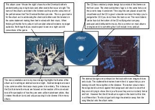
  • 1. This album cover „We are the night‟ shows how the Chemical brother‟s The CD has a relatively simple design but consists of the themes on predominantly play in night clubs and other events that occur at night. The the front cover. The chemical brothers „logo‟ is in the same font as on name of the album can relate to the listeners as they are the consumers of the cover to keep it consistent. The song titles are placed around the the performances that The Chemical Brothers provide. This is a good name Town circumference of the CD to give it a boarder and also this helps you to for the album as it is addressing the chemical brothers and the listeners in navigate the CD if you do not have the back cover. The record labels the same statement making them feel involved with their music. When can be found at the bottom of the CD notifying what company thinking of the title for my album I will consider what will relate to my target produced and distributed the music, this is common on most albums audience, the things that you would expect to see on a night out and or singles and it is something that I will include in my product. conventions of the genre. The abstract designs are continued on the back with more images of stars The star constellation and rocky moon design highlights the themes of the and clouds. The scattered feel makes it seem like it is space that you are album as it is setting an abstract scene at night. Abstract designs are seen looking into with the song titles in the distance. The darker colours make to be common within the dance music genre in its entirety. This is because the songs stand out more against the background and also it is clear that the DJs that make the music are focused on the reaction of the crowd and they are not trying to shove this in your face as they are in an orderly format less of the perception of how they are seen unlike mainstream artists. Also and font. However the title of the album is again on the back but this time it makes the album iconic and unique causing it to be diverse it from many in a different font. The block type font brings the attention away from the others. song titles but onto the album name.
  • 2. As pink Floyd was a very influential band of the 70s, 80s and still to this day; this album had many conspiracies as to what it actually stood for. The title „Dark side of the moon‟ has said to have represented the mediocrity or a class system within the world. “Those with no say or influence, we live on the dark side of the moon”. The very simple yet effective design of a prism reflecting colour has caught the eye of many consumers and has become very famous used in thousands of reproductions and re-vamps with a modern edge yet the same 3 piece design has stayed the same. The text “Pink Floyd Dark side of the moon” is in the top right hand corner in a very neat manner. It is clear to see as it contrasts with the background however it is very simplistic. Keeping my ancillary design simple is key to an effective product; therefore I need to consider what will be a good use of images and text yet eye-catching. The CD design is very unique as it has the colours from the prism going On the back cover we can see the same image but flipped over. This in all directions. Red, blue, yellow, orange, green and purple make up the draws a lot more focus to the design rather than the tracks. However beams of light coming off from different angles. This is a very abstract linking back to the idea of society being un-equal, the reason for it and vibrant design, iconic in its own way via the use of simple colours. being flipped over may be that they want to see a change. With track The track listing along with record labels can be found to the right of the titles such as „Money‟, „On the run‟ and „Us and them‟ it reflects their CD. In my ancillary I will involve the record label on the CD however I will ideology of a poverty stricken and corrupt world we live in and how the not include the track titles. This is because in my opinion I think it looks band have addressed this issue. cluttered and unorganised.
  • 3. To the right is a compilation of the very best of the stone roses. They were a very influential band throughout the 90s that started off their own unique style in music. The creator of this piece of art was a band member himself, John Squire. His artwork has adorned the singles, album covers and promotional posters for his and the Stone Roses' music. In the late 1980s and through to the 90s, Squire's artistic style was heavily influenced by the action painting technique of Jackson Pollock. Also the heavy drug use at this time throughout the music industry might have given Squire some psychedelic inspiration to use paints in such an expressive way. The album cover is trying John John Squire n Squire to maximise awareness of Squires art fully as the title is only in a small font placed at the top. In my ancillary task I will attempt to create something similar with its own abstract style, possibly an obscure image or the use of vibrant colours. John Squire Again we have another of Squires art pieces as the CD. This makes The back cover for this album replicates the front with another piece of Squires artwork. A the CD very unique as it is a piece of art itself, no writing is needed section has been highlighted for the track listing separate to the art work. This is because just the image that he has created. This links in with the front and again they wanted to maximize the awareness of his work and give is a continuous theme back cover making the album feel like one item. This differs to most throughout. My design will be similar in the way that it will not differ very much throughout CDs as it has a colourful vibrant design on it; this adds personality to in terms of design colours and fonts. Sticking to similar colours the blue and white help the album and style. Squire‟s designs are very abstract and creative; the song titles to stand out and made easy to read, I have considered this when coming it reflects both his personality and the style of experimental music to create my ancillary as I will use colours that make it easy to read and visible. the Roses create.