

Recomendados
Más contenido relacionado
La actualidad más candente
La actualidad más candente (18)
Destacado
Destacado (17)
Similar a Guitar
Similar a Guitar (20)
Más de Eddie Guy
Más de Eddie Guy (20)
Último
Último (20)
Guitar
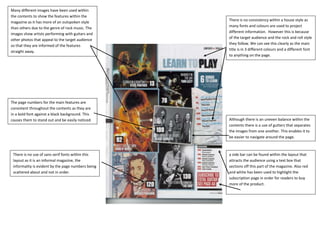
- 1. Many different images have been used within the contents to show the features within the There is no consistency within a house style as magazine as it has more of an outspoken style many fonts and colours are used to project than others due to the genre of rock music. The images show artists performing with guitars and different information. However this is because of the target audience and the rock and roll style other photos that appeal to the target audience they follow. We can see this clearly as the main so that they are informed of the features title is in 3 different colours and a different font straight away. to anything on the page. The page numbers for the main features are consistent throughout the contents as they are in a bold font against a black background. This causes them to stand out and be easily noticed. Although there is an uneven balance within the contents there is a use of gutters that separates the images from one another. This enables it to be easier to navigate around the page. There is no use of sans serif fonts within this a side bar can be found within the layout that layout as it is an informal magazine, the attracts the audience using a text box that informality is evident by the page numbers being sections off this part of the magazine. Also red scattered about and not in order. and white has been used to highlight the subscription page in order for readers to buy more of the product.