
Recomendados
Más contenido relacionado
La actualidad más candente
La actualidad más candente (20)
Destacado
Destacado (20)
Similar a Music magazine analysis
Similar a Music magazine analysis (20)
Más de ElizabethAdeoye23
Más de ElizabethAdeoye23 (20)
Último
Último (20)
Music magazine analysis
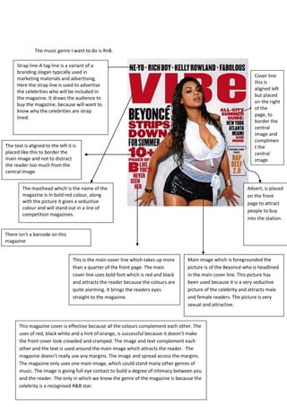
- 1. The music genre I want to do is RnB. Strap line-A tag line is a variant of a branding slogan typically used in Cover line marketing materials and advertising. this is Here the strap line is used to advertise aligned left the celebrities who will be included in but placed the magazine. It draws the audience to on the right buy the magazine, because will want to of the know why the celebrities are strap page, to lined. border the central image and complimen The text is aligned to the left it is t the placed like this to border the central main image and not to distract image the reader too much from the central image The masthead which is the name of the Advert, is placed magazine is in bold red colour, along on the front with the picture it gives a seductive page to attract colour and will stand out in a line of people to buy competition magazines. into the station. There isn’t a barcode on this magazine This is the main cover line which takes up more Main image which is foregrounded the than a quarter of the front page. The main picture is of the Beyoncé who is headlined cover line uses bold font which is red and black in the main cover line. This picture has and attracts the reader because the colours are been used because it is a very seductive quite alarming. It brings the readers eyes picture of the celebrity and attracts male straight to the magazine. and female readers. The picture is very sexual and attractive. This magazine cover is effective because all the colours complement each other. The uses of red, black white and a hint of orange, is successful because it doesn’t make the front cover look crowded and cramped. The image and text complement each other and the text is used around the main image which attracts the reader. The magazine doesn’t really use any margins. The image and spread across the margins. The magazine only uses one main image, which could stand many other genres of music. The image is giving full eye contact to build a degree of intimacy between you and the reader. The only in which we know the genre of the magazine is because the celebrity is a recognised R&B star.