

Recomendados
Recomendados
Más contenido relacionado
Más de Fatima Iftikhar
Más de Fatima Iftikhar (20)
Último
Último (20)
Billboard Magazine Analysis
- 3. Target Audience The Target audience for billboard is shown to be mainly the people ranging from early twenties to mid-fifties. This Shows that the magazine appeals to majority of the people. In addition billboard magazine is rare in a sense that it covers all types of music and so s very attractive to music lovers and open to all types of people. It’s observed that most of the readers are collage graduates and so this implies that the viewership are articulate and educated people.
- 4. Publishing Institutions Billboard Magazine is being published by Prometheus Global Media which was earlier known as Global Media. It’s a Diversified company with leading assets in the media and entertainment arenas, include Music, Entertainment and Advertising.
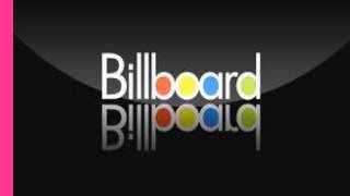
- 5. Masthead This is a trade mark logo of this magazine. The different color of the logo signifies that it’s a fun magazine that follows all the events related to latest music. The colors of the logo are also designed to appeal to a certain audience. Color Scheme The color scheme of the cover page is altogether very simple, the base with black, grey and white shades and the image again is very simple yet elegant with sober tones of colors. The base being is a bit harder shades gives the lighter tone image a great outlook and a special feeling of enhancement. The fact that the artists name is significantly in a big size and is written in bold letters in bold letters in order to catch audiences attention. This is also the main cover line of the magazine Direct Mode of Address The music artist is directly looking into the camera lenses. This direct mode of address gives the impression that the celebrity is looking directly at you. This action will in a way convey a message of importance to the audience and will convince then even further to buy the magazine. The barcode is placed in the bottom seeing that it doesn’t add any new info to the content of the cover. It’s given such place so that it generates less attention as the magazine is quite expensive and the reader Left Side Third People also read from left to right so all the important information is put in the left side third, this is because the area will most likely be the visible part on the magazine stand and so due to this all the important information is included in this area.
- 6. The background of this section is grey which is a different color then the rest of the page. This makes the section to stand out and to increase the readers interest despite of the differences the font of the page remains the same. This section offers the readers a music chart consisting on all the latest ratings etc, this section is a unique for the Billboard Magazine. The use of lesser colors for the color scheme of the page gives it a simple yet a quite professional look. This suggests that this magazine may be intended for all aged music lovers. This section of the content page advertises different things and also advertises different sorts of media used by the brand “Billboard” The page numbers help the readers navigate through the pages specified for articles. This page has no central image making all the images as important as the next. Although this is a diplomatic approach this might make the reader think that there is to much to be read. The logo shows the consistency of the features throughout the magazine. The four images here are used as make-up for the lack of a central image. This anyways works in the favor of the magazine as it shows the variety in content. The blank space makes the clack writing to standout. It’s drawing attention to the image and simultaneously to all this gives a very professional look.
- 7. This is the only part that is in color and so it collects importance and draws the readers' attention. The color of the text reflects the message of the text and connects it to the theme of the article “Summer Time” This tittle is designed by a bit playing with words and letting the audience knows that article is all about T.I, this works like a pull quote, without actually having to quote the article. The circles around the tittle draws more than usual attention towards it and works as a anchorage text as the models outing his arms up. The way of the article presentation is very effective because of the lack of color and big text makes the article look very neat and organized. This makes it easy and appealing for the audiences to read. A very plain color white and a minority of varied other colors that can be related to summers which seem to be the main theme of this DPS. The white background also works on giving the central image a standout impression. A whole page is dedicated to one big picture of the artist T.I this suggests the importance of him greater than anything else in the DPS article on him. T.I wearing casual clothing gives as impression of being casual and relaxed. The picture is very simple in the sense not over. This will help in the means of connecting with the audience be relating to an average person then a celebrity.