SlideShare una empresa de Scribd logo
1 de 22
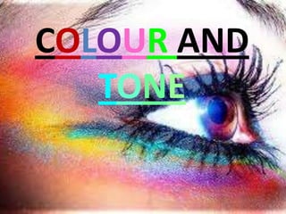
COLOUR AND TONE
This sun represents a colour chart,warm and cool colours. As in the picture think of the warms as being the closest so there for the ‘hottest’ colours and the cool colours having cooled off as they move further away from the heat..
Colours have a direct impact on ones mood. This warm colour scheme creates a ‘warm’ homely feel.
Colours have have both positive and negative attributes. With these warm colours it can create feelings anywhere from happiness to violence.I almost feel as though there is negativity engulfing the town as the clouds approach. Personal opinion..
We associate colour to feelings, in this case love.
Although there are more cool than warm colours here, we still see them contrasting  well with each other. Lovely relaxing feeling to this painting.
Here the warms and cools are clashing. It makes me uneasy and i cant look at it for to long  without becoming annoyed. They should of stuck to one colour code.
Here we have cool colours, anything from violet to green.
Cool colours are said to have a calming and relaxing effect.
This artist has used cool hues of blue, using lighter for highlighting and darker for shadows.
Just a random painting I found. I find it very upsetting, almost separating good from evil, evil being the red warm tones that we associate ‘hell 'with. Cool tones heaven.
Interior design colour schemes are chosen tocreate a calming environment..
Colour tones is how light or dark a colour rather than what the actual colour or hue is. It’s the use of the same colour in different shades.
Black and white tones are used very cleverly here to create a ‘multi-visual’ picture.
Dark tones in this picture take what is meant to be a happy Disney character and make it feel dark and gloomy.
Lighter hues of colour produce smaller ranges of tone. Here the sky (horizon) and the ground are of the same tones. Shading and highlighting is used. See the cloud with what looks like the sun behind it. Lighter shades are used for this. And the cut-off for the horizon, darker tones.
Tones are used to make paintings look more realistic and 3D.
Tones are also used to create a focal point. The eye focuses on the light element against the dark. See the lady in white.
Once again tone used to create a realistic feeling. One can imagine how flat and life-less it would look in one tone of colour.
‘en grisaille’done purely in gray tones. Different tones (light and dark) creating different levels and layers. Although it’s all one tone, there’s no feeing of incomplete. It works.
We all have different skin tones..
.....THE END.....

Más contenido relacionado

La actualidad más candente

La actualidad más candente (20)

COLOUR
COLOURCOLOUR
COLOUR
 
Space and volume
Space and volumeSpace and volume
Space and volume
 
2.colour
2.colour2.colour
2.colour
 
Element of Art - Color
Element of Art - ColorElement of Art - Color
Element of Art - Color
 
Connecting essay 2
Connecting essay 2Connecting essay 2
Connecting essay 2
 
Colour Theory
Colour TheoryColour Theory
Colour Theory
 
Color
ColorColor
Color
 
Colour 1 eso
Colour 1 esoColour 1 eso
Colour 1 eso
 
Power point
Power pointPower point
Power point
 
Ed 2201 PowerPoint
Ed 2201 PowerPointEd 2201 PowerPoint
Ed 2201 PowerPoint
 
Lesson 10 a understanding color
Lesson 10 a understanding colorLesson 10 a understanding color
Lesson 10 a understanding color
 
Colors in interior design
Colors in interior designColors in interior design
Colors in interior design
 
Colour theory
Colour theoryColour theory
Colour theory
 
Johannes Itten
Johannes IttenJohannes Itten
Johannes Itten
 
Bdft i,def, unit-i, colors
Bdft i,def, unit-i, colorsBdft i,def, unit-i, colors
Bdft i,def, unit-i, colors
 
2 d design portfolio Hayley - Score: 4
2 d design portfolio Hayley - Score: 42 d design portfolio Hayley - Score: 4
2 d design portfolio Hayley - Score: 4
 
Color Review & Johannes Itten
Color Review & Johannes IttenColor Review & Johannes Itten
Color Review & Johannes Itten
 
Colour 1st ESO
Colour 1st ESOColour 1st ESO
Colour 1st ESO
 
World colors-odai hatem
World colors-odai hatemWorld colors-odai hatem
World colors-odai hatem
 
Cool and Warm colors
Cool and Warm colorsCool and Warm colors
Cool and Warm colors
 

Similar a Colour and tone

Similar a Colour and tone (20)

Tone & Colour in Design
Tone & Colour in DesignTone & Colour in Design
Tone & Colour in Design
 
Tone and colour in design
Tone and colour in designTone and colour in design
Tone and colour in design
 
Colour and tone
Colour and toneColour and tone
Colour and tone
 
IVC - Lesson 07
IVC - Lesson 07IVC - Lesson 07
IVC - Lesson 07
 
color
color color
color
 
Design principles
Design principlesDesign principles
Design principles
 
Color theory
Color theoryColor theory
Color theory
 
Colors, id
Colors, idColors, id
Colors, id
 
Colour
Colour Colour
Colour
 
Color terms
Color termsColor terms
Color terms
 
Journal
JournalJournal
Journal
 
A Brief Introduction to Color Theory
A Brief Introduction to Color TheoryA Brief Introduction to Color Theory
A Brief Introduction to Color Theory
 
Color theory
Color theoryColor theory
Color theory
 
Kandinsky with examples
Kandinsky with examplesKandinsky with examples
Kandinsky with examples
 
Kandinsky with examples
Kandinsky with examplesKandinsky with examples
Kandinsky with examples
 
Color and texture in interior design ciu
Color and texture in interior design ciuColor and texture in interior design ciu
Color and texture in interior design ciu
 
Creative Industry Lecture 2 a b color form and space
Creative Industry Lecture 2 a b color form and spaceCreative Industry Lecture 2 a b color form and space
Creative Industry Lecture 2 a b color form and space
 
AHSArt: Color theory Drawing + Painting
AHSArt:  Color theory Drawing + Painting AHSArt:  Color theory Drawing + Painting
AHSArt: Color theory Drawing + Painting
 
Beige Watercolor Project Presentation.pptx
Beige Watercolor Project Presentation.pptxBeige Watercolor Project Presentation.pptx
Beige Watercolor Project Presentation.pptx
 
Colour
ColourColour
Colour
 

Más de Gillianlaw

Más de Gillianlaw (6)

Ancient Ottoman Empire
Ancient Ottoman EmpireAncient Ottoman Empire
Ancient Ottoman Empire
 
Ring Presentation
Ring PresentationRing Presentation
Ring Presentation
 
Ancient China
Ancient ChinaAncient China
Ancient China
 
Weight
WeightWeight
Weight
 
Ro5m
Ro5mRo5m
Ro5m
 
Lines design theory
Lines design theoryLines design theory
Lines design theory
 

Colour and tone

  • 2. This sun represents a colour chart,warm and cool colours. As in the picture think of the warms as being the closest so there for the ‘hottest’ colours and the cool colours having cooled off as they move further away from the heat..
  • 3. Colours have a direct impact on ones mood. This warm colour scheme creates a ‘warm’ homely feel.
  • 4. Colours have have both positive and negative attributes. With these warm colours it can create feelings anywhere from happiness to violence.I almost feel as though there is negativity engulfing the town as the clouds approach. Personal opinion..
  • 5. We associate colour to feelings, in this case love.
  • 6. Although there are more cool than warm colours here, we still see them contrasting well with each other. Lovely relaxing feeling to this painting.
  • 7. Here the warms and cools are clashing. It makes me uneasy and i cant look at it for to long without becoming annoyed. They should of stuck to one colour code.
  • 8. Here we have cool colours, anything from violet to green.
  • 9. Cool colours are said to have a calming and relaxing effect.
  • 10. This artist has used cool hues of blue, using lighter for highlighting and darker for shadows.
  • 11. Just a random painting I found. I find it very upsetting, almost separating good from evil, evil being the red warm tones that we associate ‘hell 'with. Cool tones heaven.
  • 12. Interior design colour schemes are chosen tocreate a calming environment..
  • 13. Colour tones is how light or dark a colour rather than what the actual colour or hue is. It’s the use of the same colour in different shades.
  • 14. Black and white tones are used very cleverly here to create a ‘multi-visual’ picture.
  • 15. Dark tones in this picture take what is meant to be a happy Disney character and make it feel dark and gloomy.
  • 16. Lighter hues of colour produce smaller ranges of tone. Here the sky (horizon) and the ground are of the same tones. Shading and highlighting is used. See the cloud with what looks like the sun behind it. Lighter shades are used for this. And the cut-off for the horizon, darker tones.
  • 17. Tones are used to make paintings look more realistic and 3D.
  • 18. Tones are also used to create a focal point. The eye focuses on the light element against the dark. See the lady in white.
  • 19. Once again tone used to create a realistic feeling. One can imagine how flat and life-less it would look in one tone of colour.
  • 20. ‘en grisaille’done purely in gray tones. Different tones (light and dark) creating different levels and layers. Although it’s all one tone, there’s no feeing of incomplete. It works.
  • 21. We all have different skin tones..