
Recomendados
Más contenido relacionado
Más de Gussssssy1
Más de Gussssssy1 (20)
Último
Último (20)
Inception magazine cover analysis
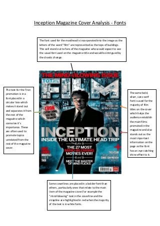
- 1. Inception Magazine Cover Analysis - Fonts The font used for the masthead is incorporated into the image as the letters of the word “film” are represented as the tops of buildings. This will stand out to fans of the magazine who would expect to see the usual font used on the magazine title and would be intrigued by the drastic change. The same bold, silver, sans-serif font is used for the majority of film titles on the cover which helps the audience establish the main films promoted in the magazine and also stands out as the most important information on the page as the font has an eye-catching shine effect to it. The text for the Tron promotion is in a font placed in a circular box which makes it stand out and separates it from the rest of the magazine which connotes it’s importance. These are often used to promote topics unrelated from the rest of the magazine cover. Some coverlines are placed in a bolder font than others, particularly ones that relate to the main item of the magazine cover.For example the “mind-blowing” text in the coverline and the strapline are highlighted in red when the majority of the text is in white fonts.
- 2. Inception Magazine Cover Analysis - Colours This magazine cover uses many conventional colours for the text such as red and white which are bold yet clear colours that are often associated with the magazine meaning the target audience will be familiar with the design. The use of silver in the coverline for the film Inception connotes class which automatically sets the film in a good light to the reader. The blue mist at the bottom of the page and the blue fade on the buildings in the image create a mystic feeling to the image which relates to the theme of dreaming and dream worlds in the film, therefore revealing an insight into the film that will increase audience interest.
- 3. Inception Magazine Cover Analysis – Image The main image is placed conventionally in the centre of the page which shows how the main coverline supports the scenes depicted in the image. The image includes the famous Hollywood actor Leonardo Dicaprio who many readers would recognise and possibly be fans of, therefore making both the film and the magazine more popular. The backdrop of the image is an aerial shot of a city and a number of buildings. This could be considered unusual and unconventional as it gives the image a supernatural element that could be considered conventional for a psychological thriller, therefore appealing to fans of this genre. The mise-en-scene is used in the image to reveal elements of the film, for example his smart costume gives the character a professional, classy look and gives the film a sophisticated feel. Props are also used such as the silencer for the weapon he is holding which connotes action and violence which is a typical element of a thriller.
- 4. Inception Magazine Cover Analysis - Layout The top third of the page is traditionally filled with the strapline and the masthead, which is conventionally the first thing the reader, will see. The strapline reads “The Mind- Blowing Issue” which creates a sense of awe and excitement for the audience. It also relates to themes of the film, which is based on the mind and therefore helps promote the film and relates to the psychological element of it. The main selling point of the magazine is typically occupied by the central image and the main coverline, which work together to promote the film Inception. On this cover both of these have a prime, central location where they stand out as the most important features of the page. The film will then be the most memorable thing the audience will acknowledge on the cover. Coverlines conventionally fill the four empty areas of the magazine cover in order to promote as many features of the magazine and films as possible. A coverline in a circular box stands out from the others and is positioned above the main coverline, which signifies its importance and appeal. It could be considered unconventional to have a column of coverlines running down the central part of the magazine but it also works effectively in linking different articles of the magazine together. The coverlines are linked together with conjunctions, which relates the topics of the articles to the main film, Inception that encourages the audience to read them all.