1. Cropping
{
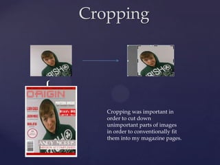
Cropping was important in
order to cut down
unimportant parts of images
in order to conventionally fit
them into my magazine pages.
2. Artistic Effects
Artistic effects allowed me to edit the appearance of
photos to make them more conventional to the house
style of my magazine. This would make them more
appealing to the target audience who would view the
magazine as a more professional product.
3. Fonts
Font websites like “Dafont”
and “Fontspace” were used to
include a range of different
fonts within my magazine to
promote different bands and
articles etc.