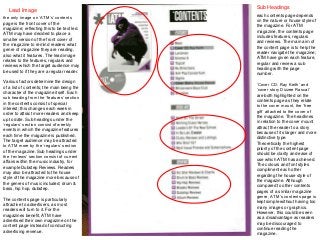
1. Lead Image
the only image on ‘ATM’s’ contents
page is the front cover of the
magazine; reflecting this to be text led.
ATM may have decided to place a
smaller version of the front cover of
the magazine to remind readers what
genre of magazine they are reading,
also what it features. The lead image
relates to the features, regulars and
reviews which the target audience may
be used to if they are a regular reader.
Various factors determine the design
of a list of contents; the main being the
character of the magazine itself. Each
sub heading from the ‘features’ section
in the contents consist of special
interest; this changes each week in
order to attract more readers and keep
up to date. Sub headings under the
‘regulars’ section consist of weekly
events in which the magazine features
each time the magazine is published.
The target audience may be attracted
to ATM more by the ‘regulars’ section
of the magazine. Sub headings under
the ‘reviews’ section consist of current
affairs within the music industry, for
example Dubstep Reviews. Readers
may also be attracted to the house
style of the magazine more because of
the genres of music included; drum &
bass, hip hop, dubstep.
The contents page is particularly
attractive to advertisers, as most
readers will turn to it. For the
magazines benefit, ATM have
advertised their own magazine on the
content page instead of conducting
advertising revenue.
Sub Headings
each contents page depends
on the nature or house style of
the magazine. For ATM
magazine, the contents page
includes features, regulars
and reviews. The main aim of
the content page is to help the
reader navigate the magazine;
ATM have given each feature,
regular and review a sub
heading with the page
number.
‘Cover CD. Ray Keith’ and
‘cover story Dizzee Rascal’
are both highlighted on the
contents page as they relate
to the cover mount, the ‘free
gift’ attached to the cover of
the magazine. The headlines
in relation to the cover mount
attract the reader to a story
because of its larger and more
distinctive type.
Theoretically the highest
priority of the content page
should be clarity and ease of
use which ATM has achieved.
The colours and font styles
compliment each other
regarding the house style of
the magazine. Although
compared to other contents
pages of a similar magazine
genre, ATM’s contents page is
kept simple without having too
many images or graphics.
However, this could be seen
as a disadvantage as readers
may be discouraged to
continue reading the
magazine.