
Recomendados
Recomendados
Más contenido relacionado
Último
Último (20)
Destacado
Destacado (20)
Mobile Web: The Rise of Mobile Devices
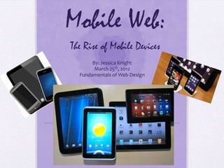
- 1. Mobile Web: The Rise of Mobile Devices By: Jessica Knight March 25th, 2012 Fundamentals of Web Design
- 3. Objectives To attract more customers. To add functionality to events and self-scheduling capabilities. Change how site links to menu options.
- 5. Mobile & Tablet Growth One out of four cell phone users Half of all searches are completed are using Smartphones. on a mobile device.
- 6. 4 Ways Mobile Sites Are Different from Desktop Sites ① Simpler and More Prioritized Content. ② Very Few Hyperlinks, Footers and Graphics. ③ Site Integration with GPS and Phone Numbers. ④ Vertical Navigation as shown in the next slide.
- 7. Example of Vertical Navigation
- 8. Technologies to make websites accessible on all devices
- 11. Not So Good Mobile Websites
- 13. Recommendations for Collins Catering and Events Create a mobile website. Using HTML5 and CSS, make the menu a vertical navigation menu with the menu item, then a pullout vertical navigation with additional information, such as pricing. Add a calendar, where people can schedule their own events and be contacted by a representative to discuss details. Possible addition of a blog, possibly discussing of weekly events and follow-up posts, which can also double as testimonials. Update monthly for pricing, add photos of events to gallery.
- 14. In Conclusion… Mobile is the new way. It’s the wave of the future. Don’t you wish you would’ve been one of those first companies to have a website when the Internet first came about? You can be on the cutting edge with a mobile site. Without one, your customers will find your competitors.
- 15. References Singer, Dirk, A Chart showing How the World is Going Mobile, published Dec. 6, 2010, located March 25, 2012 at: http://liesdamnedliesstatistics.com/2010/12/a-chart-showing-how-the- world-is-going-mobile.html Ma, Shanshan, 10 Ways Mobile Sites Are Different from Desktop Web Sites, published March 21, 2011, located March 25, 2012 at: http://www.uxmatters.com/mt/archives/2011/03/10-ways-mobile- sites-are-different-from-desktop-web-sites.php All images were located using Google on March 25, 2012 at : www.google.com
Notas del editor
- Collins Catering and Events is an Orlando, Florida catering company. They have catered events such as Champs Sports Bowl, the Capital One Bowl, the Children's Miracle Network Classic at Walt Disney World, the 1999 - 2009 WDW Marathon Weekend, the Orlando Magic, University of Central Florida, and many, many more, according to their website. They are also listed as the preferred caterers list for several facilities including the Harry P. Leu Gardens, Paradise Cove at Buena Vista Water Sports, Titanic -- The Experience, and many other beautiful and unique venues. In 2010 Collins Catering & Events became the exclusive caterer for the NEW Skyline Club on the Club Suite Level at the Citrus Bowl.
- Collins Catering and Events has three main objectives. (Read list.) We think the best way to accomplish these goals is by going mobile.
- The growth and forecasted future of mobile data usage worldwide is shown here. Using this information, it has been predicted that mobile devices will overtake traditional computers as a means to access the Internet by 2014.
- Mobile usage has sky-rocketed, with one out of four mobile users using Smartphones and half of all searches being done on a mobile device.
- Content prioritization refers to mobile sites general inclination to give priority to only the most crucial and time-and location-specific features. This essentially means people using a mobile device are really only looking to skip all the fluff and still view an eye-catching site. In true Dragnet fashion, “Just the facts, ma’am.” Vertical navigation replaces horizontal in nearly 90% of all mobile website. After thorough research, it seems that neither is a “better” choice; they both have pros and cons. Ultimately, it is the decision of the designer and site owner as to which is preferred. Hyperlinks, often used as a signature component of the Internet and the Web, are scarce on mobile sites. Mobile sites also show a minimal form of a footer, not using footers containing quick links. Mobile sites generally avoid using promotional and marketing graphics and use minimal graphics for navigation.Mobile sites offer better integration with phone functionsand present marketing opportunities, such as expeditingdirect orders by phone or sending promotional text messages.
- Verticalnavigation is seen all over the place, on every kind of website. Itis one of the most versatile patterns and able to view long lists of links. This can be accomplished by a simple sidebar menu or by a pull down, pop out type menu.
- HTML 5 and CSS3 helps a website to be viewable across many platforms. Mobify is a popular service for creating a mobile-optimized version of a website.
- For a moment, we now will explore the visual differences between mobile and standard websites. There is a vast difference between a mobile website and a standard website viewed on a mobile device.
- Notice, the mobile sites for 1-800-Flowers and ABC family are optimized for mobile. They offer vertical navigation, no hyperlinks, and limited graphics.
- As you can see, some mobile websites are not as good as others. They feature problems with too much text, too many hyperlinks, and un-useable content.
- As this chart shows, the great majority of people simply abandon a non-functioning mobile website in favor of viewing it on a traditional desktop computer, while others use it to finish their task, but don’t return to it. Still, others will simply skip a bad site and find a better one right then and there.