

Recomendados
Más contenido relacionado
La actualidad más candente
La actualidad más candente (20)
Destacado
Similar a Album posters
Similar a Album posters (20)
Más de Jodene Chisholm
Más de Jodene Chisholm (20)
Album posters
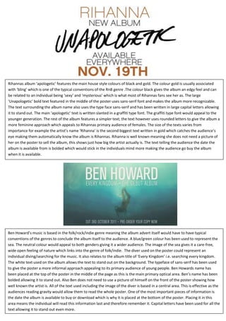
- 1. Rihannas album ‘apologetic’ features the main house style colours of black and gold. The colour gold is usually associated with ‘bling’ which is one of the typical conventions of the RnB genre .The colour black gives the album an edgy feel and can be related to an individual being ‘sexy’ and ‘mysterious’ which is what most of Rihannas fans see her as. The large ‘Unapologetic’ bold text featured in the middle of the poster uses sans-serif font and makes the album more recognizable. The text surrounding the album name also uses the type face sans-serif and has been written in large capital letters allowing it to stand out. The main ‘apologetic’ text is written slanted in a graffiti type font. The graffiti type font would appeal to the younger generation. The rest of the album features a simpler text; the text however uses rounded letters to give the album a more feminine approach which appeals to Rihannas primary audience of females. The size of the texts varies from importance for example the artist’s name ‘Rihanna’ is the second biggest text written in gold which catches the audience’s eye making them automatically know the album is Rihannas. Rihanna is well known meaning she does not need a picture of her on the poster to sell the album, this shows just how big the artist actually is. The text telling the audience the date the album is available from is bolded which would stick in the individuals mind more making the audience go buy the album when it is available. Ben Howard’s music is based in the folk/rock/indie genre meaning the album advert itself would have to have typical conventions of the genres to conclude the album itself to the audience. A blue/green colour has been used to represent the sea. The neutral colour would appeal to both genders giving it a wider audience. The image of the sea gives it a care-free, wide open feeling of nature which links into the genre of folk/indie. The diver used on the poster could represent an individual diving/searching for the music. It also relates to the album title of ‘Every Kingdom’ i.e. searching every kingdom. The white text used on the album allows the text to stand out on the background. The typeface of sans-serif has been used to give the poster a more informal approach appealing to its primary audience of young people. Ben Howards name has been placed at the top of the poster in the middle of the page as this is the main primary optical area. Ben’s name has been bolded allowing it to stand out. Also Ben does not need to use a picture of himself on the front of the poster showing how well known the artist is. All of the text used including the image of the diver is based in a central area. This is effective as the audiences reading gravity would allow them to read the whole poster. One of the most important pieces of information is the date the album is available to buy or download which is why it is placed at the bottom of the poster. Placing it in this area means the individual will read this information last and therefore remember it. Capital letters have been used for all the text allowing it to stand out even more.
- 2. Jesse J’s music is based in the pop and RnB genre. Her poster and album cover have been created using typical conventions from this genre to appeal to audiences. The image used on the front of this poster is the same as Jesse J’s album cover which makes it more recognizable. The house style colours used are black gold and white. Black is seen as a ‘sexy’ colour and can seem mysterious. The colour black used on the poster could relate to the songs on the album being serious issues. Jesse J uses direct address to capture the audience’s attention. The open mouth pose makes this the first thing the audience would look at. Black lipstick has been used on her lips with a hint of gold. This allows the lips to stand out from her pale complexion. The hint of gold feature on top of her black lips accompanies the house style. The gold colour is associated with the RnB genre through the use of typical conventions such as ‘bling’. The typeface ‘Jesse J’ is serif giving it a formal feel. This gives the album a rich look linking into the RnB genre. The font used for the album title ‘Who You Are’ looks as though it has been hand written and ‘Jesse J’ in a fun, fancy font which would appeal to the younger generation. Jesse J is a well-known artist and has been placed on the front of the poster to bring in more of an audience and allow the poster to be more recognizable. The black background which features information about the album and Jesse herself allows the white and yellow text to stand out. The more recognizable songs such as ‘who you are’ and ‘price tag’ have been placed upon the black background using n a larger font to entice the audience. Interestingly there is no date stating when the album will be out making this an unconventional music poster.