Worlds exclusive interview of My Chemical Romance
•Descargar como DOCX, PDF•
0 recomendaciones•379 vistas

The double page spread uses black as the main background color, with red used to draw the eye. Images of My Chemical Romance capture the reader's attention for the world exclusive interview. Short snippets preview the band's new tracks in a white column. The informal text and sans serif font create an engaging article for Kerrang's audience.

Recomendados
Más contenido relacionado
La actualidad más candente
La actualidad más candente (20)
Destacado
Destacado (20)
Similar a Worlds exclusive interview of My Chemical Romance
Similar a Worlds exclusive interview of My Chemical Romance (20)
Más de Jodene Chisholm
Más de Jodene Chisholm (20)
Último
Último (20)
Worlds exclusive interview of My Chemical Romance
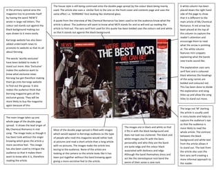
- 1. The house style is still being continued onto the double page spread by the colour black being mainly A white column has been In the primary optical area the used. The article also uses a similar font to the one on the front cover and contents page and uses the placed down the right hand magazine trys to promote itself same effect i.e. ‘KERRANG’ font looking like shattered glass. side of the page to show by having the word ‘NEW’S’ that it is different to the wrote in large red letters. The A quote from the interview of My Chemical Romance has been used to let the audience know what the main article of My Chemical colour red stands out against the article is about. The audience will want to know what MCR stands for and so will end up reading the Romance. A red arrow has black background making our article to find out. The sans serif font used for this quote has been bolded uses the colours red and white been placed at the top of eyes drawn to it more easily. so that it stands out against the black background. this column to capture the reader’s attention and Kerrangs website has also been encourage them to read added underneath news to what the arrow is pointing promote its website so that its all at. The white column about Kerrang. features mini snippets explaining what the bands The words ‘worlds exclusive’ new tracks sound like. have been bolded to make it stand out more. Also ‘Exclusive’ The explanation uses sans makes the audience want to serif font and is coloured know what exclusive news black whereas the headings Kerrang has got therefore making of the song names are them go onto Kerrangs website bolded and coloured red. to find out the gossip. It also This has been done to divide makes the audience think that the explanation and song Kerrang magazine gets all the titles up and allow the song exclusive gossip. They will be titles to stand out more. more likely to buy the magazine again because of this. The large red ‘M’ starting the article is usually used The main image takes up one in story books and helps to whole page of the double page capture the audience’s eye spread. It shows the lead singer of so that the audience is The images are in black and white so that more likely to read the My Chemical Romance in mid Most of the double page spread is filled with images it fits in with the black background and whole article. The contrast song. The image looks as though it which would appeal to Kerrangs audience as the type does not look too cluttered. The black and between the black has been took without the singer of people who read this magazine would rather look white images also fit with the bans background and white text knowing which gives the article a at pictures and read a short article than a long article personality and who they are the band from the article allows it more secretive feel. This image with no pictures. The images make the article less are quite edgy and the colour black to stand out. The text from has also been used to intrigue the boring to the audience. None of the artists are associated with darkness and edge. the article also uses the audience so that it makes them looking at the camera so the article looks like it has Although the band themselves dress and font sans serif creating a want to know who it is, therefore been put together without the band knowing again act like the stereotypical rock band the more informal approach to reading the article. giving a more secretive feel to the article. genre of their songs is pop rock. the reader.