
Recomendados
Más contenido relacionado
La actualidad más candente
La actualidad más candente (18)
Destacado
Similar a Evaluation q1
Similar a Evaluation q1 (20)
Más de Joey Gamble
Evaluation q1
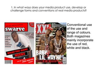
- 1. 1. In what ways does your media product use, develop or challenge forms and conventions of real media products? Conventional use of the use and range of colours. Both magazines mainly incorporate the use of red, white and black.
- 2. Conventional logo, located at the top left of the front cover. Both logos are white rounded fonts which are placed on a red background, boxed off. Both use mid shots of their main artists. My particular image is unconventional as the artist is not showing of his vast wealth or a body riddled with tattoos.
- 3. Masthead I’d say my masthead is rather conventional as I tried to emulate the ‘XXL’ logo, although I did add my own creativity. The colour is an important factor as it could attract or repel consumers so I chose the red and white in order to create an attraction
- 4. Cover lines Common to most magazines, the cover lines never touches the main image and I have followed this convention Only the main cover line can be seen to touch the main image The main cover line and the following cover lines differ in their fonts. My magazine uses this trend
- 5. Puff ‘DO IT WITH STYLE’ The particular puff I have chosen. Puff’s are a conventional magazine technique which is employed, whereby a magazine brags about its feats. Including a puff is the right choice, as the competition between magazines grow a puff creates individuality.