SlideShare una empresa de Scribd logo
1 de 3
Josh Robinson
Colour scheme
The main colour scheme used on this album is black and white to
give the impression that it is from a newspaper as can be told by
the headline on the disc, she has appeared in a lot of newspapers
following her incident with Chris Brown. The image of her sat down
has bright colours which matches her music style of pop, and also
creates a juxtaposition between the front of the album and the
back.
Position of images
A medium close up image of her has been
used on the cover of the album, this creates
symmetry. In the colour image she has been
placed towards the right to show her
surroundings giving the impression what her
genre of music will be in this album.
Photography lighting
The overall lighting of all the
images are bright and
stereotypical, her face, legs etc.
Have been made the dominant
contrast to assist the rule of
thirds in making the areas of
her body that are commonly
considered attractive the first
thing the consumers look at.
Position of text
The album title ‘Talk the Talk’ has
been placed at the bottom of the
album as it is Rihanna herself that
will be selling the album, her logo
placed in the top left is iconic and is
well known as her symbol. On the
disc the word Rihanna has been
made bold because she is the main
selling point of the album.
Guttenberg principle
In the primary optical area Rihanna’s logo has been
placed there because it is a well known symbol for
her, consumers would know that this album is by
Rihanna before looking at the images, the dead
zones are black as they would not usually be looked
at. On the image that is used on the back of the
album the scenery has been placed in the primary
optical area to show what genre of music she will
be singing in this album.
Rule of thirds
On the cover of this digipak Rihanna eyes are on the
intersecting lines, making them the dominant contrast
of the image. Her face and legs have been placed on the
crossed lines on the image used back of the digipak; this
has been done once again to make them the first area
to be viewed by consumers, as she is well known for her
eyes and legs.
Typography design
The typography design is not that
appealing in this album as the images
take up most of the covers, the text
on the disc has been used to create a
sense that it is from a newspaper, as
it follows the stereotypical bold, black
font. Unlike most music albums there
is no song list on the back of the
album.
Josh Robinson
Colour scheme
The colour scheme is very light, with the text being made black to
create a contrast, making it stand out. The colours on his clothing
make him stand out from the background, and also the colour scheme
overall matches the genre pop. This creates audience familiarity and
also attracts other people to his album as from the colours and
contrasts etc. it is very clearly following the pop genre.
Position of images
The only image used on this album is on the
front cover, he has been placed in the centre
in a rather symmetrical pose. This along with
the medium shot makes this album cover
very stereotypical as most albums follow this
style.
Photography lighting
The entire image uses high key
lighting with the main focus on
his face making him the
dominant contrast of the
album.
Position of text
Text appears all across this
album with the words ‘Right
Place Right Time’ making up
the background and title of the
album. The black text has been
placed on intersecting lines and
optical areas to make them
stand out.
Guttenberg principle – The Guttenberg design
principle has been applied very affectively on this
album cover. His logo and title of the album appear in
the primary optical areas, along with the song list and
barcode. The information that usually isn’t looked at
is placed in the dead zones; this includes the record
label information and the copyright information. This
is common across most album covers thus attracting
to the audience.
Rule of thirds
Olly Murs’ logo and name of the album have been
placed on the intersecting lines making them the first
area that the consumers look at, the list of songs on
the back of the album are also placed along the lines,
which works well with the black on blue background
creating a contrast in colours.
Typography design
There are a variety of different fonts
and styles that appear across this
album, all of them following the typical
pop font, most of them share a
handwritten style to create the sense
that Olly Murs has written on the
album himself, attracting to the
audience.
Josh Robinson
Colour scheme – The colour scheme used across this digipak is black and
white, along with gold font. The gold symbolises power and wealth, and
because of the background colour, the gold font contrasts with the
background. These colours with the use of the Justin Timberlake wearing
a suit, tells the audience that this album is trying to go for a more old
fashioned approach.
Position of images – Unlike most album covers, the artists face has been covered by another object
leaving only the mouth to be seen. This has been used not only go along with the name of the album as
the machine he is using is an eye checker, but to add to the old fashioned theme of the entire album.
The machine appears on the back and front, showing the audience that this is going to be a common
theme in the songs. The disc has been made to look like a record, creating nostalgia and thus using
audience familiarity.
Photography lighting – The
high key lighting has been
placed on the machine
making it the dominant
contrast of both sides of the
album. When analysing this
album it is clear that they
have tried a variety of
different techniques to make
the eye checker stand out
over the rest of the images
and text.
Position of text – The text has been
placed on the conventional area of
the album. The colour and size of the
text makes it the dominant contrast
of the cover. This is slightly different
on the back of the album, as despite
it the text sharing the same gold
colour, it has been placed in a small
font at the bottom which creates the
sense that the image is more
important than the song list.
Guttenberg principle –
This album similar to most
albums uses the
conventional design for
the Guttenberg design
principle, with the image
being in the primary
optical areas and the
record label information
being in the dead zone,
this creates audience
familiarity.
Rule of thirds – On both sides of
the album, the lines cross on top
of the machine, specifically the
eye area, attracting the
audience to the machine.
On the front cover his logo also
covers the intersecting lines so
the audience know that the
album is by Justin Timberlake as
that is unknown by the image,
as his face cannot be seen.
Typography design - The font
used is Sans Serif which is
common with the Pop/R’n’B
genre, this style of font goes
against the images and overall
style of the album, as you would
expect a serif font for an old
fashioned album, whereas the
use of a sans serif font gives the
album a very modern feel to
attract to different audiences.

Más contenido relacionado

La actualidad más candente

Electronic Rock Album Covers
Electronic Rock Album CoversElectronic Rock Album Covers
Electronic Rock Album CoversKateBracher
 
Digipack Presentation
Digipack PresentationDigipack Presentation
Digipack PresentationJade_16
 
Album Cover - Research
Album Cover - ResearchAlbum Cover - Research
Album Cover - ResearchxMandymoo
 
Album cover’s codes and conventions
Album cover’s codes and conventionsAlbum cover’s codes and conventions
Album cover’s codes and conventionsMartinMedia123
 
Media cd cover gcse coursework 14s copy
Media cd cover gcse coursework 14s copyMedia cd cover gcse coursework 14s copy
Media cd cover gcse coursework 14s copyKassemB98
 
Cd album cover analysis
Cd album cover analysisCd album cover analysis
Cd album cover analysis07wilsk
 
DIGIPAK ANALYSIS
DIGIPAK ANALYSIS DIGIPAK ANALYSIS
DIGIPAK ANALYSIS rmackrory10
 
Student ancillary task convention analysis 2
Student ancillary task convention analysis 2Student ancillary task convention analysis 2
Student ancillary task convention analysis 2Skyward9
 
Album cover analysis
Album cover analysisAlbum cover analysis
Album cover analysisjulianna321
 
Album covers Analysis
Album covers AnalysisAlbum covers Analysis
Album covers AnalysisJordan
 
Analysis of magazine advert
Analysis of magazine advertAnalysis of magazine advert
Analysis of magazine advertMediaEdWright
 
Genre specific digipack analysis
Genre specific digipack analysisGenre specific digipack analysis
Genre specific digipack analysisjparker98
 
Conventions of pop rock album covers
Conventions of pop rock album coversConventions of pop rock album covers
Conventions of pop rock album coversLindsay Brophy
 
Final ancillary pieces
Final ancillary piecesFinal ancillary pieces
Final ancillary piecesjparker98
 
Album cover analysis
Album cover analysisAlbum cover analysis
Album cover analysisKristyWright
 
Album cd cover analysis
Album cd cover analysisAlbum cd cover analysis
Album cd cover analysisAzakria
 
Existing digipaks
Existing digipaksExisting digipaks
Existing digipaksAlveenus
 

La actualidad más candente (20)

Electronic Rock Album Covers
Electronic Rock Album CoversElectronic Rock Album Covers
Electronic Rock Album Covers
 
Digipack Presentation
Digipack PresentationDigipack Presentation
Digipack Presentation
 
Analysing cd cover
Analysing cd coverAnalysing cd cover
Analysing cd cover
 
Album Cover - Research
Album Cover - ResearchAlbum Cover - Research
Album Cover - Research
 
Album cover’s codes and conventions
Album cover’s codes and conventionsAlbum cover’s codes and conventions
Album cover’s codes and conventions
 
Media cd cover gcse coursework 14s copy
Media cd cover gcse coursework 14s copyMedia cd cover gcse coursework 14s copy
Media cd cover gcse coursework 14s copy
 
Cd album cover analysis
Cd album cover analysisCd album cover analysis
Cd album cover analysis
 
Digipak analysis
Digipak analysisDigipak analysis
Digipak analysis
 
DIGIPAK ANALYSIS
DIGIPAK ANALYSIS DIGIPAK ANALYSIS
DIGIPAK ANALYSIS
 
Student ancillary task convention analysis 2
Student ancillary task convention analysis 2Student ancillary task convention analysis 2
Student ancillary task convention analysis 2
 
Album cover analysis
Album cover analysisAlbum cover analysis
Album cover analysis
 
Album covers Analysis
Album covers AnalysisAlbum covers Analysis
Album covers Analysis
 
Analysis of magazine advert
Analysis of magazine advertAnalysis of magazine advert
Analysis of magazine advert
 
Genre specific digipack analysis
Genre specific digipack analysisGenre specific digipack analysis
Genre specific digipack analysis
 
Conventions of pop rock album covers
Conventions of pop rock album coversConventions of pop rock album covers
Conventions of pop rock album covers
 
Final ancillary pieces
Final ancillary piecesFinal ancillary pieces
Final ancillary pieces
 
Digipak analysis
Digipak analysisDigipak analysis
Digipak analysis
 
Album cover analysis
Album cover analysisAlbum cover analysis
Album cover analysis
 
Album cd cover analysis
Album cd cover analysisAlbum cd cover analysis
Album cd cover analysis
 
Existing digipaks
Existing digipaksExisting digipaks
Existing digipaks
 

Similar a Music Digipak Research

Digipack analysis 3
Digipack analysis 3Digipack analysis 3
Digipack analysis 3baki123
 
Album posters research
Album posters researchAlbum posters research
Album posters researchJoshRobinson12
 
Cd Covers Analysis
Cd Covers AnalysisCd Covers Analysis
Cd Covers AnalysisWaleedbutt5
 
Case studies
Case studiesCase studies
Case studiesMuminaa
 
Digipak analysis google docs
Digipak analysis   google docsDigipak analysis   google docs
Digipak analysis google docsBiancaCozma1
 
Tanya's Digipak
Tanya's DigipakTanya's Digipak
Tanya's Digipakwhegg
 
Case studies for print products
Case studies for print productsCase studies for print products
Case studies for print productsebonysmcleod
 
Digipak Analyses
Digipak AnalysesDigipak Analyses
Digipak AnalysesLornaaaa
 
Digipak and Release Poster Analysis
Digipak and Release Poster Analysis Digipak and Release Poster Analysis
Digipak and Release Poster Analysis Ayushi Rawal
 
Generic Conventions of Pop Digipaks
Generic Conventions of Pop DigipaksGeneric Conventions of Pop Digipaks
Generic Conventions of Pop DigipaksSam Benzie
 
Digipak and contents analysis As Media coursework
Digipak and contents analysis As Media courseworkDigipak and contents analysis As Media coursework
Digipak and contents analysis As Media courseworkelliotballasmedia
 
Brandon - ATR
Brandon - ATRBrandon - ATR
Brandon - ATRB H
 
Ancillary Research Task - Analysis of Advertisements and Digipaks
Ancillary Research Task - Analysis of Advertisements and DigipaksAncillary Research Task - Analysis of Advertisements and Digipaks
Ancillary Research Task - Analysis of Advertisements and DigipaksJerard Ocitti
 
Digipak Analysis
Digipak AnalysisDigipak Analysis
Digipak Analysissara ali
 

Similar a Music Digipak Research (20)

Album Poster Analysis
Album Poster AnalysisAlbum Poster Analysis
Album Poster Analysis
 
Digipack analysis 3
Digipack analysis 3Digipack analysis 3
Digipack analysis 3
 
Album posters research
Album posters researchAlbum posters research
Album posters research
 
Cd Covers Analysis
Cd Covers AnalysisCd Covers Analysis
Cd Covers Analysis
 
Case studies
Case studiesCase studies
Case studies
 
Digipak analysis google docs
Digipak analysis   google docsDigipak analysis   google docs
Digipak analysis google docs
 
Tanya's Digipak
Tanya's DigipakTanya's Digipak
Tanya's Digipak
 
Anclilary products
Anclilary products Anclilary products
Anclilary products
 
Case studies for print products
Case studies for print productsCase studies for print products
Case studies for print products
 
Cd Booklet Research
Cd Booklet ResearchCd Booklet Research
Cd Booklet Research
 
Digipak Analyses
Digipak AnalysesDigipak Analyses
Digipak Analyses
 
Digipak and Release Poster Analysis
Digipak and Release Poster Analysis Digipak and Release Poster Analysis
Digipak and Release Poster Analysis
 
Digipak
Digipak Digipak
Digipak
 
Analysis on existing album releases
Analysis on existing album releasesAnalysis on existing album releases
Analysis on existing album releases
 
Generic Conventions of Pop Digipaks
Generic Conventions of Pop DigipaksGeneric Conventions of Pop Digipaks
Generic Conventions of Pop Digipaks
 
Digipak and contents analysis As Media coursework
Digipak and contents analysis As Media courseworkDigipak and contents analysis As Media coursework
Digipak and contents analysis As Media coursework
 
Brandon - ATR
Brandon - ATRBrandon - ATR
Brandon - ATR
 
Ancillary Research Task - Analysis of Advertisements and Digipaks
Ancillary Research Task - Analysis of Advertisements and DigipaksAncillary Research Task - Analysis of Advertisements and Digipaks
Ancillary Research Task - Analysis of Advertisements and Digipaks
 
Digipak Analysis
Digipak AnalysisDigipak Analysis
Digipak Analysis
 
Cd booklet research
Cd booklet researchCd booklet research
Cd booklet research
 

Más de JoshRobinson12

Question 1 Evaluation
Question 1 Evaluation Question 1 Evaluation
Question 1 Evaluation JoshRobinson12
 
Question 2 Evaluation
Question 2 Evaluation Question 2 Evaluation
Question 2 Evaluation JoshRobinson12
 
Question 1 Evaluation
Question 1 Evaluation Question 1 Evaluation
Question 1 Evaluation JoshRobinson12
 
A2 advanced portfolio_production_diary Josh Robinson
A2 advanced portfolio_production_diary Josh RobinsonA2 advanced portfolio_production_diary Josh Robinson
A2 advanced portfolio_production_diary Josh RobinsonJoshRobinson12
 
Music video script template a2 media adv portfolio
Music video script template a2 media adv portfolioMusic video script template a2 media adv portfolio
Music video script template a2 media adv portfolioJoshRobinson12
 
Music video script template a2 media adv portfolio1
Music video script template a2 media adv portfolio1Music video script template a2 media adv portfolio1
Music video script template a2 media adv portfolio1JoshRobinson12
 
Music video report121312
Music video report121312Music video report121312
Music video report121312JoshRobinson12
 
Music video analysis 3 version
Music video analysis 3 versionMusic video analysis 3 version
Music video analysis 3 versionJoshRobinson12
 
Music video analysis 2 version 2
Music video analysis 2 version 2Music video analysis 2 version 2
Music video analysis 2 version 2JoshRobinson12
 
Music video analysis 1 new version
Music video analysis 1 new versionMusic video analysis 1 new version
Music video analysis 1 new versionJoshRobinson12
 
Music Video Analysis 1
Music Video Analysis 1Music Video Analysis 1
Music Video Analysis 1JoshRobinson12
 

Más de JoshRobinson12 (16)

Evaluation Q4
Evaluation Q4Evaluation Q4
Evaluation Q4
 
Evaluation Question 4
Evaluation Question 4Evaluation Question 4
Evaluation Question 4
 
Question 1 Evaluation
Question 1 Evaluation Question 1 Evaluation
Question 1 Evaluation
 
Evaluation Question 4
Evaluation Question 4Evaluation Question 4
Evaluation Question 4
 
Evaluation complete 4
Evaluation complete 4Evaluation complete 4
Evaluation complete 4
 
Question 2 Evaluation
Question 2 Evaluation Question 2 Evaluation
Question 2 Evaluation
 
Question 1 Evaluation
Question 1 Evaluation Question 1 Evaluation
Question 1 Evaluation
 
A2 advanced portfolio_production_diary Josh Robinson
A2 advanced portfolio_production_diary Josh RobinsonA2 advanced portfolio_production_diary Josh Robinson
A2 advanced portfolio_production_diary Josh Robinson
 
Music video script template a2 media adv portfolio
Music video script template a2 media adv portfolioMusic video script template a2 media adv portfolio
Music video script template a2 media adv portfolio
 
Music video script template a2 media adv portfolio1
Music video script template a2 media adv portfolio1Music video script template a2 media adv portfolio1
Music video script template a2 media adv portfolio1
 
Music video report121312
Music video report121312Music video report121312
Music video report121312
 
Survey analysis
Survey analysisSurvey analysis
Survey analysis
 
Music video analysis 3 version
Music video analysis 3 versionMusic video analysis 3 version
Music video analysis 3 version
 
Music video analysis 2 version 2
Music video analysis 2 version 2Music video analysis 2 version 2
Music video analysis 2 version 2
 
Music video analysis 1 new version
Music video analysis 1 new versionMusic video analysis 1 new version
Music video analysis 1 new version
 
Music Video Analysis 1
Music Video Analysis 1Music Video Analysis 1
Music Video Analysis 1
 

Music Digipak Research

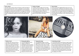
  • 1. Josh Robinson Colour scheme The main colour scheme used on this album is black and white to give the impression that it is from a newspaper as can be told by the headline on the disc, she has appeared in a lot of newspapers following her incident with Chris Brown. The image of her sat down has bright colours which matches her music style of pop, and also creates a juxtaposition between the front of the album and the back. Position of images A medium close up image of her has been used on the cover of the album, this creates symmetry. In the colour image she has been placed towards the right to show her surroundings giving the impression what her genre of music will be in this album. Photography lighting The overall lighting of all the images are bright and stereotypical, her face, legs etc. Have been made the dominant contrast to assist the rule of thirds in making the areas of her body that are commonly considered attractive the first thing the consumers look at. Position of text The album title ‘Talk the Talk’ has been placed at the bottom of the album as it is Rihanna herself that will be selling the album, her logo placed in the top left is iconic and is well known as her symbol. On the disc the word Rihanna has been made bold because she is the main selling point of the album. Guttenberg principle In the primary optical area Rihanna’s logo has been placed there because it is a well known symbol for her, consumers would know that this album is by Rihanna before looking at the images, the dead zones are black as they would not usually be looked at. On the image that is used on the back of the album the scenery has been placed in the primary optical area to show what genre of music she will be singing in this album. Rule of thirds On the cover of this digipak Rihanna eyes are on the intersecting lines, making them the dominant contrast of the image. Her face and legs have been placed on the crossed lines on the image used back of the digipak; this has been done once again to make them the first area to be viewed by consumers, as she is well known for her eyes and legs. Typography design The typography design is not that appealing in this album as the images take up most of the covers, the text on the disc has been used to create a sense that it is from a newspaper, as it follows the stereotypical bold, black font. Unlike most music albums there is no song list on the back of the album.
  • 2. Josh Robinson Colour scheme The colour scheme is very light, with the text being made black to create a contrast, making it stand out. The colours on his clothing make him stand out from the background, and also the colour scheme overall matches the genre pop. This creates audience familiarity and also attracts other people to his album as from the colours and contrasts etc. it is very clearly following the pop genre. Position of images The only image used on this album is on the front cover, he has been placed in the centre in a rather symmetrical pose. This along with the medium shot makes this album cover very stereotypical as most albums follow this style. Photography lighting The entire image uses high key lighting with the main focus on his face making him the dominant contrast of the album. Position of text Text appears all across this album with the words ‘Right Place Right Time’ making up the background and title of the album. The black text has been placed on intersecting lines and optical areas to make them stand out. Guttenberg principle – The Guttenberg design principle has been applied very affectively on this album cover. His logo and title of the album appear in the primary optical areas, along with the song list and barcode. The information that usually isn’t looked at is placed in the dead zones; this includes the record label information and the copyright information. This is common across most album covers thus attracting to the audience. Rule of thirds Olly Murs’ logo and name of the album have been placed on the intersecting lines making them the first area that the consumers look at, the list of songs on the back of the album are also placed along the lines, which works well with the black on blue background creating a contrast in colours. Typography design There are a variety of different fonts and styles that appear across this album, all of them following the typical pop font, most of them share a handwritten style to create the sense that Olly Murs has written on the album himself, attracting to the audience.
  • 3. Josh Robinson Colour scheme – The colour scheme used across this digipak is black and white, along with gold font. The gold symbolises power and wealth, and because of the background colour, the gold font contrasts with the background. These colours with the use of the Justin Timberlake wearing a suit, tells the audience that this album is trying to go for a more old fashioned approach. Position of images – Unlike most album covers, the artists face has been covered by another object leaving only the mouth to be seen. This has been used not only go along with the name of the album as the machine he is using is an eye checker, but to add to the old fashioned theme of the entire album. The machine appears on the back and front, showing the audience that this is going to be a common theme in the songs. The disc has been made to look like a record, creating nostalgia and thus using audience familiarity. Photography lighting – The high key lighting has been placed on the machine making it the dominant contrast of both sides of the album. When analysing this album it is clear that they have tried a variety of different techniques to make the eye checker stand out over the rest of the images and text. Position of text – The text has been placed on the conventional area of the album. The colour and size of the text makes it the dominant contrast of the cover. This is slightly different on the back of the album, as despite it the text sharing the same gold colour, it has been placed in a small font at the bottom which creates the sense that the image is more important than the song list. Guttenberg principle – This album similar to most albums uses the conventional design for the Guttenberg design principle, with the image being in the primary optical areas and the record label information being in the dead zone, this creates audience familiarity. Rule of thirds – On both sides of the album, the lines cross on top of the machine, specifically the eye area, attracting the audience to the machine. On the front cover his logo also covers the intersecting lines so the audience know that the album is by Justin Timberlake as that is unknown by the image, as his face cannot be seen. Typography design - The font used is Sans Serif which is common with the Pop/R’n’B genre, this style of font goes against the images and overall style of the album, as you would expect a serif font for an old fashioned album, whereas the use of a sans serif font gives the album a very modern feel to attract to different audiences.