Falcon Invoice Discounting: Unlock Your Business Potential
Brainstorming of ideas & Audience research
1. Music Mag
Ideas
Colour scheme.
Layout.
Title.
Fonts.
Cover artist.
Heading 1
Heading 2
Heading 3
Heading 4
Heading 5
Vu (pronounced view)
Chart
Tune
Shh!
Fix
•Needs to be something bright.
•Needs so have a plain basic background
colour.
•Colours must be in contrast with each
other.
•Cover artist must be
someone famous to attract
audience.
•Must be a music artist as
this is a music magazine.
•The more popular and well
known the cover artist is,
the more readers I will get.
•Title must be placed toward top of the
front cover so the audience can easily
identify the magazine.
•The dominant image used must be of a
close up composition photo centred on
the front cover.
•Anchorage must be place around the
image and not cover it.
•Price could be included on front page.
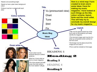
Here is a mind map I have
created to brain storm
some ideas I have for
making my music
magazine. I have looked at
such things as the title,
colour scheme, layout,
fonts and the cover artist.
This will help my to
conclude my overall design
for my music magazine.
2. VuVu
VuVu
VuVu
VuVu
VuVu
VuVu
VuVu
VuVu
After thinking of potential colour schemes and titles I decided to design some titles
using the fonts and colours I chose. I didn’t like the title in these designs as I think
it is too short and will not give the audience an insight as to the ‘style’ or type of the
magazine.
3. ChartChart
ChartChart
ChartChart
ChartChart
ChartChart
ChartChart
ChartChart
ChartChart
I did like these designs for my music magazine as I think ‘chart’ is a word
associated with music therefore is a suitable title for my music magazine. However
this is not a very unique title and many magazines have already used titles similar
to these in there magazine’s. Therefore I will not be choosing this design.
5. Shh!Shh!
Shh!Shh!
Shh!Shh!
Shh!Shh!
Shh!Shh!
Shh!Shh!
Shh!Shh!
Shh!Shh!
This title gives a mystery as to the type of magazine. This could encourage the
audience to read it or make them ignore it all together. This is because ‘Shh’
doesn’t give anything away as to the magazine type, which could be a bad point. I
don’t think I will consider using this in my design.
6. FixxFixx
FixxFixx
FixxFixx
FixxFixx
FixxFixx
FixxFixx
FixxFixx
FixxFixxI like this title the most as it is unique and doesn’t completely give away the magazine type. I have chosen
to use the font on the top row as it is an attractive font than is easy to read and understand. It is also bold,
making the title stand out amongst others. I am also considering to use the ‘Fixx’ title as I think this is a
unique title that hasn’t been used before. However I will first proceed with a questionnaire to see the views
of my target audience.
7. Once I had made a choice of
colour schemes and titles to
choose from, I then created a
questionnaire which I would ask
my target audience there views on
the magazines design, colour
scheme, title, price and possible
front cover artist etc. I will take the
answers into account as my
magazine must be appealing to
my target audience therefore it
must be designed how they would
want it. Here is the questionnaire
sheet I used and a tally of the
answers I collected.
The answers I collect I will use to
influence the design and content
included in my magazine. This is
to make it as appealing as
possible to my target audience.
Questionnaire.
For the design and price of a new music magazine
coming to the market soon, give us your views!
Q1. If you were to buy this magazine, how much would you expect to
pay?
A. 50p
8
B. £1.00
13
C.£1.50
5
D. £2.00+
4
Q2. What singer would you want to see on the front page?
A. Cheryl Cole
10
B. Beyonce
7
C.Alicia Keys
6
D. Lady Gaga
7
Audience
Research.
8. Q3. Which colour scheme would appeal to you the most?
A. Yellow, Purple & Navy blue
5
B. White, Black & Red
6
C.Black, Orange & Green
11
D. Black, Pink & Yellow
8
Audience Research Continued...
Q4. What genre of music would you prefer to read about?
A. Rock
4
B. Indie
5
C. R&B
7
D. Dance
6
E. Club
6
F. Other
. 2
Q5. What do you think is a suitable title for the
magazine?
A. Vu ( pronounced ‘view’ )
5
B. Chart
5
C. Tune
6
D. Shh!
3
E. Fixx
11
Q6. How many pages should the magazine have?
A. 0-50 pages
7
B. 51-80 pages
14
C. 81-100 pages
4
D. 101-130 pages
3
E. 131-150 pages
2
9. After choosing my font
and title for my magazine I
then needed to choose my
colour scheme. The colour
scheme must be important
as it is going to be used
throughout the magazine.
The colours must be
contrasting as to stand out
from each other and not
blend in. This is so the
audience find the
magazine attractive and
can read the magazine
(especially the front cover)
easily.
I like this colour scheme as the
yellow really stands out amongst
the navy blue and purple.
The orange and green really mix well in
this colour scheme and make the entire
front cover stand out. The black
background also makes the orange and
green look brighter and attractive.
This will be the colour scheme I will
choose as it is the most popular among
the questionnaire and also is the most
unique.
10. I really like this colour scheme as pink is my
favourite colour and the colours mix well together
and stand out. The black background also makes
the pink and yellow look very bright. However the
pink makes the magazine unintentionally aim itself at
the female audience. This is a bad point as I want
my magazine to be suitable for audiences of all ages
and both genders. Or at least as many audience
group as possible.
The colours used in this design are similar to that
of the ‘Q’ magazine which I researched in the
previous task. I think the colours stand out against
each other and give the design a stylish look. This
is a good design to attract my target audience,
however I want to create a unique magazine
therefore taking ideas from and existing magazine
is not a good method to use.