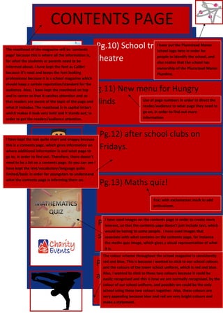
1. CONTENTS PAGE
Pg.10) School trip to globe
theatre
Pg.11) New menu for Hungry
Minds
Pg.12) after school clubs on
Fridays.
Pg.13) Maths quiz!
Pg.14) Charity events after
school
Pg.15) Outburst performances
after school
The masthead of the magazine will be ‘contents
page’ because this is where all the information is,
for what the students or parents need to be
informed about. I have kept the font as Calibri
because it’s neat and keeps the font looking
professional because it is a school magazine which
should keep a certain reputation/standard for the
audience. Also, I have kept the masthead on top
and in centre so that it catches attention and so
that readers are aware of the topic of the page and
what it includes. The masthead is in capital letters
which makes it look very bold and it stands out, in
order to get the readers/audience attention.
I have put the Plumstead Manor
School logo here in order for
people to identify the school, and
also realise that the school has
ownership of the Plumstead Manor
Plumline.
The colour scheme throughout the school magazine is consistently
red and blue. This is because I wanted to stick to our school colours
and the colours of the lower school uniform, which is red and blue.
Also, I wanted to stick to these two colours because it could be
easily recognised and this is how we are normally recognised, by the
colour of our school uniform, and possibly we could be the only
school using these two colours together. Also, these colours are
very appealing because blue and red are very bright colours and
make a statement.
I have kept the text quite short and snappy because
this is a contents page, which gives information on
where additional information is and what page to
go to, in order to find out. Therefore, there doesn’t
need to be a lot on a contents page. As you can see I
have kept the text/vocabulary/language quite
limited/basic in order for youngsters to understand
what the contents page is informing them on.
Text with exclamation mark to add
enthusiasm.
I have used images on the contents page in order to create more
interest, so that the contents page doesn’t just include text, which
would be boring to some people. I have used images that
associate with what contains on the contents page, for instance
the maths quiz image, which gives a visual representation of what
it is.
Use of page numbers in order to direct the
reader/audience to what page they need to
go on, in order to find out more
information.