
Recomendados
Más contenido relacionado
La actualidad más candente
La actualidad más candente (20)
Destacado
Similar a Centre Stage Poster Analysis
Similar a Centre Stage Poster Analysis (20)
Último
Último (20)
Centre Stage Poster Analysis
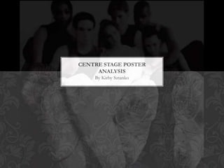
- 1. CENTRE STAGE POSTER ANALYSIS By Kirby Sztanko
- 2. The masthead and title of the film is displayed in the bottom center third of the poster. The typography of the masthead is in bold red font, and is very contrasting to the black and white picture. Although the image on the poster is the largest part, the audience will be equally as drawn to the bright bold font. The main protagonists’ names are all printed in the bottom third of the poster in small compacted font. It is readable to the audience however, the text does not stand out like the masthead does, due to it being so small and in grey font.
- 3. Above the text at the bottom of the poster is the tagline. The typography is grey in colour and in capital bold letters so again, stands out to the audience. It says ‘LIFE DOESN’T HOLD TRY OUTS’ which gives the audience an insight as to what the film is about and that dancing is a tough career with challenges. The term ‘try outs’ is specialist dance terminology which would get through to the target audience of dancers. They would understand what a try out is so it will appeal to them more as they would want to know the result. A try out is another word for an audition It is larger and more prominent than the other grey small text which implies that the tagline is more important. The grey font blends in well with the colour palette and house style of the poster; does not stand out too much, but enough for the audience to be drawn to it.
- 4. In this picture, it is very different to most dance posters. The actors and actresses faces, are not what the audience would first be drawn to. It would either be the bright red typography of the title or the dancers shoes. The characters faces are blurred and out of focus and their shoes are the part of the image that have ben focused. Dance shoes are conventional iconography that are associated with dance films so they have been placed on the poster to make it clear to the audience the genre of the film. You can see from the image that the shoes have been worn out and are scruffy. This connotes the idea that dancing is a tough career and very hard work; you have to train hard and long hours to get a shot. The colour scheme connotes an idea that the dance world is very ‘black and white,’ you either do well or you don’t. This coincides with the tagline.
- 5. The colour palette of the image is black and white which again is not commonly seen on dance film poster. We can see that the dancers are all using direct mode of address to make the audience feel as though they are being involved, even though their expressions and faces are out of focus. The main three actors have been placed in a ‘triangle’ centre position, to show that they are the main characters in the film; the others are gathered around them. Their positioning shows the audience that they all have a close relationship with each other and that they are all friends, due to the intensity and closeness of their positioning.
- 6. The mise en scene of the poster, looks as though it is in a dance studio. The surroundings are plain, to ensure that no attention is being drawn away from the image and the title. Although dance films are mostly set in a dance studio, not many commercial posters show the mise en scene in a dance studio. This is one of the only posters that is set in the studio. The target audience and age certification for Center Stage is a 12. There are some scenes in the film that would not be appropriate for younger viewers. The target audience would be both girls and boys who enjoy dancing, who are over the age of 12 or younger who are watching it with an adult. It could also appeal to a secondary audience who are fans of the protagonists and also the adults who will be watching it with the children.
- 7. At the bottom third of the poster, in small grey typography, there is a web address, where the audience can go onto to find out further information about the film. This is a good marketing technique, as on the website you would be able to buy this poster, for fans of the film and actors/actresses. The text in the bottom third also includes who directed, choreographed and put the film together etc. The logo of the film’s production company ‘Columbia Pictures’ is located in the right hand bottom corner as it is more recognisable to the audience and stands out more than text. If the audience have seen a film and enjoyed it from Columbia Pictures before, then they may be more inclined to want to watch this film.
- 8. On the website Fanpop, film posters are available to buy. There are many posters of Centre Stage on this website, including individual character posters. They tend to produce these if the protagonists have a large fan base and as use as collectibles.