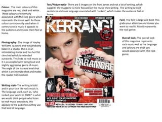
1. Text/Picture ratio- There are 5 images on the front cover and not a lot of writing, which
Colour- The main colours of this suggests the magazine is more focused on the music then writing. The writing is short
magazine are red, black and white . sentences and uses language associated with ‘rockers’, which makes the audience feel at
These colours are normally home.
associated with the rock genre which
represents the music well. As these Font- The font is large and bold. This
colours are normally used when it grabs your attention and makes you
comes to rock music it appeals to want to read it. Also it represents
the audience and makes them feel at the rock genre.
home.
Overall look- The overall look
Photography- The image of Hayley of this magazine represents
Williams is posed and was probably rock music well as the language
taken in a studio. She is in an and colours are what you
intimidating stance and has her fist would associate with the rock
clenched which is extended genre.
outwards. This links to rock music as
it is associated with being loud and
slightly aggressive genre of music.
The angle of the is a eye level shot
which is an intimate shot and makes
the reader feel involved.
Writing style- The writing is bold
and in your face like rock music is.
The language used, such as, ‘who
rocked your world in 2009?’ is what
we would think people who listen
to rock music would say, this
appeals to the audience as they use
that kind of language.
2. Colour- The main colours of this Text/picture Ratio- There is only one image on the front cover, this is of Daft Punk.
magazine are blue, black and This tells the audience that this issue is focused on Daft Punk and the dance genre is
white. These colours have been all about the music.
used as they are used in the
featuring bands logo, ‘Daft Punk’ Font- The font is large on the
This appeals to the audience as mast head and the font is large
they have seen this colours before for the name of the band, this
being associated with the band so tells us the magazine is focusing
makes them feel at home. Also the on Daft Punk. ‘Daft Punk’ is
fluorescent blue and white could written in a futuristic font
represent a night club as dance which represents their music
music is used in a night club so and the colours used are the
this also appeals to the audience. colours associated with dance
music and with Daft Punk,
Photography- The image used is
appealing to the audience.
from a Daft Punk video, and is a
two shot/mid shot of two
members from Daft Punk. The Overall Look- The overall look
use of the image from a video, of this magazine suggests to
makes the audience feel at home me that the target audience is
as they have seen the image males and females aged 16+
before. This image represents as a lot of teenagers are into
the band well as they are dance music and from the age
associated with electronic music, of 18 upwards people tend to
and the image looks quit e go out clubbing and enjoy this
electronic as they are wearing genre of music. It also
suits with fluorescent lighting represents dance music well
and it looks quite futuristic. as the colours are normally
associated with that genre of
Writing style- The language used music. The use of these
is brief and not a lot of detail. colours, images and language
The writing is focused on the let the readers know that this
return of Daft Punk. The use of the magazine is made for them.
word ‘Robots’ suggest that Daft
Punks music is robotic and
futuristic, appealing to the
audience as they might refer to
Daft Punk as the ‘Robots’ as well.
3. Colour- The main colour s used
on the text is pink, black and
white. These colours represent the Font- The font is bold,
genre of pop music. These colours ‘Rihanna’ and ‘The state
also appeal to the female of music today’ are in
audience. Also Rihanna has pink bold telling the audience
make up on which connects the the main focus of this
two well as it shows she is a pop issue are those two
artist. The colours appeal to the topics. The font is simple
audience as it is associated with and is the same font as
the pop genre,. the title of the magazine
Photography- The image is of ‘NME’ keeping in the
Rihanna a hip-hop/pop/dance theme of the magazine.
artist. It is a medium shot and
she is posed with a bit of attitude Overall Look- The
which represents the hip-hop use of the colour
genre as it is associated with scheme and the
attitude. Rihanna is looking photography
stylish and feminine which represents the
appeals to the female audience. genre of music
As she is a hip-hop artist, it is well and appeals
portrayed in her stance and outfit to both males and
as she is looking ‘hip’ female audiences.
Writing style- The length of
sentences are quite short and there
is a pull quote, the language used in Text/picture
the quote is quite strong and could ratio- There is
suggest she is passionate about her only one image
music and needs people to tell her used here and
if she is doing something wrong for not a lot of text.
her to be successful. It appeals to This tells the
the audience as they used that kind audience this
of language and hip-hop is known issue is focused
for having artist with attitude and on Rihanna.
know what they are doing in their
careers.
4. Writing style- The language
Colour- Like the front covers the used is slang such as, ‘tunes’ and
contents page uses fluorescent ‘tech’ These are probably words
colours, such as the yellow on the audience use, making them
the word ‘contents’ this could be feel at home and lets them know
a colour used in a night club that this magazine is aimed at
where a lot of dance music is them.
played. It appeals to the
audience as these colours are Text/Picture ratio- The
associated with dance music. images are the main focus on
this page as they are trying to
Photography- There are
sell you the magazine and
three images on the
draw you in. There is some
contents page, the first
text but not a lot and the
image is showing the
contents of the magazine are
fashion. This appeals to the
in brief, which makes you
audience as they follow a
want to buy the magazine
certain trend and this is
and read more.
advertising clothes they
want to wear. The second
Fonts- The fonts used are the
image is of either a night
same as the ones on the front
club or of a dance music gig.
page, keeping in the theme of
This appeals to the
the dance genre and appealing
audience as it shows
to the audience as they are
something they have
used to seeing that certain font;
experienced or want to
associating it with Mixmag.
experience. It shows how
exciting and colourful the
clubs are and it also reflects
the music to be exciting and
colourful. The last image is
of an artist, but it is a dark
image. I believe this image
has been used to represent
the night club atmosphere
as it is dark, but still looks
exciting.
5. Photography- There
are 5 images on this Text/Picture ratio- The text
contents page. There on the contents page is
are two images of a brief and has short
dance music gig or a sentences. It doesn't give a
‘rave’ This appeals to lot of detail away, which
audiences as they makes you want to
have probably been to read/buy the magazine.
a ‘rave’ and know how
much fun it is, these
images are used as Fonts- The font used on
advertisement to the words ‘raving mad’
tell/show people that and ‘music’ represent
these gigs are fun and the music. The font
anyone can go to used is bold, like dance
them. One of the music is and the same
images is of a music font has been used on
deck, this appeals to headings, which the
the audience as some reader is used to and
may be wanting to get what they would
in to the dance music associate it with
business and this magazine.
magazine provides
information on where Colour- The colours used
to get the latest ‘tech’ are bright blue and pink,
which are colour s normally
Writing style- The associated with dance/club
language is quite informal music. This appeals to the
which could represent the audience as it makes them
music, as it is quite laid feel at home.
back and fun. Also words
such as ‘raving’ and ‘tech’
make the audience feel at
home as that is the kind of The use of this language lets the
language they will use. readers know that this magazine is
made for them.
6. Colour- There isn't Writing style- There is a lot of
really a colour scheme pull quotes. Telling me there is a
which tells me there lot of articles inside this
isn’t really a specific magazine on artists talking about
genre of music to this their music. Also there are use of
magazine. The strong language tells me that
background is white and this magazine is aimed at males
the text is black making and females aged 16+ and the
it stand out. language is what the readers are
normally used to and probably
use them selves, appealing to
Photography- There them.
are six images on the
contents page. In Text/Picture ratio- There is a
these images we see bit more text than images
artists having fun and which suggest to me that the
posing in a fun sort magazine will be more focused
of way, showing us on what is being said in the
their music is up beat articles, and that the articles
and exciting. Also will be on how the artists have
there are images of got to where they are today.
artist looking serious,
and staring out at Fonts- There are two
you. The angle of the different fonts used, the
shot is eye level, italics one and the bold one. I
making it intimate believe some of the text has
and involving the been put in bold because
reader. As the artist that is a more fun article and
look quite serious the writing in italics is on a
tells me they are more serious subject linking
serious about their to the certain artist.
music.
7. Colour- In the image there are pinks, reds, blues and Writing style- The length of the sentences and of the article suggests
yellows. Which suggests to me that this kind of music the magazine is aimed at people aged 16+ as they are used to reading
is up beat, fun and appeals to a lot of people. The use books, magazines etc that are quite long. The use of the funny pull
of the pinks and purples in the text appeals to female quote appeals to audiences and represents the personality of the
audiences and tells me that the article is on a female band and of the music.
artist.
Photography- The Text/Picture
image is of ratio- There
Florence out of is only one
Florence and the image on
machine. She is this double
putting up bright page spread
colourful banners and it takes
up in a run down up an entire
room. The run page which
down room could tells me that
represent the this article is
music scene at the going to be
moment and the about
banners represent Florence and
her music. So it the machine
shows her bringing and that
a new lease of life they are
to the music scene. going to talk
It also suggests to about their
me that her music music.
is up beat and fun
as banners are
normally
associated with fun
and normally some Fonts- The fonts used on some words are in bold and stand out which suggests
sort of event. these are important or interesting sentences. Such as the pull quote in the certain of
the page, it is funny and grabs the readers attention and makes you want to read on.
8. Colour- The background of the double page spread is dark which represents the atmosphere where dance music is
normally played. The colours in the images are bright yellows, reds and florescent blues which are normally
associated with dance music. This appeals to the audience as they will have seen this colours before so they know
that this magazine is aimed at them. Font- The font
use is quite a
relaxed, funky
kind of font
Photography- which
There are quite a represents the
few images of genre of music
night clubs, well. It also
where dance gives the article
music is normally a fun edge as
played. In the there is quite a
images it shows lot of writing.
people having
fun, which Writing style-
suggests the The language
music is used in this
entertaining. The article appeals
people in the to the
images could audience as it
represent the is the kind of
targeted language they
audience as use and it tells
people over the them that this
age of 18+ magazine is
normally go out aimed at
clubbing, so it them.
appeals to them
as they have Text/picture ratio- There are more images then text on these
experienced it. double page spread which suggest to me the magazine is
trying to show people that these events are fun and people
can really enjoy the dance music to the full if they go to these
gigs and events.
9. Colour- The colours used Writing style- The use of words like ‘rock’ appeals to the audience as this is the kind of
are black, white and red. language they would use on a regular basis as people who listen to rock music are know
These colours are as ‘rocker’. So the audience know that this magazine is aimed at them.
normally associated with
rock music, they have
been used as this is what
the audience of Kerrang! Fonts- The
Would normally would fonts used
see and associate with are big and
this magazine, so the bold which
audience know that this represents
magazine is aimed at the rock
them. genre well
as it is loud
and in your
Photography- The face. The
images used are of the font used is
featured band also the
performing live. These same as
images have been the logo
used as rock is for
associated with live Kerrang! So
gigs. As there is an the
image of the band audience
performing live it tells are used to
me the band is serious seeing it
about their music. and can
recognise
it.
Text/picture ratio- There are 7 images on the double page spread which
take up most of the page, which tells me this band is all about the music
because the images are of them performing live. Also they want people to
have fun at their gigs as the images are of people enjoying their gigs.