

Recomendados
Más contenido relacionado
La actualidad más candente
Destacado
Similar a Look into album covers
Similar a Look into album covers (20)
Más de Layla Dunthorne
Más de Layla Dunthorne (20)
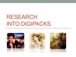
Look into album covers
- 2. I have chosen to look at Indie Digipack as they suit our music genre the best. I have looked at both male and female artists who use guitar as their main instrument. The male artist I have chosen to look at is Olly Murs, an X factor competitor who comes from England. Olly I have chosen to look at his album cover ‘Right place, right time’ because I find that it fits well with our music video, as it uses words in a personal way to Murs engage the audience. This Album cover appeals to me because I think it works really well with the basic looking image with the words edited onto the image. The words look although they have been written onto the artwork which adds the personal feel so the audience feels like it is more of a relationship between the singer and themselves. The image itself is also quite powerful as he is looking straight into the camera, this would draw the audience in by reinforcing the personal relationship feel as he is looking straight at the audience.
- 3. I have decided to look at Taylor Swift for the female Digipack. I chose her because she is a solo female artist who focuses a lot on her voice and the acoustic guitar. So therefore she is similar to our band because although in the actual song there is both male and female members we have decided to make the Digipack to be just for the female member so she is a solo artist. This is the artwork from Taylor Swifts album ‘Fearless’ I have chosen to look at this piece because I found that the cover was both simple and interesting. It draws you in because of her hair, I think that it does this because it is the only thing about the picture that stands out. I think the meaning behind the picture is to show just how ‘Fearless’ she is, as her hair is quite free and her stance shows her being unafraid, and strong. The font saying her name is quite personal looking as it is done in a script font. This is good as it makes the audience feel close to the artist as it is almost although she has written it herself. The main writing is bold and contrasts against her name, however this makes it more noticeable and the use of colour makes the album itself seem very light and pure, which goes with her genre of music as its pleasant and calming with a sense of humour.
- 4. A Fine Frenzy • Whilst looking through for females artists under the genre of ‘Indie Folk’ I came across an Artist called ‘A Fine Frenzy,’ When I looked into their album cover I found that it is very similar to Taylor Swifts, for example the font is also a white and the album once again comes across as quite light and calming. However this album has a lot more colour in it, especially with her red hair. The picture is taken outside, this could represent the title of ‘Come on. Come out’ as she is outside. By looking into the camera it enables the audience to connect with the artist as they feel more close although she is looking at them directly.
- 5. Ingrid Michaelson This is another band that interested me, once again the person is a female artist. I picked out two of her album covers as I found both of them interesting and similar to what we are looking at doing, for example the white title that is used throughout my examples. Another reason why I chose this artist is because of how she uses writing within her work. For example the chalk in the first cover which also blends with the title as it looks handwritten. But also the second album as we see the writing on the face of the female. The writing was one of our motifs so therefore this is a good reference to take elements from.
- 6. The honey trees This is another Indie Folk band that I found, although I could not find an album cover I found some of the photography that they had and this interested me. The elements that seem to appear a lot is the green backgrounds with flowers. So I plan to take into account all the elements from the CD covers that I have found to put into my own Digipack to help it reinforce the genre of Indie folk.