
Recomendados
Más contenido relacionado
La actualidad más candente
La actualidad más candente (18)
Similar a Targeted R&B Magazine
Similar a Targeted R&B Magazine (20)
Último
Último (20)
Targeted R&B Magazine
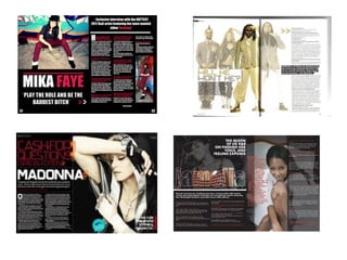
- 2. -The arrows used on the page to direct the audience which has a successful effect as there is more chance that the audience will read the article. -The writing including the headline, interview, an introduction and artists name, are all linking back to the colour of the artists outfit as well as the overall colour theme. This makes a nice and settled completion on the tone of the page. -The large image is on the left hand side. It’s the first thing we see as we read from left to right. Also the artists name and quote is on the left hand side as it is the most important part of the page so the reader see’s the left side first It’s almost like a cycle, as the headline directs you to the arrow and the arrow directs you to the text very smoothly. -I've also added an introduction at the top of my page on the right side as an introduction gets the reader ready to read on.
- 3. My main article is in the form of an interview. The questions and answers are in the colour code of the model. The questions are in a red/pink reflecting the models trousers and white matching the picture, making the tone of the page settled and making it look professional. This is an easier way to read as its not a long article which appeals to my target audience. The first letter starting the writing off, in the ‘impact font’ takes up to ¾ lines of the page. This is done to On the top right hand corner of my page, I had direct the audience to the placed my magazine logo horizontally, which writing. my type of genre usually do with their pages. This is done purposely so the audience create an image of the logo and remember their logo for future reference.
- 4. Very large pull quote with emphasis on words which attracts target audience as their type of language is being used, addressing them towards the article. It’s layout is following the colour code (Pink/red and white), As the speech marks are pink/red and the text is white standing out on a black background. The line above sets a gap between the picture and text, this is effective as it makes the piece look professional. ‘Vibe’ magazines also do this as the image of the headline ‘Jamelia’ shows this. Again I have also done this with the artists name on my double page spread. Here I have used the idea of the arrow as it indicates the reader where to follow on to. This is an effective way to get the audience reading. I have also followed the colour code again as one arrow is white and the other pink/red. This blends in with the page making it mix.
- 5. How does your media product represent particular social groups? The social group I have represented belong in the , C1, C2, D social grades, as my music magazine questionnaire results show that 77% of the readers are female and 22% are male mostly aged between the ages 14-18 who are young people in education. I have represented my social group in my media product by making it clear how important fashion is to my target audience as it’s is represented through the house style for my magazine; the colours I have used for my house style are red, black and white. I used the font ‘Impact’ throughout my magazine to keep a consistent house style; I used this font to keep the tone the same throughout the magazine as this was attractive and appealing to my audience as it also gives my magazine a professional look. I also represented my social group with my props; I used props such as a bike and a skateboard representing their young and physical personalities. To make this more effective I set the photo shoot at a skate park which was appealing to my target audience as its a part of their environment making them feel welcome. I also used a boom box to represent their passion for music and used young fashionable females to attract my target audience. I dressed the models in the way my target audience would dress, targeting my audience to my magazine. I also used informal language on my media product such as ‘baddest’ and ‘bitch’ which influences my target audience to participate. On my front cover I used R&B artists name such as Busta Rhymes, Rick Ross, and T.I who are all R&B artists. This is done to pull the audiences attention as this is what my target audience demand to. (LL cool J) - Hip-Hop/R&B Rapper.
- 7. What kind of media institution might distribute your media product and why? Vibe magazine and is founded by producer Quincy Jones. The publication predominantly features R&B and hip-hop music artists, actors and other entertainers. The magazine's target demographic is predominantly young, urban followers of hip-hop culture which I believe is the company who could distribute my magazine. It’s a Inter Media private equity investment firm focused on leveraged buyout and growth capital investments in the media sector. Though InterMedia already have an R&B genre music magazine, Type Private adding my magazine to their production would be beneficial as sales would increase for my magazine if people know that the publishing Industry Private equity company also publishes some their favorite existing magazines. Founded 2005 Making my magazine available in large supermarkets would make it available to more people, there fore increasing sales as well as my Founder(s) Leo Hindery target audience such as, Sainsbury's, Asda, Tesco, WHSmith etc. New York, New York. Headquarters United States Key people Tom Daschle Leveraged buyout, Products Growth capital Total assets $1 billion Website www.intermediaadvisors.com
- 8. Who would be the audience for your media product? My music magazine questionnaire results show that 77% of the readers are female and 22% are male mostly aged between the ages 14-18 who are young people in education. 50% of these people enjoy listening to R&B and second mostly hip-hop and mentioned more R&B artists influence them more than any other genre. My target audience are more likely to have hobbies like dancing such as jerking, street, crump etc. Their personalities are most likely to be creative, funky and fun. They would shop in places such as Top shop, Schuh, Newlook, Hollister, Uni qlo, JD etc.
- 9. How did you attract/address your audience? I created a music magazine questionnaire to find out what my target audience really like and want. I asked sufficient questions in my questionnaire for example, ‘What's the most effective feature to you on a magazine cover?’ as 59% said pictures pulled their attention more than anything. Paying attention to this, I decided to use more than one picture on each page apart from the front cover as a front cover looks professional with just one image. I used colours that stood out via clothing, setting and font. The models in my images are wearing R&B type of clothing which captivates people interested in this style. The models look like a person from my target audience and this informs them that my magazine is aimed at them. Also the mise-en-scene was effective as my props were things that my target audience would use/wear or have. These were things such as a beat box, bike, skateboard, hat, headphones (Dr dre beats) which are one of the top brand selling headphones. Settings such as the streets and skate park also fashion is very important to my intended audience so I decided to dress my models the way they do, as I have also advertised streetuniqueclothing.com on the front of the magazine which is very powerful as my intended audience agreed that it would attract their attention.
- 10. What have you learned about technologies from the process of constructing this product? • Why were each of these things below useful? I used Photoshop CS5 to create my magazine and from this, I learnt how to create an effective, attractive magazine cover, contents page and double page spread. I learnt how to use the layers feature to hide unnecessary parts of an image or entire layer. I learnt that Photoshop was very good with keeping the quality of photos the same once they have been uploaded from a digital camera and resized. Using a program like Microsoft Publisher would have made this difficult as the photos could pixelate easily and therefore would be unable to use but is appropriate whilst doing drafts. Also, resizing images without distorting them was made easy by using the ‘shift’ key when resizing which was very helpful. I also used Picnik to edit my photos and learned how to edit photos with such interest e.g. learned how to change images tones, lighting sharpness etc. I used the zoomerang website which is an online survey tool that allows users to create, send and analyze online survey results. I then had posted the questionnaire onto social networking sites such as twitter and facebook to attract target audience and to receive flexible results. I used blogger a blog-publishing service that allows private or multi-user blogs with time-stamped entries to upload all my media coursework on to which allows other people to look and to make comments on what they think. This is a good way of getting good/bad feedback. By using a good camera, my pictures would look professional and would be appropriate to use on my media product as not so good images would not attract my audience. Finally using the internet had a great impact on constructing my product as for without it I wouldn't have as much information/knowledge about similar products to give the ideas to help me create my final piece.
- 11. I learned how to use different skills via picnik such as learn how to darken, sharpen and add a variety of effects on my images. By using Photoshop, I played around with different tools and settings, learning different Photoshop skills whilst working my way through. For example I learned how to create a transparent masthead and to move it behind the model without cutting around her. Using Photoshop, I figured out that it was an easier and a less complex way of planning my magazine, and using them for drafts. I learnt that this is a simple way and less time consuming to plan things.
- 12. Looking back at your preliminary task, what do you feel you have learnt in the progression from it to the full product? Looking back at my preliminary task I have learnt how to create and design a professional media product e.g. by following codes and conventions of specific genre types e.g. Looked at colour codes/house styles. I also learnt how to attract target audience I also learnt how to take professional images, looking at the angles, lighting setting etc. The layout of my prelim task was done straight forward without any knowledge from looking at similar products. Moving on to my final media product, whist creating my magazine I had researched different media products of different genres and then studied my own. I had even created a questionnaire to find out what my target audience really want e.g. what sort of things from a magazine appeal to them the most. By using Photoshop, I had developed skills to make my media product look like a genuine and professional product e.g. moving a particular piece of text behind an image which your not able to do on a software such as publisher. I came to know that publisher was ideal for planning/preparation of your product as its simple and straight forward. Overall, I believe that most of my progression was made through receiving information from my target audience as they are the final impressers and research from similar media products which had a huge impact on my final piece.