2. I decided to use RWD,Flavour and vibe
to help create my magazine. I followed
the codes and conventions of RWD the
most as not only is it is similar in style
and tone to my magazines genre, but
also due to its targeted audience.
I used RWD for my cover layout as I like
the calmness of the image and the
story was similar. There’s not too much
information but the main story is made
clear.
My cover has slightly more information at the front to
let the readers know more. Also the colour conventio
on my front cover are different. However I have
decided to use a large relaxed image in the centre an
the models name is shown large.
3. • The genre for my music magazine is grime and rap which are very similar. For my front cover I decided to
look at examples from RWD magazine. Although i used some ideas I didn't use all of them, as I tried to add
some originality. I also used codes and conventions from VIBE and Flavour which gave me suitable ideas.
I decided to use a large masthead that clearly states the magazines title and also attracts the reader. Like RWD
I placed it at the top of the page where it is easily noticed by the intended audience. I made my masthead
black and grey which relates to the colour pallet just as RWDS masthead does. Also the font is quite
informal which relates to grime being a more informal music genre.
My sell line is ‘UK no1 for grime’. Although RWD didn't include a sell line I decided to use one to not only boost
the status of my magazine but to also reflect it as being one of the best in its genre. I placed it under the
masthead for easy recognition and made it purple to match the issues colour conventions.
In what ways does your media product use, develop or
challenge forms and conventions of real media products?
4.
5. • My main headline is similar to RWDS being the second largest text on the page and so easily recognised as
being connected to the front covers model. The text is large on my cover, easily attracting the reader
straight away and reflecting the importance of the text. I decided to have the text ‘tragic' bold and white
with a purple outline as it stands out nicely against the darker background colours and also still associating
with the house colours.
• I have also used left side third the same as RWD. By using this the text in that area is revealed if the
magazine is placed horizontally and can still be read. This is important as sometimes shops place their
magazines in this way. The text is also in purple and white maintaining the colour convention. I used more
informal text being genre specific.
• The difference between my cover and RWDS is the use of slightly more text. I decided to add more text to
cover more information on my magazine as it is a new release and so readers may want more information
on what the magazine is about. I also added free items such as a mix tape which specify in the genre of
grime.
6. • I have stuck to the conventions by using a mid-shot image of my model just as RWD has, as well as many
other rap associated magazines. I decided to have my model placed in the centre, in a relaxed position. I
decided to do this as RWD had chipmunk in a similar calm position. My model is also looking straight
towards the reader which gives a feel of empathy, as though he can acknowledge who is reading the
magazine.
• My model is wearing a purple jacket with white stripes, and black arms. also he's wearing a black cap with
a white symbol on it.. I have chose these colours as it is the house style for my magazine. When my
questionnaire was answered I found that purple and black were the most popular colours, and I decided
to add white as it can easily interact with those colours and be shown.
• There is text over my image but the body and face can still be seen. It is important to have these visible so
the reader knows who their looking at. The masthead is large and fully visible. Sometimes magazines will
place the masthead behind the image but being a new release I need my masthead to be easily identified.
• At the bottom of my page I have a banner, half being purple and half white still associating with the house
colours. On the banner there is text which says free tickets to see Devlin. This is specifying the genre as
Devlin is a known grime artist. Also in the survey people answered Devlin as one of their most popular
artist so Involved him.
• I decided to put a barcode in the bottom right corner. Although not easily noticed it is vital that if I want
my magazine to seem more realistic that a barcode is placed on the cover as they are need for a magazine
to be purchased. My barcode contains my magazines website www.grimesup.co.uk. This is a technique
usually used by magazine and it also makes it clear that my magazine is UK based.
7. • I decided to use a similar layout to Vibe magazine on my contents. I liked the idea of a model in a
calm pose and text on the right. However I did add some of my own features too.
• I have decided to have a large mid-shot image placed to the left of the page. The Vibes magazines
image does see more centred but the image is ,mostly visible on the left which makes it similar to
my magazine. Both models are looking towards the reader ,emphasising.
• My text is on the right and goes down the page as flavours does. Like Vibes contents I have
separated features and interviews yet I have made them headings larger where flavour hasn’t.
8. • My contents page still has the same purple used but slightly alters the colour convention as grey is added
to substitute for the white. I done this because I wanted a more darker feel to the contents and grey is just
as good as white to be associated with darker colours, but its not too light.
• The banner placed up the top is important. The words contents are placed on it so it is easily identified as
the contents page. Also like some magazines the magazines masthead is placed in the top left corner
reminding readers what magazine it is their reading. Also the date of the magazine is shown and the page
number to add realism.
• In the background of the page I've added a large GU. This is a logo for the magazine and identifies it as
grimes up. I made it fade so that text in front of it is still visible.
• The text is placed on the left just like Vibes. I decide to split the pages into two categories features and
interviews and I done this with black banners and grey text sticking to the conventions. Known grime artist
such as Tinie Tempah and chipmunk are involved in the pages. This specifies the genre and by shortening
names it reveals that the reader will be familiar with the genre by already knowing the artist despite their
full name being revealed.
• On my contents page I decided to have a quote of the issue , in which a music related quote is used
accompanied by music notes. I done this as a inspiration to readers who would like to be involved with
this type of music.
• I placed a purple arrow pointing towards a smaller image of my front cover followed by the words
subscribe now. This is to add realism as magazines usually place subscription adverts on their contents
pages.
9.
10. •For my double page spread I analyzed a few grime/rap magazines and found ideas from a few,
mainly vibe again. I liked the way the text was placed in columns on the right side with one large
image on the left and a faded image on the right .
•The image I used was a mid-shot, similar to vibes. I felt that this was the best choice as the image
can show face expressions clear but also the clothes as well as filling up space on the side of the
page. The model is wearing purple still, once again sticking to the pages colour conventions.
However I decided to add some red to the image as the model has red around the neck area. This
is a evident difference to vibes being more darker, but this may be due to their model being a more
dark character.
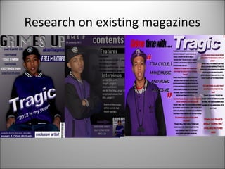
11. • The article for my double page spread is grime time with tragic.. I decided to use this as a regular feature
that my magazine has where a different artist is is specifically interviewed every week and are the
magazines main focus for the issue. The words tragic are large, bold and white so they easily stand out and
are blatantly associated with the model in the images.
• I decided to use a quote as music magazines would usually do this to give a small idea of what is in the
article. The quote is placed next to the large image of the model to make it evident that they are
associated. The quote reads ‘ it’s a cycle I make music and music makes me’ this reveals part of the artist
character so readers will want to know more. I used large red speak marks making it evident as a quote
and connecting to colour conventions.
• Before the article there is a small introduction which reveals who the articles going to be about this issue.
This is a technique usually used before articles as it adds a sense of empathy, making the article seem
more personal.
• The text in the article separated by the questions from grime up and the answers from tragic and this is
made clear by the names at the start of the copy, and the difference in the colour of text, questions in red
and answers black, two colours that associate with the pages colours and are still seen against the
background. In the text tragic is asked different questions about his life, and readers are interested in the
lives of artist in this genre. Finally the article is followed with text saying download tragics new tune. I
decided to add this as answers from my questioners revealed that most people download their music and
so they would be interested.
12. How does your media product represent particular
social groups?
• The social group I have decided to represent is C2DE social grades as young people are more likely to be
earning either a lower or no income. My age range was altered to 14-18 as I saw it more suitable for this
genre, and the way I laid out my magazine. Also my magazine is aimed at males and females of this age.
This is shown through the use of the colours such as purple and red which can be seen as unisex colours.
The grime genre is not necessarily represented by certain colours so I decided to use light and dark colours
throughout. The font of the text is informal throughout, looking like modernised graffiti. These fonts are
more associated with the teenage group.
• My front cover represents the social group through the models clothing. My model is wearing a Addidas
tracksuit top with a black cap. This is the type of clothing that a male from this social group would be
likely to wear. The model also has two ears pierced which is a recent trend for males in this group. On the
double page spread the model has a chain with the words ‘swag’ written on it. The word swag is a
modern slang term for a attractive image and so by having this word involved the readers in this group can
relate.
14. What kind of media institution might distribute your media
product and why?
• http://www.ipcmedia.com
• IPC media are a institution that publish and produces magazines in the United kingdom such as NME.
Although they do not produce magazines associated with rap and grime , they do produce other music
related magazines. If IPC media published my magazine it would be their first grime related magazine and
so people would show interest in seeing if it is effective. Also I chose IPC media because they are located
in the UK and my magazine focuses on UK grime and rap so it wouldn't be appropriate to have it based in
a country such as America where they have less interest and knowledge on the subject.
• Also IPC media is the United kingdoms leading publishing company and so the audience would have trust
in the product due to its experience. IPC media distribute their brands across many supermarkets in the
UK and so not only will my target audience notice but people not as interested in the genre will notice the
magazines existence which is still increases the magazines profile.
• An alternative choice would have been Intermedia partners as they produce the magazine vibe which is
associated with rap. However because they are located in America it would not be appropriate for my UK
magazine.
15. What have you learnt about technologies from the
process of constructing this product?
• I used Photoshop CS5 to create my magazine. This was the first time I used this programme but after
using it for sometime I learnt how to create a attractive magazine, using the features to make my
magazine attractive.
• The layers feature is important in making a magazine. Different layers are used to hide irrelevant parts
and the layers can be placed above other items easily. Also when placing images onto layers they can be
made larger without pixilation by going on free transform and holding control while stretching. This
feature would not be available on Microsoft publisher.
• I also used the ‘FX’ tool on the text throughout to make my text stand out and to add features to the text
such as shadows or more light to make the text more effective.
• I also used darkening tools to make images darker and the opposite with the light tool. I also learnt how
to manipulate images, cutting parts of and removing outside areas to make the image professional.
16. The images I started with
were each taken with a
professional camera in
chosen locations, and I
decided to have them with
backgrounds that could be
cut out easily. With each
image I had to use the
magic lasso tool to cut
around the. Then I had to
place them on a plain
background of a chosen
colour. After I would then
use the eraser tool to
dispose of any remains of
the original background so
the pictures look more
professional. I used free
transform to stretch the
images without pixilation.
After
17. This is a first draft of my cover. As you can see I
used the same image as my final draft but the
cover is lacking text, text which I feel was needed
to introduce the magazine being a first issue. The
text is across the model and in black which I
found quite boring and bland so I decided to
change the colour and tilt it. Also I made the
image slightly lighter to try and escape that dark
feeling.
With this contents page I also used the same image
but once again it is lacking vital information and
looks very simple. The words grime up are written
simply, not even showing the magazines logo. Also it
is made clear it’s the contents page but the text is
small and not very not attractive. A few pages and
their artist are shown but it is clear that not enough
information us present for a reader. The best feature
is probably the associating colours.
18. Looking back at your preliminary task, what do you feel you
have learnt in the progression from it to the full product?
• I decided to call my preliminary task news extravaganza
as the words Negus can be made out from letters
including in that heading. Unlike my magazine I did not
use a specific colour convention but instead decided to
make my cover quite colourful, a bright yellow which
would attract a reader. Compared to Grimes up the
house style is very ordinary, lacking the quality that a
magazine needs.
• The layout also has its importance. On my preliminary
task I had a simple layout, 2 images one mid-shot and
the other a body shot placed in different areas on the
page, with text along the side. I did have the model on
one image looking towards the camera which is
appropriate, but the actual images used look simplistic,
as though they were taken with ease not concentrating
on background or the position specifically.
• The text on my preliminary task is also in a simple font
and is black which doesn't really show excitement, but
is more bland compared to the text in grimes up which
differs in fonts, and colours adding that unique style to
the copy.
19. How did you attract/address your audience?
• I decided to create a questionnaire to see what people would be interesting seeing and what they would
like to be included in my magazine. It gave the public a chance to state their opinions. The purple and
black used throughout was chosen due to them being the most popular colours chosen in the survey. If
the reader finds the colours attractive their more likely to purchase the magazine. Also the model in the
front appeals to the age range as he is a similar age group to most readers.
• The models clothes are more modern, street style which represents the grime genre well. This also makes
the model look like a member of my target audience and so not only is it made clear the magazines aimed
at them, but also many of the readers are aspiring artist so they may feel they can be as successful as the
artist.
• Names of well known artist are shown throughout the magazine including on the front page. I chose the
artist that the public interested in this genre chose as their favourites from the survey, as readers will
want to see artist that appeal to them.
• The survey also showed me that most readers are in education so I decided to include a free mix tape on
the front and competitions such as the one to see Devlin. I mentioned these prizes as young people may
not have the income to be able to afford certain luxuries.
20.
21. Who would be the audience for your media product?
• The target audience for my magazine is 14- 18 year old males and females who are interested in grime and
UK rap and some who produce their own music. I have made a reader profile about the target audience of
my magazine which shows images connected to my magazine. It reveals their interest in clothes, artist,
downloads and other useful information. It also mentions how much they would spend on certain items
and so reveals financial status.
• My target audience are quite fashionable but on a reasonable budget. They are influenced by known
grime artist and so they attend their concerts when they can. They are interested in brands such as Nike
and they are interested in social networking sites such as Face book and My Space.
• My magazine is priced at £2 as most of the people in the survey saw this as the most efficient price, and it
would be most suitable as they are mostly not in full time work. My target audience think its best to pay
for quality products.