
Recomendados
Más contenido relacionado
Último
Último (20)
Destacado
Destacado (20)
Music Magazine Cover Comparisons.
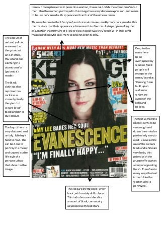
- 1. Here a close upisusedas it presentsawoman,thuswouldcatch the attentionof most men.Plusthe women portrayedinthisimage hasa verydeviousexpression,andseems to be lessconcernedwithappearance thanthatof the otherwomen. Thismay be due to the lifestyleof arock star whomare usuallymore concernedwitha mental state thattheirappearance.Howeverthisoftenresultsinpeople makingthe assumptionthattheyare of a lowerclassinsocietyas they’re notwillingtospend massesof moneyto lookmore appealingaesthetically. The textwithinthis image seemstobe veryrough and doesn’tseemtobe particularlyeasyto read. Likewise the use of the colours blackand white are verybasic,this pairedwiththe grunge effectgives a veryunappealing finish.Therefore in manyways the text ismuch like the womanwhois portrayed. The layouthere is veryclutteredand untidy. Makingit hard to read.This can be done to portray the messy and unpredictable lifestyle of a personsuchas that showninthe image. The colour scheme used isvery basic,withmainlydull colours. Thisincludesaconsiderable amountof black,commonly associatedwithrockstars. The coloursof redand yellow were usedas theycontrast one another, thusstand out; catchingthe attentionof a (potential) reader. The black clothingalso representsa rockstar as stereotypically theytendto weara lotof blackand other dull colours. Despite the name here been overlappedby women.Most people still recognise the name/brandas ‘Kerrang’have builtupan audience whomare aware of the logoand header.
- 2. The texthere is writtenvery informallyasits handwritten, whichcould suggestthatthe personalityof the personshownis alsoinformal. The backgroundhere isa solidblack,which isn’tveryappealing to lookat. Stereotypically, rockstars use this colouroften,butalso they’re notbothered abouttheirlooks- thusaren’tbothered aboutlooking appealing. The expressionuponthe face of the womenisextremelymenacing whichcouldimplyanoverall view of the stereotype of ‘rockstars’. Rockstarsare often quite rebelliousto,stereotypically.
- 3. The womanhere is verypale and wearingdark,heavymakeup.Plus she’swearingablack,leather jacket whichimpliesshe hasadeep attitude. The womenislookingdirectlyatthe readerhere,whichmaycause the readerto feel more inclinedtoread the article;due to eye contactbeen made. Here the backgroundis a dark colour,whereasthe textisof light coloursof pinkand white.This Thisquote standsout,not only due to the colourchoice,but also as it’sisolatedfromthe restof the text. The textalsocausesthe readerto become intriguedas theybecome curiousof the mistakesshe made. Also,the wordswhichindicate the subject of the sentence have been isolatedfromthe restof the quote bybeenof a different colour. The womanis equally as large as the textas an image (especiallyof a woman) wouldbe more likelytocatch the attentionof people/readers.
- 4. Close upof a womanwhois heavily made up,relatingtothe subjectof the magazine:‘GlamCounture’. The word ‘glam’ meanstowear outrageousand unique outfits,whichisportrayedin thisimage. Thisimpliesthatthis womenisof a highclassas she is been portrayedas veryinterestedinthe wayshe looks,asshownthroughthe use of heavymakeup.Furthermore, the image impliesthatthiswomen wouldbe willingtospendconsiderable amountsof moneyto ensure she maintainsthisimage. A numberof cover lineswhichgive a brief insightto some of the major articles.Assuch the readerthen becomesintrigued and wantsto read on… Use of plainand bleakbackground emphasisesthe textand images displayed, drawingattention to the focusof the cover- the women and the text. The textof thismagazine isverysharpand quite easyto lookat and read.Thistherefore insome waysmirrorsthe womenalso.Asthey’re bothdepictedasveryflashyand alsoquite feminine:due tothe use of the colourpink. The layoutof thismagazine isverybasic,but vary tidy. Everythinglooksasthough it shouldbelong,and matchesone another throughout,withthe same colourscheme.Againthis looksas thoughitwas designedlike thistoolook appealingtothe reader; once more much like the woman. The colour scheme usedonthis coveris extremelyfeminine,using onlywhite andpink.These colours are verybrightand excitable,which couldbe comparedto the women once more.