2. Throughout the process I learnt how to use
Photoshop and improve my Photoshop skills.
By the time I had finished I had learnt enough
for me to be able to create my music
magazine with success. I learnt how to edit
photographs and how to make them look
better and also how to stylize fonts.
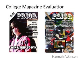
3. My front cover is very basic but I think this
works for a college magazine as it will grab
students attention without bombarding
them with lots and lots of text on the front
cover.
I decided to go with the simple tonal
colour scheme of black and white and let
the images pick up the colour like the pink
shirt does on the cover and then the
contents background does the same with
the splashes of colour.
I went for the idea of having two main
fonts which help separate the different
parts of the front cover.
4. My contents page could have done
with being more separated into
different sections like features, regulars
etc. When it came to my music
magazine I learnt that I had to do so.
Once again I used the two different
fonts to differentiate between the
headings and page numbers.
I do like the background I created for it
but I think it looks more poster like
than contents page. I think if I had
broke my text up I would have avoided
this problem.