
Recomendados
Más contenido relacionado
La actualidad más candente
La actualidad más candente (20)
Similar a How Kerrang and NME present contents pages and articles
Similar a How Kerrang and NME present contents pages and articles (20)
Más de RBloomfield
Más de RBloomfield (10)
Último
Último (20)
How Kerrang and NME present contents pages and articles
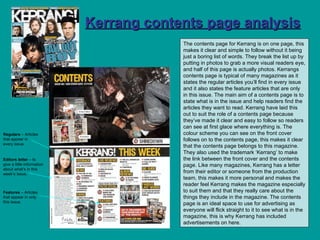
- 1. Kerrang contents page analysis The contents page for Kerrang is on one page, this makes it clear and simple to follow without it being just a boring list of words. They break the list up by putting in photos to grab a more visual readers eye, and half of this page is actually photos. Kerrangs contents page is typical of many magazines as it states the regular articles you’ll find in every issue and it also states the feature articles that are only in this issue. The main aim of a contents page is to state what is in the issue and help readers find the articles they want to read. Kerrang have laid this out to suit the role of a contents page because they’ve made it clear and easy to follow so readers can see at first glace where everything is. The colour scheme you can see on the front cover follows on to the contents page, this makes it clear that the contents page belongs to this magazine. They also used the trademark ‘Kerrang’ to make the link between the front cover and the contents page. Like many magazines, Kerrang has a letter from their editor or someone from the production team, this makes it more personal and makes the reader feel Kerrang makes the magazine especially to suit them and that they really care about the things they include in the magazine. The contents page is an ideal space to use for advertising as everyone will flick straight to it to see what is in the magazine, this is why Kerrang has included advertisements on here. Regulars – Articles that appear in every issue. Features – Articles that appear in only this issue. Editors letter – to give a little information about what’s in this week’s issue.
- 2. Kerrang double page spread analysis Layout and Design This double page spread has a very simple layout. On the first page there is two columns of text and then one down the middle of photos. This makes a good balance between photos and text keeping the article interesting to the reader. This article is arrange in a very simplistic manner which makes it easy to read. The second page of the double page spread is just one large photo with a pull quote which makes it more visually appealing. Images used They’ve used images of old issues of Kerrang as the these anchor with the article which is about the band going on a ‘break’ from making music. On the second page they used a large image of the most popular member of the band, he’s smiling and in a confident pose which is giving out the message that they are a fun band and are happy with what they’re doing. This fits with the bands persona that they are a group of fun loving guys. The heavy eyeliner on one of his eyes goes with his image of being the ‘emo’ one and famous for founding ‘guyliner.’ The clothes he’s wearing also go with this persona linked to him. You can clearly see his tattoos in this photo which is another thing he’s well known for and strongly links to the genre of music his band are in. Standfirst The first thing you read is ‘exclusive’ in a bright blue box which makes it stand out, this gives the reader the feeling they are finding out something no one else knows and that they are the first to hear it thanks to Kerrang. The introduction says “is this the end of the emo superstars?” which is what the reader will be asking themselves and gives them the idea that this will be answer therefore encouraging them to read on. Photoshop techniques This article hasn’t been edited that much on Photoshop, as Kerrang wanted to keep it simple and easy to read. The editing on the member of the band isn’t too obvious I’d say they just touched up a few imperfections to make sure he was happy with the photo they’d taken.
- 3. Headline The headline for this article was on the page before and it was “We don’t know the future of Fall Out Boy!” and this is a direct quote from a member of the band. They’ve used correct English to make it seem serious not slang or punch lines. The Headline is in a totally different font to the rest of the magazine and this could be done to make it stand out against the others and to get the reader to notice it as it is the main feature article in this issue. The headline is in black apart from the work ‘future’ which is blue and this puts an emphasise on this word and make the reader question whether they have one or not. The spacing of the headline is really uneven and doesn’t really a follow pattern which could be linking to the falling apart of the sentence and the falling apart of fall out boy. Pull Quote They use the pull quote “we need to take a break and we’ll come back. Maybe…” The pull quote states that it’s not the end of fall out boy and this would be important for the fans to hear. It is a quote said by Pete Wentz and is used to go with the photo of him. The pull quote is a summary of the whole article in the words of the band so it works really well at giving the reader an idea of what it’s about without even reading any of the actual article. Copy The journalist has organised the story in a very simple and clear way so that it’s easy to read. It’s obvious they’re a very popular band by how the journalist describes them he says such things as “superstars…double platinum status…loved” which shows it’s obviously going to be very upsetting for a lot of fans that they are splitting up. The journalist talks about it in a sensitive way as if she’s breaking bad news to some, which she is in a way because the readers of Kerrang are loyal music fans and would be very passionate about it. They use quite a few direct quotes to make it seem more personal and like the band themselves are breaking the news to the fans. You find out a little about the artist but they’re already a really well known band so you don’t need to have a lot of time spent on giving you background information and they presume most readers will know them. I think the artist would be happy with this article as they come across as genuinely nice guys who are under a lot of stress and just need a break to concentrate on other things, and every reader should be able to relate to this in some way. I also think the egotistical side of the band will like being called ‘superstars’ and quote likes “admit it you’ll miss this face” will make them feel they are popular.
- 4. NME contents page analysis This NME is a special souvenir issue and to follow this theme they have a colour scheme to match it, the use of silver to make it seem almost like a prize that is to be kept. The contents page clearly links to the front cover as you can see they’ve actually put a small image of the front cover on the contents page. The layout of this contents page is very interesting it really catches your eyes as you see all the different colours in the background and then when you look closer you realise that it’s all the front covers of NME between two dates, this follow the theme of it being a special edition magazine. The front colours are also the only colour on this page which has a symbolic code that NME is adding colour to music. Everything that is included in the magazine runs down the left hand side of the page with page numbers in a clear chronological order and this suits the main purpose of a contents page and makes it clear for the reader to follow. This contents page also has a letter from the editor which again makes it seem more personal and as if the magazine is addressing the reader personally. Regulars – Articles that appear in every issue. Editors letter – to give a little information about what’s in this week’s issue. Features – Articles that appear in only this issue.
- 5. NME double page spread analysis Layout and design Like the Kerrang magazine this also has one page of just photos with very little text and the second page with the whole article written on. This makes it more visually appealing and catches the readers attention so they take the time to read the article. This article again has a balance of photos and text but I think it has quite a large chunk of writing that isn’t as inviting to read to more visual inclined readers. The main body of the text is in two columns that are simple and well organised to make it easy to read. There is a third column featuring both text and photos which is a top ten which anchors the article as it’s all time music was part of a television program. Images used They use a lot of photos in this article to make it appeal more interesting to the reader and break up the large amount of writing. None of the photos are serious and this helps display the persona of the people featuring in them. Every photos includes at least one person pulling a funny face which make it look like it’s an interesting article to read. This is a different kind of article to the other magazine as it isn’t about a certain band it’s about the music industry in general but in most of the photos there is an emphasise on one or two people and they are in the centre of the photo. Standfirst The way we are introduced to the article is a blunt and to the point way, the headline is “getting with the programme” and they use words like “finally understood” ad “changed forever” in the introductory paragraph. This shows us that this is a up to date and relevant article and this is important for NME to appear relevant or even ahead of he time as this would appeal to the demographic interested in NME magazine. The image we are sold of the people appearing in this article is one of fun and they appear to be quite cool and are very well known with the readers of NME. NME want us to think that they are different to other magazines as they have a true passion for music and want to see it used as part of television more to make television more interesting, that is why they use photos a little different to the normal serious poses you see in magazines.
- 6. Copy The journalist has chosen to organise the story in a clear and well structured manner, they want to make it clear and easy to follow for the reader. They’ve not gone for any crazy editing or positioning and they want to make it tradition to suit their readers expectations. The people featured in the article are introduced as icons, like we should look up to them. They are called “a new breed of people” which makes them seem extraordinary and the first people to be using music in there television program. They say “indie culture…firestorm” which makes it seem like they are taking over and are out of control, and this also pull the reader in as NME appeal largely to the indie culture. I think the people featured in this article will be more than happy with how they are presented as they are shown as fun and different characters that are visionaries for the future of music In television programmes. Photoshop techniques Similarly to the Kerrang DPS NME hasn’t used any dramatic Photoshop techniques because they are a more tradition magazine and want their articles to be different without needing to be edited to the extreme. They’re used small features like tweaking the images to make sure the people photographer are happy with how they appear but apart from that they’ve not editing it much. Headline The headline for this article is “Getting with the programme” and it is written in capital letters, this makes it stand out and catch your eye when you flick through the magazine. They’ve used a very square and angular text which makes it more simplistic and this would suit the target audience as they will be more interested in the state facts. It is also overlapping the photos with a rough edge, this anchors with the article about being edgy and different as this isn’t typical of magazine headlines. It’s also not a full sentence which makes it appear different and catch the attention of the reader more. They use black and white as a colour scheme on this DPS and the title strongly fits with this and the rest of the magazine. Pull Quote They use the pull quote “the emotional resonance and inherent drama of music is finally being taken seriously.” This pull quote states that this is a big change to music and that it’s finally being taken seriously, this makes it seem like NME has been fighting for this cause and that it’s they’re doing that it is happening. The pull quote is said by the writer of the article and is their own strong opinion on the subject and is stated as fact so that the reader thinks it’s actually true. The pull quote strongly links to the rest of the article and would work at pulling the reader in and getting them interested in the subject matter talked about on this double page spread.
- 7. Q contents page analysis Q’s contents page is spread over two pages, this was done because Q is a larger music magazine than the other two I looked at and would have a longer list of articles and to make it less boring and more appeal to the reader they’ve broken up the long list with photos, therefore taking up more room. The fact it’s over two pages may make the reader feel it has more in it so making them more likely to buy it, thinking there’s more to read in it. You can instantly tell that this contents page follows from the front cover because of the colour scheme, they both use only red, white and black. The connotations of these colours are of being bold and they make a statement without making it too fussy. Unconventionally Q doesn’t have a editors letter on the contents but on the next page they do have a section called masthead which is all about the production team. Regulars – Articles that appear in every issue. Features – Articles that appear in only this issue.
- 8. Q double page spread analysis Layout and design The layout of this double page spread is quite different from the other two, it doesn’t have a page of just photos. I think this makes it quite interesting as the text is broke up with a small pictures at the side and the first half of each page is photos too. This makes it quite an interesting article to look at and would appeal to it’s more serious music fans as they would want to read the detail more than look at the image of a good looking band. The text is in four short columns at the bottoms of both pages, this makes it look like there’s less to read and would therefore be less boring than a full page of writing. The columns aren’t as organised as the other magazine, Q has split the columns up with little features like a circle that states ‘the fact’s about the band, this makes it different and quite interesting to the reader. Images used They have used an image of the band in the recording studio but it’s not the typical music studio, this one is a living room in someone’s house. This makes it seems edgy and different, you see the photo and think are they really in a living room and you want to read the article to find out. You can see more of the instruments and equipment used than you can the bands faces this give the impression this article and band are more about the music than getting famous for how they look. Standfirst The way we are introduced to the article is totally different to the other magazines, this one isn’t very flattering towards to band, the introductory paragraph states that the bands new album has “no hits and no singles.” This really gets the reader intrigues and they presume no artist would aim for that in an album. The introductory uses very strong sarcasm which gives an impression of both Q magazine and the band featured in this article. This isn’t the typical music magazine article that ‘bigs’ up the band to make them sound amazing to get people to buy their album, it’s a truthful and down to earth article that states the band are just making songs they like and if no one else does they won’t mind because it’s about them being happy with their album not making millions by being in the public eye.
- 9. Copy The journalist has chosen to organise the story in a more interesting way to make it quirky like the band come across in the article. It makes it more interesting and would appeal to the target audience of Q magazine. The band are introduced as “quirky” which sums up the whole article, it’s not really serious and they all seem like bold characters and an interesting band when put together. They don’t try to boost their egos in this article as they are obviously already quite popular from the success of their first album. I think the band would be happy with how they are portrayed as they come across as quite a genuine bunch of guys who really enjoy making music and will keep doing it whether they make it into the mainstream or not because they’re not in it for the fame, they only want to make good music. Photoshop techniques This doesn’t look like they’ve used Photoshop which gives it a more traditional feel and that fits with the persona of Q magazine as being a tradition music magazine that looks at well known bands. I think it works effectively likes this and doesn’t need any use of Photoshop to enhance it as it’s interesting enough without it. Headline The headline for this article is “How’s the new album, MGMT? “Terrible.” Oh…” This is a very different headline and really pulls the reader in. The question automatically makes you ask the same question and the fact the answer isn’t what you expect makes you even more intrigues so suits it’s purpose of pulling in readers well. The use of the ellipsis tells you that it’s not the end of this issue and makes you want to read on to find out more about the subject. They use a direct quote from the article which includes a quote from the band themselves. This makes it more personal and makes it seem more true because it’s coming from the band themselves. The MGMT is in orange which really catches your eye, this is also the colour used in the rest of the magazine for titles or the name of sections in the magazine. The colour scheme used on this page follows through the whole magazine making it flow smoothly from story to story. Pull Quote They use the pull quote “in the UK people shove ecstasy down your throat.” The use of this quote tells you a lot about the band, if gives them a rebellious persona as they have tried drugs, it also makes them seem like typical young people as now a days a lot more of them do try drugs at least once. It follows closely with popular culture now a days and this would appeal to the readers of Q. this is a direct quote from a member of the band which makes it seem personal. It relates to the whole article in the way that you can tell the band are up for a good time and just your typical guys who just happen to make hit records.