SlideShare una empresa de Scribd logo
1 de 4
Descargar para leer sin conexión
Top 10 Color Trends for Spring 2012


1. Tangerine Tango (Pantone color number 17-1463)
                                   A bright, juicy, happy color that is wonderfully flattering on all skin
                                   tones. I have had a lovely time over the last few days pouring over a
                                   plethora of combinations this particularly vibrant color will work with.
                                   My personal favorite, and by far the most popular, is tangerine, white
                                   and navy. I just LOVE this combination! Particularly matched with
                                   denim, tangerine’s brilliant color attracts a lot of attention – it just
                                   screams ‘World, look out ‘cuz here I come’ through a megaphone.
Doesn’t everyone need a pair of tangerine espadrilles? They say “I am fun but don’t mess with me”.
How can you NOT be empowered to do the best at everything that comes your way? I’m just saying….
Look for additional colorful pairings with black, off-white and lighter neutral colors.

2. Solar Power (Pantone color number 13-0759)
                                   Yellow, from mustard to marigold, is one of Spring’s hottest color
                                   trends (pardon the pun!) and this golden yellow channels its warmest
                                   undertones. Along with its partner tangerine, (which is seriously
                                   EVERYWHERE this Spring), the bright hue is adding a “little ray of
                                   sunshine” to wardrobes that are otherwise dominated by lots of gray
                                   and even more black…. Not too keen on rocking a bright yellow top? If
                                   yellow scares you, it’s understandable but take it from me, find a way
                                   to incorporate yellow into your wardrobe. Start small, by adding a
shopper tote or textured bag or my personal preference, a pair of fabulous “Hello, I’m here and have we
met yet?” kind of shoes in this high-wattage color. I’m just saying……

Still too big of a risk, then accessories are a great way to add a pop of sunshine color whether through
bangles, a whimsical necklace, or cocktail rings. And of course, an awesome yellow umbrella would be a
delightfully, sassy way to brighten any old rainy day!

3. Sodalite blue (Pantone color number 19-3953)
                                  For those who love a nautical navy in the springtime, the cool blue
                                  tones in this color really matches the rich royal blue undertones of its
                                  mineral namesake. Whether you’re sporting the nautical trend with
                                  navy blue and white stripes, or sticking with a simple all-blue shift
                                  dress, navy blue is a complementary color on almost all skin types and
                                  tones. Look for sleek, form-fitting dresses, French cuff shirts and dark
                                  wash jeans in this color to round out your wardrobe. We all know that
                                  navy “anchors” the traditional, basic nautical colors but tangerine and
yellow will give you new twist to the nautical theme. Adding Cabaret (October 24) and Margarita
(November 7) can give a whole new dimension to the trend. Knowing ways on how to wear the nautical
trend can definitely bring the best out of the new season. This is a trend that will never go out of style. It
is a classic look that can definitely make you stand out among the crowd. It probably doesn’t hurt that
the Duchess of Cambridge (aka Kate Middleton) frequently wears similar colors. After all, her husband is
in the Royal navy….I’m just saying…..

4. Cabaret (Pantone color number 18-2140)
                                 Cabaret is literally a hot pink. Don’t you love hot pink? I do. It’s a “Look
                                 at me now” shade of pink that’s extremely flattering, warms pale skin
                                 tones and contrasts well with darker complexions. The key to making
                                 this vibrant color work for you is to pair a hot pink dress with decidedly
                                 adult shoes like sophisticated black pumps or strappy nude stilettos. A
                                 simple, black or metallic clutch works best too. If the idea of drawing a
                                 lot of attention to yourself makes you quiver, you can access the trend
                                 with an accessory. Switch it up with a studded, pink suede evening bag,
fabulous shoes or show stopping earrings. Lipstick or blush which will add an instant edge to anything
you wear. Oh, and keep in mind that a woman in hot pink can’t be a bore. You had better have some
zingers if you plan to swan around in hot pink. Think Holly Golightly…….I’m just saying….

5. Starfish (Pantone color number 16-1120)
                                  This deep khaki is the perfect backdrop and works well as a solid base
                                  with dynamic accents such as Sodalite, Tangerine Tango, Solar Power
                                  and Cabaret. This practical neutral radiates warmth so naturally that it
                                  will be one of the major players for Spring 2012 for both women and
                                  men. Khaki makes me think of sandy beaches…and hot dessert
                                  retreats. The color is the perfect transition from the cold winter
                                  season. Starfish should become a staple in your wardrobe – you can
                                  take your look casual or sophisticated depending on how you pair it
with accessories or the other pieces of your wardrobe. I like it because it is adaptable in many styles and
easy to jazz up with the vibrant colors associated with the Spring 2012 collection. Incorporate this shade
on top of your brighter colors or try a layered look for a more feminine touch. Whether you choose a
khaki trench coat or earthy suede clutch, neutral colors can work for anyone and with any spring look.

6. Margarita (Pantone color number 14-0116)
                                  This toned down version of a margarita is a subdued yellowish green
                                  that lifts spirits with its refreshing and stimulating glow. The hue
                                  reminds one of the classic combination of lime and salt….yum…and just
                                  like the combination, using this color should be done in moderation. As
                                  a fun fact, the original Margarita was invented in 1948 by socialite
                                  Margarita Sames. According to the legend it was during a party at her
                                  cliffside hacienda in Acapulco that Margarita began experimenting with
‘the drink’. Looking for something to cut the dust of a hot afternoon, she mixed Tequila, Cointreau and
fresh lime juice. Her cocktail kept the party going for two weeks and today the Margarita is the #1 most
popular cocktail in the U.S. So, the moral of the story ladies is attitude…..So, go ahead, salt and lick my
rim….I’m just saying…..

7. Sweet lilac (Pantone color number 14-2808)
                                  Lilacs where I grew up were known as the harbinger of spring. When
                                  the lilacs bloomed, all was right in the world! This luxurious, romantic
                                  and floral-inspired lavender shade flatters all skin tones. Seen in
                                  various fabrics from cotton wovens, silk embellished ruffles and striped
                                  jersey knits, this versatile color translates from casual to evening and is
                                  perfectly soft and pretty. One can’t help but think of Mila Kunis’
                                  stunning lilac Elie Saab dress at the Oscars as a catalyst for spring’s soft
purple hues. I love that the super flattering hue is richer than a typical pastel ‘cuz it might energize you
to play with lilac’s trademark sweetness to vamp it up a bit with edgier pieces to add some punch to
your look. Sweet yes, but sassy, hell yes!…..I’m just saying….

8. Driftwood (Pantone color number 18-1210)
                                    Natural, versatile neutrals add practicality to this season’s vibrant
                                   colors. Driftwood, an adaptable blend of beige and gray with a slightly
                                   weathered feel won’t brighten a dull day, but this moody gray can help
                                   balance out some of the bolder spring colors. Neutrals have the
                                   advantage of never really going out of style, mainly because they’re so
                                   versatile, but also because many women feel more comfortable
                                   wearing neutral colors than they do very bold colors like tangerine,
                                   yellow or purple. By definition, a neutral color is not warm or cool, so
in theory, neutral colors are meant to work with any other color – choosing a focal piece of your
wardrobe in a neutral color allows you to change your accent pieces at a whim….I’m just saying….that
never again will you be saying, “I have nothing to wear.”

9. Bellflower (Pantone color number 18-3628)
                                   One of my favorite colors for spring, it has been described as “a distinct
                                  ornamental purple, exudes uniqueness and creativity.” Named after a
                                  violet blue flower, this purple will light up many skin tones and is a fresh
                                  springy take on purple. Okay, so by now, you all know how I feel about
                                  the importance of adding a little color to your wardrobe this spring
                                  (Tangerine Tango, hello????) but you shouldn’t overlook a cute purple
                                  dress or skirt either. Mix it up with cowboy boots and giant shopper tote
to add your own touch to the look. Unlike other colors that add a pop to your wardrobe that may fade in
popularity, purple is a timeless standard and can be recycled easily for summer and fall. Purple is office
appropriate, and also great for a day at the beach, and is way cooler than pink. Purple is so easy to pull
off, make it a must for your spring shopping list…flirty, feminine and oh-so versatile, a purple dress is a
serious must this season! No one will accuse you of being a shrinking violet…I’m just saying….

10. Cockatoo (Pantone color number 14-5420)
                                   This blue-green shade looks less like a bird and more like the
                                  Mediterranean Sea. It will look refreshingly like the ocean and pop
                                  beautifully with some of the more subdued neutrals. From sandals to
                                  shoes to jewelry and home decor, this blue-green shade is the fresh
                                  color for Spring 2012. Spring is all about fun colors and feeling fresh.
                                  This unusual hue of blue-green just makes me think of: nature, fresh,
                                  growth, abundance, life, youth, renewal, hope, peace, balance – all the
                                  wonderful promises we think of for springtime. Cockatoo is such a
versatile color that can be accented with a plethora of colors like tangerine, yellow, pink or even lilac.

That’s it. We hope you enjoyed our review of the top spring colors for 2012! Let us know what you
thought. What is your favorite of all the colors?


  Search Salon from all over USA: http://salonspasource.com


   Read More about Salon Tips at : http://salonspasource.com/blog/

Más contenido relacionado

Destacado

How to Prepare For a Successful Job Search for 2024
How to Prepare For a Successful Job Search for 2024How to Prepare For a Successful Job Search for 2024
How to Prepare For a Successful Job Search for 2024Albert Qian
 
Social Media Marketing Trends 2024 // The Global Indie Insights
Social Media Marketing Trends 2024 // The Global Indie InsightsSocial Media Marketing Trends 2024 // The Global Indie Insights
Social Media Marketing Trends 2024 // The Global Indie InsightsKurio // The Social Media Age(ncy)
 
Trends In Paid Search: Navigating The Digital Landscape In 2024
Trends In Paid Search: Navigating The Digital Landscape In 2024Trends In Paid Search: Navigating The Digital Landscape In 2024
Trends In Paid Search: Navigating The Digital Landscape In 2024Search Engine Journal
 
5 Public speaking tips from TED - Visualized summary
5 Public speaking tips from TED - Visualized summary5 Public speaking tips from TED - Visualized summary
5 Public speaking tips from TED - Visualized summarySpeakerHub
 
ChatGPT and the Future of Work - Clark Boyd
ChatGPT and the Future of Work - Clark Boyd ChatGPT and the Future of Work - Clark Boyd
ChatGPT and the Future of Work - Clark Boyd Clark Boyd
 
Getting into the tech field. what next
Getting into the tech field. what next Getting into the tech field. what next
Getting into the tech field. what next Tessa Mero
 
Google's Just Not That Into You: Understanding Core Updates & Search Intent
Google's Just Not That Into You: Understanding Core Updates & Search IntentGoogle's Just Not That Into You: Understanding Core Updates & Search Intent
Google's Just Not That Into You: Understanding Core Updates & Search IntentLily Ray
 
Time Management & Productivity - Best Practices
Time Management & Productivity -  Best PracticesTime Management & Productivity -  Best Practices
Time Management & Productivity - Best PracticesVit Horky
 
The six step guide to practical project management
The six step guide to practical project managementThe six step guide to practical project management
The six step guide to practical project managementMindGenius
 
Beginners Guide to TikTok for Search - Rachel Pearson - We are Tilt __ Bright...
Beginners Guide to TikTok for Search - Rachel Pearson - We are Tilt __ Bright...Beginners Guide to TikTok for Search - Rachel Pearson - We are Tilt __ Bright...
Beginners Guide to TikTok for Search - Rachel Pearson - We are Tilt __ Bright...RachelPearson36
 
Unlocking the Power of ChatGPT and AI in Testing - A Real-World Look, present...
Unlocking the Power of ChatGPT and AI in Testing - A Real-World Look, present...Unlocking the Power of ChatGPT and AI in Testing - A Real-World Look, present...
Unlocking the Power of ChatGPT and AI in Testing - A Real-World Look, present...Applitools
 
12 Ways to Increase Your Influence at Work
12 Ways to Increase Your Influence at Work12 Ways to Increase Your Influence at Work
12 Ways to Increase Your Influence at WorkGetSmarter
 
Ride the Storm: Navigating Through Unstable Periods / Katerina Rudko (Belka G...
Ride the Storm: Navigating Through Unstable Periods / Katerina Rudko (Belka G...Ride the Storm: Navigating Through Unstable Periods / Katerina Rudko (Belka G...
Ride the Storm: Navigating Through Unstable Periods / Katerina Rudko (Belka G...DevGAMM Conference
 
Barbie - Brand Strategy Presentation
Barbie - Brand Strategy PresentationBarbie - Brand Strategy Presentation
Barbie - Brand Strategy PresentationErica Santiago
 
Good Stuff Happens in 1:1 Meetings: Why you need them and how to do them well
Good Stuff Happens in 1:1 Meetings: Why you need them and how to do them wellGood Stuff Happens in 1:1 Meetings: Why you need them and how to do them well
Good Stuff Happens in 1:1 Meetings: Why you need them and how to do them wellSaba Software
 
Introduction to C Programming Language
Introduction to C Programming LanguageIntroduction to C Programming Language
Introduction to C Programming LanguageSimplilearn
 

Destacado (20)

How to Prepare For a Successful Job Search for 2024
How to Prepare For a Successful Job Search for 2024How to Prepare For a Successful Job Search for 2024
How to Prepare For a Successful Job Search for 2024
 
Social Media Marketing Trends 2024 // The Global Indie Insights
Social Media Marketing Trends 2024 // The Global Indie InsightsSocial Media Marketing Trends 2024 // The Global Indie Insights
Social Media Marketing Trends 2024 // The Global Indie Insights
 
Trends In Paid Search: Navigating The Digital Landscape In 2024
Trends In Paid Search: Navigating The Digital Landscape In 2024Trends In Paid Search: Navigating The Digital Landscape In 2024
Trends In Paid Search: Navigating The Digital Landscape In 2024
 
5 Public speaking tips from TED - Visualized summary
5 Public speaking tips from TED - Visualized summary5 Public speaking tips from TED - Visualized summary
5 Public speaking tips from TED - Visualized summary
 
ChatGPT and the Future of Work - Clark Boyd
ChatGPT and the Future of Work - Clark Boyd ChatGPT and the Future of Work - Clark Boyd
ChatGPT and the Future of Work - Clark Boyd
 
Getting into the tech field. what next
Getting into the tech field. what next Getting into the tech field. what next
Getting into the tech field. what next
 
Google's Just Not That Into You: Understanding Core Updates & Search Intent
Google's Just Not That Into You: Understanding Core Updates & Search IntentGoogle's Just Not That Into You: Understanding Core Updates & Search Intent
Google's Just Not That Into You: Understanding Core Updates & Search Intent
 
How to have difficult conversations
How to have difficult conversations How to have difficult conversations
How to have difficult conversations
 
Introduction to Data Science
Introduction to Data ScienceIntroduction to Data Science
Introduction to Data Science
 
Time Management & Productivity - Best Practices
Time Management & Productivity -  Best PracticesTime Management & Productivity -  Best Practices
Time Management & Productivity - Best Practices
 
The six step guide to practical project management
The six step guide to practical project managementThe six step guide to practical project management
The six step guide to practical project management
 
Beginners Guide to TikTok for Search - Rachel Pearson - We are Tilt __ Bright...
Beginners Guide to TikTok for Search - Rachel Pearson - We are Tilt __ Bright...Beginners Guide to TikTok for Search - Rachel Pearson - We are Tilt __ Bright...
Beginners Guide to TikTok for Search - Rachel Pearson - We are Tilt __ Bright...
 
Unlocking the Power of ChatGPT and AI in Testing - A Real-World Look, present...
Unlocking the Power of ChatGPT and AI in Testing - A Real-World Look, present...Unlocking the Power of ChatGPT and AI in Testing - A Real-World Look, present...
Unlocking the Power of ChatGPT and AI in Testing - A Real-World Look, present...
 
12 Ways to Increase Your Influence at Work
12 Ways to Increase Your Influence at Work12 Ways to Increase Your Influence at Work
12 Ways to Increase Your Influence at Work
 
ChatGPT webinar slides
ChatGPT webinar slidesChatGPT webinar slides
ChatGPT webinar slides
 
More than Just Lines on a Map: Best Practices for U.S Bike Routes
More than Just Lines on a Map: Best Practices for U.S Bike RoutesMore than Just Lines on a Map: Best Practices for U.S Bike Routes
More than Just Lines on a Map: Best Practices for U.S Bike Routes
 
Ride the Storm: Navigating Through Unstable Periods / Katerina Rudko (Belka G...
Ride the Storm: Navigating Through Unstable Periods / Katerina Rudko (Belka G...Ride the Storm: Navigating Through Unstable Periods / Katerina Rudko (Belka G...
Ride the Storm: Navigating Through Unstable Periods / Katerina Rudko (Belka G...
 
Barbie - Brand Strategy Presentation
Barbie - Brand Strategy PresentationBarbie - Brand Strategy Presentation
Barbie - Brand Strategy Presentation
 
Good Stuff Happens in 1:1 Meetings: Why you need them and how to do them well
Good Stuff Happens in 1:1 Meetings: Why you need them and how to do them wellGood Stuff Happens in 1:1 Meetings: Why you need them and how to do them well
Good Stuff Happens in 1:1 Meetings: Why you need them and how to do them well
 
Introduction to C Programming Language
Introduction to C Programming LanguageIntroduction to C Programming Language
Introduction to C Programming Language
 

Top 10-color-trends-for-spring-2012

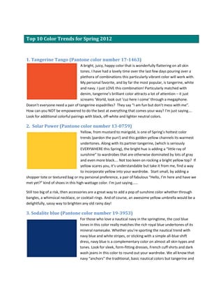
  • 1. Top 10 Color Trends for Spring 2012 1. Tangerine Tango (Pantone color number 17-1463) A bright, juicy, happy color that is wonderfully flattering on all skin tones. I have had a lovely time over the last few days pouring over a plethora of combinations this particularly vibrant color will work with. My personal favorite, and by far the most popular, is tangerine, white and navy. I just LOVE this combination! Particularly matched with denim, tangerine’s brilliant color attracts a lot of attention – it just screams ‘World, look out ‘cuz here I come’ through a megaphone. Doesn’t everyone need a pair of tangerine espadrilles? They say “I am fun but don’t mess with me”. How can you NOT be empowered to do the best at everything that comes your way? I’m just saying…. Look for additional colorful pairings with black, off-white and lighter neutral colors. 2. Solar Power (Pantone color number 13-0759) Yellow, from mustard to marigold, is one of Spring’s hottest color trends (pardon the pun!) and this golden yellow channels its warmest undertones. Along with its partner tangerine, (which is seriously EVERYWHERE this Spring), the bright hue is adding a “little ray of sunshine” to wardrobes that are otherwise dominated by lots of gray and even more black…. Not too keen on rocking a bright yellow top? If yellow scares you, it’s understandable but take it from me, find a way to incorporate yellow into your wardrobe. Start small, by adding a shopper tote or textured bag or my personal preference, a pair of fabulous “Hello, I’m here and have we met yet?” kind of shoes in this high-wattage color. I’m just saying…… Still too big of a risk, then accessories are a great way to add a pop of sunshine color whether through bangles, a whimsical necklace, or cocktail rings. And of course, an awesome yellow umbrella would be a delightfully, sassy way to brighten any old rainy day! 3. Sodalite blue (Pantone color number 19-3953) For those who love a nautical navy in the springtime, the cool blue tones in this color really matches the rich royal blue undertones of its mineral namesake. Whether you’re sporting the nautical trend with navy blue and white stripes, or sticking with a simple all-blue shift dress, navy blue is a complementary color on almost all skin types and tones. Look for sleek, form-fitting dresses, French cuff shirts and dark wash jeans in this color to round out your wardrobe. We all know that navy “anchors” the traditional, basic nautical colors but tangerine and
  • 2. yellow will give you new twist to the nautical theme. Adding Cabaret (October 24) and Margarita (November 7) can give a whole new dimension to the trend. Knowing ways on how to wear the nautical trend can definitely bring the best out of the new season. This is a trend that will never go out of style. It is a classic look that can definitely make you stand out among the crowd. It probably doesn’t hurt that the Duchess of Cambridge (aka Kate Middleton) frequently wears similar colors. After all, her husband is in the Royal navy….I’m just saying….. 4. Cabaret (Pantone color number 18-2140) Cabaret is literally a hot pink. Don’t you love hot pink? I do. It’s a “Look at me now” shade of pink that’s extremely flattering, warms pale skin tones and contrasts well with darker complexions. The key to making this vibrant color work for you is to pair a hot pink dress with decidedly adult shoes like sophisticated black pumps or strappy nude stilettos. A simple, black or metallic clutch works best too. If the idea of drawing a lot of attention to yourself makes you quiver, you can access the trend with an accessory. Switch it up with a studded, pink suede evening bag, fabulous shoes or show stopping earrings. Lipstick or blush which will add an instant edge to anything you wear. Oh, and keep in mind that a woman in hot pink can’t be a bore. You had better have some zingers if you plan to swan around in hot pink. Think Holly Golightly…….I’m just saying…. 5. Starfish (Pantone color number 16-1120) This deep khaki is the perfect backdrop and works well as a solid base with dynamic accents such as Sodalite, Tangerine Tango, Solar Power and Cabaret. This practical neutral radiates warmth so naturally that it will be one of the major players for Spring 2012 for both women and men. Khaki makes me think of sandy beaches…and hot dessert retreats. The color is the perfect transition from the cold winter season. Starfish should become a staple in your wardrobe – you can take your look casual or sophisticated depending on how you pair it with accessories or the other pieces of your wardrobe. I like it because it is adaptable in many styles and easy to jazz up with the vibrant colors associated with the Spring 2012 collection. Incorporate this shade on top of your brighter colors or try a layered look for a more feminine touch. Whether you choose a khaki trench coat or earthy suede clutch, neutral colors can work for anyone and with any spring look. 6. Margarita (Pantone color number 14-0116) This toned down version of a margarita is a subdued yellowish green that lifts spirits with its refreshing and stimulating glow. The hue reminds one of the classic combination of lime and salt….yum…and just like the combination, using this color should be done in moderation. As a fun fact, the original Margarita was invented in 1948 by socialite Margarita Sames. According to the legend it was during a party at her cliffside hacienda in Acapulco that Margarita began experimenting with
  • 3. ‘the drink’. Looking for something to cut the dust of a hot afternoon, she mixed Tequila, Cointreau and fresh lime juice. Her cocktail kept the party going for two weeks and today the Margarita is the #1 most popular cocktail in the U.S. So, the moral of the story ladies is attitude…..So, go ahead, salt and lick my rim….I’m just saying….. 7. Sweet lilac (Pantone color number 14-2808) Lilacs where I grew up were known as the harbinger of spring. When the lilacs bloomed, all was right in the world! This luxurious, romantic and floral-inspired lavender shade flatters all skin tones. Seen in various fabrics from cotton wovens, silk embellished ruffles and striped jersey knits, this versatile color translates from casual to evening and is perfectly soft and pretty. One can’t help but think of Mila Kunis’ stunning lilac Elie Saab dress at the Oscars as a catalyst for spring’s soft purple hues. I love that the super flattering hue is richer than a typical pastel ‘cuz it might energize you to play with lilac’s trademark sweetness to vamp it up a bit with edgier pieces to add some punch to your look. Sweet yes, but sassy, hell yes!…..I’m just saying…. 8. Driftwood (Pantone color number 18-1210) Natural, versatile neutrals add practicality to this season’s vibrant colors. Driftwood, an adaptable blend of beige and gray with a slightly weathered feel won’t brighten a dull day, but this moody gray can help balance out some of the bolder spring colors. Neutrals have the advantage of never really going out of style, mainly because they’re so versatile, but also because many women feel more comfortable wearing neutral colors than they do very bold colors like tangerine, yellow or purple. By definition, a neutral color is not warm or cool, so in theory, neutral colors are meant to work with any other color – choosing a focal piece of your wardrobe in a neutral color allows you to change your accent pieces at a whim….I’m just saying….that never again will you be saying, “I have nothing to wear.” 9. Bellflower (Pantone color number 18-3628) One of my favorite colors for spring, it has been described as “a distinct ornamental purple, exudes uniqueness and creativity.” Named after a violet blue flower, this purple will light up many skin tones and is a fresh springy take on purple. Okay, so by now, you all know how I feel about the importance of adding a little color to your wardrobe this spring (Tangerine Tango, hello????) but you shouldn’t overlook a cute purple dress or skirt either. Mix it up with cowboy boots and giant shopper tote to add your own touch to the look. Unlike other colors that add a pop to your wardrobe that may fade in popularity, purple is a timeless standard and can be recycled easily for summer and fall. Purple is office appropriate, and also great for a day at the beach, and is way cooler than pink. Purple is so easy to pull
  • 4. off, make it a must for your spring shopping list…flirty, feminine and oh-so versatile, a purple dress is a serious must this season! No one will accuse you of being a shrinking violet…I’m just saying…. 10. Cockatoo (Pantone color number 14-5420) This blue-green shade looks less like a bird and more like the Mediterranean Sea. It will look refreshingly like the ocean and pop beautifully with some of the more subdued neutrals. From sandals to shoes to jewelry and home decor, this blue-green shade is the fresh color for Spring 2012. Spring is all about fun colors and feeling fresh. This unusual hue of blue-green just makes me think of: nature, fresh, growth, abundance, life, youth, renewal, hope, peace, balance – all the wonderful promises we think of for springtime. Cockatoo is such a versatile color that can be accented with a plethora of colors like tangerine, yellow, pink or even lilac. That’s it. We hope you enjoyed our review of the top spring colors for 2012! Let us know what you thought. What is your favorite of all the colors? Search Salon from all over USA: http://salonspasource.com Read More about Salon Tips at : http://salonspasource.com/blog/