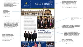
1. Italic style writing connotes to the
old fashioned style buildings, which
till now these buildings were and
are considered posh and
sophisticated, this links with how
the students are dressed.
The blue background indicates the rich
background how much expensive this
college is, when we think of blue we
automatically think, posh, expensive,
sophisticated and well mannered. This
links in with the images of the students.
Posh building
reinforces to the
sophisticated
students dressed
smartly as well as
the high standards
Sophisticated students,
people reading this can relate
to them
The only negative side of this article , is
that it only shows the middle/high class
people. Others who are not in these
categories will not find this appealing
and will back away because they feel
they cannot compete with the high
standards of this college.
They are dressed very neatly
and look good-mannered, this
indicates the school is very
high class and people wanting
to come to this can expect
these high standards
The word investor can relate to the students
expensive suits, due to the fact investors are
highly wealthy and wear suits.
The well structured writing reflects
how well organised the college is, this is
also shown by how well organised and
neat the students are shown towards
us.
Images at the bottom show
how diverse they are in terms
of sports and activities and not
only focusing on education.
2. The title is big and bold, its also red which links in
with the red shirt
The red shirt and title connotes
she’s sexually active due to her
dressing as well the colour red.
She’s presented as a cheerful
and confident person, this is
shown by the way she's
standing and her facial
expressions indicates she's
satisfied and proud with her
self.
Her style of dressing and
appearance reflects the
stereotypical western American
‘college girl’.
The background looks like
it’s a very friendly green
environment, the
environment also links
with the way the girl is
dressed and her emotions
i.e. its summer and she's
happy, she’s tanned etc.
The sub-heading may link in with
the girl in the image as the words
‘American’ and ‘Teenager reflect
this
There’s a little skin shown
which may attract the
opposite sex
The magazine is free, its shown so
people can see it.
3. AS Media Studies Preliminary Task – School Magazine Front Page Proposal Form
Target audience:
(age range, interests)
Although it is a school newsletter you still have to think about
your audience and how to appeal to them.
targeted at group age between 11-16 year olds. Young audience
Possible title ideas:
(masthead / title block)
What is your magazine going to be called?
Main image:
What will be the focal point of your front page, remember, your
work “must include a photograph of a student in a medium
close-up”
Two students smiling with arms around each other
Main cover line:
What will be the main story?
Preston manor football team
Additional key images:
What other images will be on your front cover?
Remember, it is a school magazine.
teachers, view of the school, football team and other students in their daily school life
Additional cover lines:
Other features, stories or selling points which will be inside the
magazine, these need to be audience appropriate.
school related matters and situations, activities, extra curriculums etc.
Typography:
(style, size, colour of copy)
Think about the writing and the style of the writing on your front
page.
A4 sized front cover
Background colour/image:
What will be in the background, remember you don’t want to take
the focus away from the main image.
light purple background
Technical considerations:
(equipment, setting, props, costume, lighting)
Be realistic and creative, think about what you have access to and
how you could use it.
using Photoshop and DSLR camera