Cadbury launches new fruit flavored marshmallows "Fruitllows
•
1 like•544 views

Cadbury launches a new marshmallow product called Fruitllows to challenge its main competitor Haribo in the candy market. Fruitllows are marshmallows that taste like real fruits. The visual for the promotional campaign is based on Monet's painting "Nature morte, poires et raisin" and depicts fruit replaced by Fruitllows marshmallows. The slogan "Fruitllows, Marshmallows have never been so fruit" plays on this visual deception to highlight the unique fruit flavors of the new product.

Recommended
Recommended
More Related Content
Similar to Cadbury launches new fruit flavored marshmallows "Fruitllows
Similar to Cadbury launches new fruit flavored marshmallows "Fruitllows (20)
More from Sharmili RAJARATHINA
More from Sharmili RAJARATHINA (11)
Cadbury launches new fruit flavored marshmallows "Fruitllows
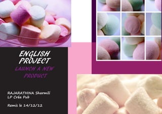
- 1. ENGLISH PROJECT LAUNCH A NEW PRODUCT RAJARATHINA Sharmili LP Créa Pub Remis le 14/12/12
- 2. PRESENTATION OF THE PROJECT Targets The market candy The benefits of the candy market were around 3,39 Miliards in 2011. In France, 171 800 tons of can- dies are bought every year, that is to say, 80% by supermarkets and, 20% by bake- The brands try to segment the market to its maximum ries, stations and etc... in order to satisfy the demand. The candy market mostly In 2011, the candy targets the children who ask for acid drops. This market market is still growing is lead by Lutti which produces, like its competitors. many (+1,2%). This is one of new ranges of products in order to satisfy the consumers. the rare products that Moreover, this kind of product has the advantage to seduce is not be threatened by a large target. the crisis. The brands emphazise the fact that the pleasure / price ratio is really good and incomparable in the market. The segment which had known the most important growth is the adult segment. A particular segment called « thirty The major brands that take benefits from the market are : regressive», who are nostalgic of their childhood, seems to Cadbury, Haribo, Lamy-Lutti, Solinest, Wrigley... be the new target of the brand. Cadbury launches a new product is an english brand that Cadburry already owns the marshmallows This choice of introducing this new pro- was created in 1824. In mark (brand), under the name of (named af- duct is due to the fact that Haribo, the 2010, they were bought ter) Pascal Marshmallows, but it’s only distri- main competitor, only produces marsh- by an american society called Kraft. buted in Great Britain. In order to challenge mallows with specific tastes (candy floss, The society produces candies and his main competitor on the candy market, tutti frutti... ). drinks. This is the only international Haribo, they decided to enter the marsh- producer to use ingredients from the mallow market with a new product called They target adults, the growing segment. fair trade et biological farming. They Fruitllows. Launch of a new type of product Their aim is to make their product the own Poulain, La Pie qui Chante, Bou- : marshmallows which has the taste of real most wanted one by targeting people quet d’or and Michoko. fruits. who have a certain pruchasing power. It aims at being a top of the range product. 2
- 3. VISUAL 3
- 4. Slogan FAIR VISUAL TECHNIC The base line is « Fruitllows, Marshmallows have never been so fruit.». It was created especially Briefly for the ad. The term «Marshmallows» is used in order to tell what kind of product that the It is an promotional campaign which aims at launching a new product. Cadburry ad sells. As the visual can be misinterpreted, decides to use a traditionnal media : the billboard, which is the best channel when the term removes the doubts. The choice of the you have to promote a new product. They mean to use a cultural reference, in order «have never been», suggest the fact that the to link art with the product, which gives it a certain standing. The visual was chosen product is new, but also that it has a competi- in order to make people skeptic and thoughtful. This is based on a elegant tone. The tive advantage. Not using the puriel for the word disposition was made under Photoshop. fruits is not a fault of spelling, but to transforms the common name in adjective. The slogan re- minds the main caracteristic of the product. The brandname and the logo The typography reminds a handwriting writing FFruitllows is a The prononciation has a specific meaning. which can be link to a know-how but also to the Fruitllows brandname which The first part can sound harsh, whereas elegance and the rareness. was created purpo- the end sounds soft, which refers to the sely for the ad. It aims marshmallow, which is a little dry at at mixing the taste of fruit (the main first, and finally melts down in the mouth. The visual specific caracteristic of the product) The visual which re- and the product itself (marshmallows). The logo was made especially for the pro- presents a still life was The choice of the two LL, instead of duct on Illustrator. It aims at being elegant created entirely under only one in the brandname Fruitllows, that qualifies the position of the product. Photoshop. The frame is made, in order to recall the word The choice of the color (black and white) in was taken on a website. : marshmallows, but also not to give addition, aims at conveying a message of the brandname a negative meaning (if luxury. This choice is due to the fact that This is a cultural refe- you write fruilows wit h one «l», it the product line is so large that giving rence to Monet’s pain- contains then the word «lows» which a special color can make them loose their ting «Nature morte, can be misinterpreted). consumers. poires et raisin» which was painted in 1867. The disposition of the ad The packaging retakes the disposition of this painting. First of all, The packaging is a web creation, available on the website as the market is french, it could be considered im- devianart in the following URL (http://nomibee.deviantart. portant to make a reference to a french painter. com/art/Candy-Packaging-130248895) and was made Moreover, the fact that you have to belong to a by NomiBee. It was choosen because of its elegance but also certain cultural background to catch the reference the fact that it corresponds to the product and his flavor. contributes to the image of luxury of the product. In fact, each packaging suggests a particular savor. It per- The message plays with the form. It justifies the fectly mix the concept of Fruitllows which is luxe and taste main caracteristic of the product which is the fruit of fruits. flavor. As the fruits are replaced by marshmal- lows, the link was established implicitly. We enter The packaging was changed on Photoshop. The licorices through the visual, which at the first sight seems were changed by the marshmallows in each packaging. The to be a still life. But, then you see the packshot and word «licorices» was erased. The Cadburry’s logo was add, the slogan which makes you realise that the fruits it was recreated under Photoshop to give it a certain image aren’t fruits but the marshmallows. The com- of luxury. The brandname Fruitllows was written on each pulsory phrase closes the ad, but the fact that it packaging with the colors which corresponds to the flavor. contains the word «fruits» can be considered as a plus for the ad. 4