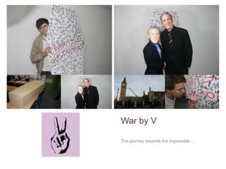
2. +
Contents of presentation…
1. Conventions of music videos/ conventions of music video of
chosen genre.
2. Advertising V; A look at digi-pack and poster/ Links to actual
video.
3. Audience feedback, what people thought.
4. Use of media technologies
3. +
Background to piece: Group
members…
Myself and Danny worked together last
year on our WAFTA award winning title
sequence „Spencer.‟ A combination of
creativity and technical ability has
allowed our group to flow effectively
whilst also maintaining a high quality of
work.
Conor Luxford entered the group this
year, equipped with fresh ideas on how
to bring a new wave of imagination into
the group project.
4. +
The band, values and
ideals…
A look at what drives the band, and the ideology behind the brand
that is, „V.‟
5. +
Audience…
At the commencement of the project, we
decided to draft the basic version of what we
considered to be the archetypal fan of the
music of V.
The several main features of the profile were of
an unreligious, middle class professional, who
are also inclined to be anti-establishment.
6. +
The band ideology…
The ideology of the band was automatically assigned due to the nature of the
video itself. Because of the political anti-war status of the music video itself, the
band would naturally share these views, thus resulting in V. adopting these views,
and expressing them through political statements, as seen in the final product,
and in the image above.
8. +
The video…
The product itself, and it‟s relationship alongside the band.
9. +
Synopsis of video…
The video can be broken down into several key segments that each
collectively make up the effectiveness of the music video.
1. The use of stop animation to effectively dictate the idea of a filming
sequence, and the subsequent impression this gives.
2. The use of regular filming shots, which would eventually go onto be
edited with a sepia contrast creating an atmospheric shot that connotes
the idea the group is trying to convey, that war is bad and dark, and
therefore shouldn‟t be presented in a positive light.
3. Use of the logo throughout the music video, appearing at several times,
reinforces the idea of an up and coming band trying to make it in the
business.
12. +
Use of Goodwin‟s Theory…
Lyrics and visuals
Use of lip-syncing equated to a correlation between
lyrics and visuals, and this can be seen directly
through the shot to the right…
Our use of the coffin scene directly correlates to the
line in the song that reads, “friend only to an
undertaker.”
Music and visuals
The footage taken of Lawrence performing the song
directly links to the music playing, subsequently
allowing us to convey Lawrence as choreographing
his dancing to the fast beat of the song.
The sharp movement of the stop-motion shots is
choreographed to be in time with the beat of the
music.
13. +
Use of Goodwin‟s theory 2…
Genre characteristics
The psychedelic rock displayed in the video allowed
us to make the video unique and revolutionary in
terms of what we as the makers could do. This
resulted in the trips to London and the focuses of the
piece. We also decided to follow the trend of
psychedelic rock by adopting a particular cause on
which we would campaign with through use of the
song.
Intertextual references
The music video itself s in its entirety a whole
intertextual reference, referencing many wars as
well as featuring several famous London landmarks,
including Big Ben and Buckingham Palace.
14. +
Ancillary texts…
A look at the poster and digipak….
15. +
POSTER:
On the right you will find my poster, and you will
see how the music video itself and the poster co-
exist effectively. As you can see, my use of
various colours highlights the revolutionary theme
that the video is trying to compute. The
underlying and potent use of the peace logo
signifies once again the message of peace, and
the central image also reiterates our focus on the
politics of war. My decision to place this image in
the centre of the poster was made in order to fully
enforce the potent nature of the peace. My use of
vibrant colours will also appeal to the target
audience, whose liberal approach to life will allow
them to be more unguarded in their acceptance
of posters.
16. +
DIGIPACK:
My digipack design is once again indicative of the rest of our project. The front cover of my digipack is purposely
neutrally coloured in its design, and as a result, the two figures in the foreground of Bush and Blair each stand out
more as a result. My decision to design the typography in red and black echoes the approach of the video in subtly
and yet effectively reflecting the necessity of peace, as red connotes blood and black connotes general darkness. The
second panel design is once again indicative of the music video itself, and reflects the view that although the Union
Jack is respected around the world, my use of the church window filter on Photoshop also represents ther loss of life
seen by Britain in our struggle to maintain peace.
17. +
Digipack 2…
My third window portrays a picture I took on Parliament Square, and shows a lock that reads, “free the
square.” I applied the “darkness” filter onto the image, and also used the painting tool to instigate the
music video approach of blood and subsequent war.
My fourth window also conveys a series of images depicting famous world leaders of the last ten
years, representing those that played some role in either the War on Terror or War in Iraq.