Call Girls Near The Corus Hotel New Delhi 9873777170
Hip-Hop Fans Teenagers Young Adults
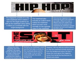
1. The magazine consists of a very Some hip-hop magazines have
The masthead also words that are part of the masthead
bold masthead which makes it
includes an outline which but smaller, different font style or
clear for the target audience as
makes the masthead different colour this creates more
well as the masthead colour being excitement for the audience and
stand out even more
in black so it contrasts with the emphasizes the masthead in general
normally it’s the opposite and gives the front cover/magazine
bright background
colour to the masthead that extra oomph
Different from other Similarly, my masthead is bold However I did not add any outline colours
magazines, part of the and the font style is similar to as I feel the masthead already stands out
masthead I had rotated
vertically alongside the rest
the masthead above and it’s from the background colour, by that it
to create a unique brand really large in size as well as shows the music genre the magazine
appearance whereby contrasted with the white comes from being hip-hop because it’s
customers find it easier to background.
remember the company logo
vibrant and unique.
2. Feminine colour to attract female
Many different fonts
audience as well as males. Challenges were used within the
hip-hop magazines because usually magazine so it can
consist of masculine colour background attract different
audiences and this
supports the traditional
Challenges hip-hop magazine because of the hip-hop magazine as
female rapper used on the front cover, gives a there are many fonts
masculine posture, holding jeans and learning used with the magazine
forward. Also, clothes worn are masculine as to supply a sense of
well as the extra props being the bandana and edginess as well as the
the headphones. main cover-line being
the largest font size with
The layout consisted of a colour palette being black white
and yellow. The variation of colours were used for the
the exception of the
edginess and gives the magazine that look of style and main masthead.
strength that signifies hip-hop in this generation.
Masculine coloured background .. Model to another in
(typical). Red, Blue & White. It portrays comparison to my
the masculinity via the layout of the magazine the model is at
magazine and the colours used. the centre stage while the
cover lines are around
her. Also it uses colour
contrasts to make the
Supports the stereotype of using a male rapper for magazine stand out, the
a hip-hop magazine, posture in a masculine manner colour palette used for
as if he’s going to fight which is thought to be more this layout are black,
of a manly act. Topless with a lot of tattoos white and red. Both the
supports the masculinity not forgetting the jewelry models are looking at the
as well. camera to show intensity
and to make it out as if
The layout of a typical magazine also consists of they are looking at the
different font styles as well as cover-lines being the audience which creates
biggest excluding the masthead. However in this more involvement
magazine coverlines are shifted to one side and the..
3. Supporting
typical hip-
hop
magazines, t
he models
consist of
jewelry and
this conveys
hip-hop and
it’s power
also it’s an
aspect one
can show off
with being
how
expensive
the jewelry
is.
Evidently, the
models used for
hip-hop
Supporting typical hip hop Even though having a female on the magazines would
magazines, Props include front cover of a hip-hop magazine Looking at a typical hip-hop consist of jewelry
Bandanas /hats as that is a key breaks the stereotype, masculine magazine we can analyze props as this signifies
aspect of violence and gangs aspects are still used to portray that such as hats are worn so this hip-hop and it’s
which is a huge part of the hip- hip-hop feel such as loose idea I took into account for my power that the
hop genre. Also, the use of jeans, black trainers as well as loose magazine genre consists of.
headphones emphasize that this black hood as we can see masculine
is a music magazine so this helps colours are used and we get the
the audience identify. idea even the female rappers This challenges the conventions of my magazine as the male models
consist of a male personality. are wearing tight vests this also signifies hip-hop because it gives
the audience a chance to see how ripped the rappers bodies are
this shows physical power as well as showing a strong body
language.
4. Teenagers Hip-Hop Fans Young Adults
Due to the hip-hops unique sense of
One of my target audience based upon my
Another target audience are those excitement and youthfulness, the genre
hip-hop magazine are teenagers. This is
who already have an interest in hip- consists of a lot of contents that are not
because there are a lot of hip-hop songs
hop music. This target audience suitable for young children nor senior
that talk about their pasts when they were
will recognize the magazine from citizens because it involves reviews of
teenagers themselves so this gives the
it’s edgy look and one advantage different songs of different artists as well as
young consumers an opportunity to relate being is that they take more gossip that involves sex, drugs, money,
to the genre as well as teenagers having interest in the genre so they’ll be alcohol and many more which sums up hip-
outspoken and bright personalities, this more fascinated by the aspects to
hop in this day and age. Putting aside the
relates to hip-hop magazine because the which my magazine provides. In
gossip, the humour that my magazine
magazine itself has a vibrant and outspoken relation the artists that are in the
magazine the audience will already consists are directed to young adults
personality meaning giving the latest
identify and establish who they are because of some of the aspects listed above
insight within the industry, reviewing songs
that young adults might find interesting.
and albums and many more.
5. My magazine
My magazine (left) supports a typical magazine (up), uses
(right) because it uses quotation marks to conventions of a
develop the point that it is being discussed and typical hip-hop
also lets the readers get involved by letting them magazine (down)
My magazine (left) uses as well as develops a typical know who said what. This makes the point more because quotes a
magazine (right) in the written content as it talks clearer as we know what they are talking about lyric by whoever the
about topics relating to the picture one the other side as well as creating excitement too. artist is and
of the page. Also it purely talks about aspects to do whatever the topic is
with that particular artist or about the music, it never about. For example
goes out of topic and the topic it talks about it goes my magazine (up) is
straight to the point. Also in regards of presentation a review of a
upcoming artist and
both the magazines take advantage of using more
she’s been criticized
than one colour, this makes the page look more for her swearing
unique and presentable. which is shown in the
quote with the use of
‘****’
6. Also the clear
contents page
hints out like it’s
a hip-hop
The use of props and the costumes helps magazine due to
to portray it’s a hip-hop magazine the layout and
because of the use of baggy how the
jeans, hoodies and bandanas. Looking at a contents page
typical hip-hop magazine props such as itself is
guns and the use of tattoos makes THE presented.
SOURCE look like a hip-hop magazine.
The use of extra coverlines on top
of the magazine hints out that it’s
part of a hip-hop genre as it
relates to the masthead.
The unorganized use of fonts and font
style give us a sense that it’s a hip-hop
magazine genre because typical hip-hop
magazines are known for their edginess
and due to this makes the magazine look
more exciting and unpredictable.
7. The layout consisted of the models of both magazines being in
the middle. As well as the main cover-line being the biggest
with a clear masthead and sharing the same edginess.
However, my masthead challenges the conventions of a
typical hip-hop magazine because it only consists of one
picture on the front cover whereas the typical magazine (right
hand side) has more pictures towards the side of it however I
feel by doing that it makes the magazine look more cheap.
Also I’ve used one sold background colour whereas the typical
magazine just used the whole picture itself for it’s background
also the models are looking directly at the camera.
The contents consist of different colours and sizes within
both contents page. My magazine supports conventions of a
typical hip-hop magazine as it has put the models towards
one side in order to present the features of the contents
page more clearly. I’ve taken advantage of the use of
numbers to make it more easier for the readers to see what
page shows which topic. I’ve also used a puff to create even
more excitement to show what the magazine has to offer.
The pictures of the double page spread are put towards
one side of the page, while the title is clear and grabs the
readers attention for example the page on the left (mins)
shows clearly ‘good girls’ gone bad and grabs the readers
attention as well as the page on the right saying life of the
shooting star the font style and colour had helped both of
the double page spread. Also the use of different colours
for the writing content makes it look more approachable.
8. Audience are clearly
shown that this is the
contents page with
clear and bold writing
Dates are added
My contents page uses conventions
of a typical hip hop magazine by
shifting the features and text to one
side of the page and making it clear
what that topic is about, it uses
contrasting colour with the
background to make it more
presentable and clear
My magazine uses
conventions of a typical
magazine by numbering
the topics so it becomes
easier for the audience
My magazine contents page uses
the same conventions as a typical
contents page by only having one
picture and shifting it to one side
Contrasting colours used
My magazine also challenges conventions
typical magazine because a typical
magazine consists of a plain background
while I added a background with design in
it to look more appealing and catch the
eyes of the audience
9. I have used and
developed
conventions of a
typical hip-hop
magazine as I’ve
come up with a
short catchy
name that grabs
the readers
attention as well
as developing it
by adding ‘The’
to it and rotating
it so it becomes
vertical, this is
very unique and
due to that
audience will
realise the
company name
through the
unique display of
the mast head.