
Recomendados
Más contenido relacionado
Destacado
Destacado (18)
Más de SianLynes
Más de SianLynes (20)
Último
Último (20)
Billboard: Magazine Analysis
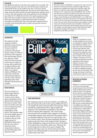
- 1. COLOUR COVERLINES Here Billboard conforms to the three colour palette but very simply. The The main cover line “BEYONCE” in capitals is the centre of visual dark blue is present in the main cover line, the lime green relates to the interest so it clear that it relates to the main image. The text is masthead fill of the„d‟ in the smallest cover lines, and wob is used by presented as a gradient from white, left to dark blue, right. This white text on the gradient background. The mise-en-scene of the central allows it to match the colour pallet of the magazine and draw image of the dress adds contrast to the dark background; making it stand attention to it in comparison to the solid/defined colour of other out more. The only exception to the colour palette rule is the masthead text. The minor cover lines in relation to the main cover line are used to entice the reader, firstly by using single nouns such as logo which the „b‟ is filled with red, this is the regular appearance of the “Singer. Actress.Businesswoman.Philanthropist.” in a smaller font logo so this same exception resumes for every issue. Overall the blue to positively sum up their main feature in the magazine. The word theme gives the magazine a cool feel which also makes it transmit „PLUS‟ on the cover also gives connotations to the reader that there connotations of being trendy. This colour also shows superiority that is is more „for your money‟ and extra content in the magazine. A plug normally a male stereotyped colour so adds to the powerful „women‟s is also used: „Paramore hits the road as headliner‟ to attract the music# theme. reader into the music group‟s latest activities and want to be a part of it. Another cover line appears around a blue lined circle which immediately strengthens the importance of the subject in comparison to the other cover lines. AUDIENCE FONTS Firstly, it is important to point The audience for this out that significant cover stories magazine would be are displayed in capitals whereas primarily young women as least significant articles are in above the masthead lower case such as „Rising Star‟. “women‟s music” is The thin and wide font used prominent; attracting in consistently for the main cover women as they can relate to lines gives the magazine a chic and fashionable look. This font the theme of the magazine. also correlates with the target The central image of music audience of women as it is not icon, Beyonce, would too thick and therefore intrusive; attract her fans and young appealing to their primary women who can relate to audience of women. The her age. Men would be the emboldened fonts connotate to secondary audience who the audience that the cover line would be drawn to other or subject is significant against topics or are regular the rest such as „Lady Gaga‟. This readers of Billboard. The strategy also balances the fonts colour blue would also and giving the page more variety. subconsciously appeal to men but is also a mutual appealing colour when SPACING & OTHER diverged with the picture of COMMENT a female. Billboard is an American magazine as well as an internationally MAIN IMAGE recognised music chart which has a variety of different music genres The cover image is of within the charts. The magazine female singer, Beyonce however focuses on mainstream BY SIAN LYNES which reinforces the music such as pop/dance which has a mass audience in comparison to „women‟s music‟ theme THE MASTHEAD other genres. Therefore artists or again and appeals to their other music relations regularly primary focus audience for appear on the cover in relation to The masthead conforms to the rule of thirds as the Billboard this issue of women. With their success or rising achievement logo and tag line take up the entire spacing. Billboard‟s logo is the icon‟s hands on her hip in the Billboard 100 chart (the very simple with iconic coloured circles in the lettering. As the with a strong posture this overall chart sales). The magazine logo fills the masthead from left to right it enables the conveys power and is published on a weekly basis in magazine to be immediately recognisable on the shelf and the same timing as the regular independence of the stand out against other magazines. The central image chart updates. Billboard circulates person. This therefore takes obscures part of the masthead which suggests it is already a 19,000 a week, but has been in a lot of the middle space in recognisable magazine and connotates to the audience that it decline and prolongs recognition the rule of thirds. Text is mainly from its web and chart is a reputable magazine if they have not read it before. The avoided on the top of the based industries. The spacing is line „women‟s music‟ above the logo immediately informs the image (except for neutral as a lot of text is used as the audience about the theme of the magazine before buying it. BEYONCE) which shows bottom left and right of the cover Unlike „RollingStone‟ magazine the banner does not fit within that the cover artist is with spacing between the top left the masthead but at the bottom right corner. This gives the and right text. This spacing in the important and no central image and coverlines more space to display. The central rule of thirds balance the compromise is taken to kerning of the logo is also very close but does touch which cover so it is not over cluttered and show the full image of the makes it more distinguishable to read and adds a simple & the customer is not bombarded important artist. with the magazine‟s offers. modern look to the cover.