1. BY SIAN LYNES
CONTENT JUXTAPOSITION OF ELEMENTS
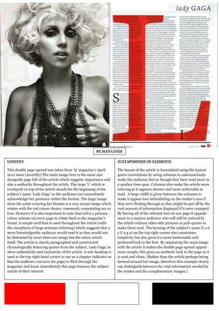
This double page spread was taken from ‘Q’ magazine’s April The layout of the article is formulated using the typical
2012 issue (monthly) The main image here is the same size genre conventions by using columns to subconsciously
alongside page full of the article which suggests importance and make the audience feel as though they have read more in
also a authority throughout the article. The large ‘L’ which is a quicker time span. Columns also make the article more
overlayed on top of the article stands for the beginning of the enticing as it appears shorter and more achievable to
subject’s name ‘Lady Gaga’ so the audience can immediately read. A large width is given between the columns to
acknowledge her presence within the format. The large image make it appear less intimidating on the reader’s eyes if
show the artist covering her breasts is a very sexual image which they were flicking through as they might be put off by the
relates with the red colour choice; commonly connotating sex or vast amount of information displayed if it were cramped.
love. However it is also important to note that red is a primary By having all of the relevant text on one page it appeals
colour scheme on every page to relate back to the magazine’s more to a mature audience who will still be enticed by
brand. A simple serif font is used throughout the article (with the article without other side pictures or pull-quotes to
the exceptions of large sentence lettering) which suggests that a make them read. The kerning of the subject’s name (l a d
more knowledgeable audience would read it as they would not y G a g a) on the top right corner also connotates
be distracted by more than one image but the entire article simplicity but also gives it a more fashionable and
itself. The article is clearly paragraphed and constructed preferred look to the font. By separating the main image
chronologically featuring quotes from the subject, Lady Gaga, to with the article it makes the double page spread appear
show authenticity and exclusivity of the article. A sub-heading is more simply; this gives an aesthetic look to the page as it
used at the top right hand corner to use as a chapter indicator so is neat and clean. (Rather than the article perhaps being
that the audience can turn the page/or flick through the formed around her image, therefore this example clearly
magazine and know immediately this page features the subject can distinguish between the vital information needed by
article of their interest. the reader and the complimentary images.)