
Recomendados
Más contenido relacionado
La actualidad más candente
La actualidad más candente (20)
Destacado
Destacado (20)
Similar a Mast head design
Similar a Mast head design (20)
Más de Sophietyndall
Más de Sophietyndall (20)
Mast head design
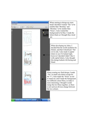
- 1. When starting to design my mast head I decided I wanted ‘The’ to be smaller than ‘Bromley’ and ‘Bromley’ to be smaller than ‘Noise’, I also wanted the background to be blue. I made the letters black as I thought they stood out. When developing my ideas, I decided that the words needed to be thicker, and that I should put ‘The’ on its side, I also made it capital letters to see if it looked right, however I decided I didn’t like it with capital letters, I also thought this design looked a bit boring and bland. When creating my final design, I made ‘The’ in small case letters except for the ‘T’, I also made the ‘Noise’ in red to stand out, and I made the background two different colour blues, to make it more interesting, I thought I could merge the two blues together, so there is not such an obvious change between the two colours.
- 2. After drawing my designs, I then went on to photoshop and began to create my mast head. I first put the words in ‘The’ and ‘Bromley and found a font I liked, after searching through a few I came across ‘book antiqua’, I liked it because it stood out and was more modern than some other fonts. I then put the word ‘Noise’ in and made it bigger, and red, I made it the same font though, because I thought it would not look right otherwise. I then made the background I used to two different blue colours and tried to merge them together so from the bottom left corner to the top right corner it goes from light blue to dark blue. I like my mast head, as I think its quite bold and stands out, however I think it may be slightly too big. However I will see when I put it on my newspaper.