
Recomendados
Más contenido relacionado
La actualidad más candente
La actualidad más candente (20)
Destacado
Similar a Poster research
Similar a Poster research (20)
Más de Sophietyndall
Más de Sophietyndall (20)
Poster research
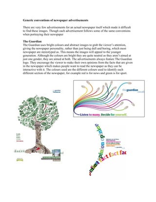
- 1. Generic conventions of newspaper advertisements There are very few advertisements for an actual newspaper itself which made it difficult to find these images. Though each advertisement follows some of the same conventions when portraying their newspaper The Guardian The Guardian uses bright colours and abstract images to grab the viewer’s attention, giving the newspaper personality, rather than just being dull and boring, which most newspaper are stereotyped as. This means the images will appeal to the younger generation. Although the colours are bright they are quite neutral as they aren’t aimed at just one gender, they are aimed at both. The advertisements always feature The Guardian logo. They encourage the viewer to make their own opinions from the facts that are given in the newspaper which makes people want to read the newspaper as they can be interactive with it. The colours used are the different colours used to identify each different section of the newspaper, for example red is for news and green is for sport.
- 2. Daily Telegraph The Daily Telegraph looks more sophisticated and would appeal to the older generation. The background colours are very neutral making it non gender specific, helping to give it a serious feel. The images are of celebrities that the older generation would relate to and recognize. In both advertisements the newspaper uses the same slogan "It pays to think big" showing that people and things have developed into greater things which is what the newspaper wants its readers to do, become something because of the stories they have read, etc.
- 3. The Times The Times uses simple images and neutral colour schemes so the advertisement isn't aimed at a specific gender or age. The advertisements include the logo and same font as the logo on slogans and text. The second advert is more likely to grab some body’s attention as it is an emotional image, like an emotional plea to the readers. The Sun
- 4. The Sun advertisements focus more on value for money rather than the stories included in the newspaper. The till receipt is especially effective as people are interested in value for money. This image shows readers exactly what they can get for 30p. The adverts include The Sun logo. It also uses images of people that the readers can relate to. The colours are quite dull and neutral which then really make The Sun logo stand out. It also lists everything that you will receive within the paper, so it shows everything you can read.
- 5. The generic conventions I have found are • 1 main image • Not a lot of text • Eye-catching • Involves the newspaper website • The general tone is serious • Features the name of the newspaper with its logo • The advert tells you what is unique about the newspaper • They aren't gender or age specific • They include pronouns to involve the audience • 'Value for money' is a technique used to sell the newspaper To back this theory up, I found other newspaper adverts to check that they also followed this:
- 6. This one is for the daily mail, and is simple, as it has a photograph, a simple background, and it has only two words one saying indulge, and the other saying daily, which shows it’s the Daily Mail. I think this one is quite effective, but would only appeal to women. This is another one I found, which is a billboard, it is simple, and uses an image to grab the publics attention.
- 7. In conclusion all the newspaper follow similar conventions in order to captivate the audience and get them to purchase their newspaper. They do this by using simple advertisement techniques and neutral colours, making the adverts appeal to all types of people no matter what their age or gender. The adverts focus on what the newspapers have to offer and value for money. All the adverts contain bold titles to grab peoples attention, but then little text so they don’t lose interest.