SlideShare una empresa de Scribd logo
1 de 11
Evaluation!
 Throughout the course in media we have had to research, create and analyse, existing music magazines;
  to therefore then create our own individual products; a music magazine front cover, contents page and
  double page spread. Using Photoshop and our own skills we were able to create these three pieces of
  media, but before doing so we had to research a lot about the history of our genre; such as the genre I
    choose which was pop and we had to carry out many things such as; case studies, questionnaires,
 costume ideas and mock ups. This was to help make our 3 media pieces the best they could possibly be;
              after conducting our research and planning we had to then create our 3 pieces.

In what ways does your media product use, develop or challenge forms
and conventions of real media products?
Through the use of my front cover I was able to follow the codes and conventions of a typical Pop
magazine. I used a lot of bright colours on my front cover to make it stand out; this would also appeal to the
target audience as they like bright colours and not dull boring colours, therefore they would be more
attracted to buying my magazine rather than any other magazine being sold in that shop. This follows the
codes and conventions of a Pop magazine because typically there are a lot of bright colours used to grab
the reader’s attention. I followed the same colour scheme throughout using, pink blue and yellow and
sometimes white; these are typically colours that are associated with Pop and feminine colours that would
attract the target audience but they are not too in your face.


In the same way I also used the same sort of idea for the banner at the bottom of the page, I used the
poster idea because it would draw the readership into buying the magazine, knowing that there are posters
of hot guys and that they can keep these posters. It was also a good way of filling up the page if there was
a lot of blank space then this would help to cover more space. The images are also similar and the barcode
is in the same position. Differently I choose to use a puff on my front cover next to the banner as typically
on a lot Pop music magazines, the puff is usually near the top of the page so it is seen first advertising
something that may be free. In We (heart) pop magazine they typically do this or they feature no puff, but in
the issue covering One Direction they have a sort of arrow shape that is directing you to the posters,
drawing you into buying the magazine for the posters.


In my magazine front cover I also followed the general layout of a typical Pop magazine. A lot of my sell
lines, banners and text are in the same positioning as it is on We (Heart) pop magazine. Typically you
would expect to see the banner at the bottom of the page, which is also where I have positioned mine.
There is also a shopping guide to the left hand side in the left hand corner; which as you can see in the
images below where I have placed mine in my magazine front cover and where it has also been placed on
an actual existing Pop music magazine. The name of the magazine is very bold and stands out; this has
been placed on the top left hand corner, which draws the reader into buying the magazine; therefore they
are able to identify the magazine again and again. The positioning of the model also draws the reader in as
they stand out and catch the target audience’s eye; the celeb image dominates the page. The use of a
celeb makes the reader want to pick up and buy the magazine as they want to know more about these
celebrities and find out all about their lifestyles.


                                                          My contents page followed some of the codes and


conventions of a typical pop music magazine

contents page. In the same way as my front cover, my contents page also uses a lot of bright and pop like
colours; blues, pinks and reds which make the magazine stand out and also show typical conventions of
the pop genre so it is easily identified to any other magazine, I tried to use the same colours throughout all
3 of my pieces that’s why focused heavily on the colours baby blue and pink which are not only very
feminine colours which will attract my target audience but very pop like colours. I used the lips imagery
again to carry on a symbiotic link from my front cover onto my contents page, it also makes my contents
page seem a little quirky and cheeky and not just your boring, average pop music magazine. The layout is
quite similar to how you would expect to see in on a music magazine, there is a larger main image then
there are smaller feature article photographs, this generally seen on a pop music magazine contents page.
Then there is always a section on the page that tells you what is inside the issue this week/month, being it
articles, interviews, quizzes, games and more the magazine is always cram packed full of things to do and
read about drawing the reading in even more to buying the magazine because this is the first page they
open; if it is not interesting or appealing the reader will not buy it.

Differently I changed the positioning of my images and where the text was positioned on my contents page.
Typically you would see the images placed more to the right hand side of the page or to the middle of the
page, whereas I have chosen to position my images to the left hand side of the page because that is where
the human eye first looks when opening a magazine. My main article photograph is also positioned here so
therefore this would be the first thing that they get to see, also drawing them into buying the magazine so
They can find out more about this article and celebrity. But both my contents page and this current existing
contents page look very similar; it looks like the page has just been flipped round and is now positioned on
the opposite side of the page.

Using my double page spread I was able to portrait common codes and conventions that are shown
throughout pop music magazines. I have used common features to show the codes and conventions of the
pop genre. Each double page spread in pop music magazines have certain similarities, such as the use of
balancing out the images and the text so the article/interview does not become too word heavy. I used pull
quotes to draw attention to specific points in the article; I also used a pull out quote from the article as a title
                                                             as it draws attention to the article. A lot of pop
magazines typically do this as it adds to the effect of the article and is makes the article more fun as well
and highlighting and stressing a certain point.A typical convention used in La Pop magazine is that the
colours are very bright and friendly as the reader and target audience would expect to see on a double
page spread in a music magazine. Another similarity between my double page spread and a double page
spread from ‘top of the pops’ magazine, is that there is a bigger main image that dominates the page, and
then smaller feature images that surround the page which make it more fun and visual. A lot of pop
magazines tend to have the writing on one side of the page and the image/images on the other side, this
creates a type of division or barrier between the visual side of the magazine and the informal, textual side
of the magazine.

How does your media product represent particular social groups?
My three media pieces show the representation of different female social groups. It does slightly stereotype
the typical female as loving the colour pink and enjoying mainly pop music; due to the fact La Pop
magazine is predominantly featured on pop artists and bands and this is the type of target audience La Pop
want to attract. A lot of feminine colours are used to show this, such as hot pink, baby blue and a soft
purple, to exaggerate the type of magazine and target audience we want to achieve. Such artists that fill
these brackets are people like:
        Katy Perry


       Taylor Swift


       CarleyraeJepsen

However they are not also
shown to be these typical sex objects just thrown onto a page, wearing very revealing clothing, such as
Vibe and Billboard; this is because the artists La Pop like to feature are more than just a sex object they are
these powerful and successful women, we know the target audience will look up to. La Pop magazine also
wants to give an edge and quirkiness to the magazine that’s why the clashes and mixes of bright colours
and colours such as black give a good contrast between the typical pop colours and the darker edgier
colours, which also link in with the personality of my target audience. Artists that can be placed into these
categories are:
       Jessie J


       Pink


       Lady GaGa

My magazine also shows a lot of bands that are a mix between the girly stereotype and the quirky
edginess. The bands that are shown are both female and male pop bands, but for the past 10 years there
has not been a band that has had a mix of both female and male artists such as S Club 7. However
typically the articles and fashion pages in La Pop will just be based on the female bands; whereas the
posters that are featured will be predominantly male this is due to the fact that the readership of La Pop
would rather have posters about these males, and therefore rather read about their role models. Through
the use of bands La Pop is able to represent different ethnicity groups and gender as bands such as JLS
and little mix have different ethnicities within their girl/boy bands. Pop bands that are featured throughout
La Pop magazine include;
         Little Mix

       JLS

       One Direction

       Girls Aloud
The reason I have chosen to represent these specific female social groups is because this is a typical of
the type of celebrities and people that are featured in a pop music magazine such as top of the pops and
we love pop magazine. Generally the readership would typically see these celebrities dressed in pink and
girly clothing throughout the magazine; these celebs also reflect the type of fashion sense the readership of
these magazines and the type of qualities they possess. The target audience and readership for these two
magazines also possess some of the same qualities that my target audience and readership posses, so
therefore I wanted to make sure that their needs were met. But in a lot of pop magazines you would not
typically see much of pop artists such as pink and lady gaga due to the fact they are slightly edgier and
quirkier than the typical stereotype for pop magazines. But in a lot of pop magazines you would not typically
see much of pop artists such as pink and lady gaga due to the fact they are slightly edgier and quirkier than
the typical stereotype for pop magazines. But I have chosen to represent this type of female social group
because I wanted to publicise and broadcast my magazine to a wider audience, therefore grabbing more
female attention more readership figures. Using a range of different representations of female social groups
makes sure that La Pop is a magazine that is able to maintain a high level of success and keeps its readers
interested and glued to their seats when reading the magazine.

Most of the stereotypes that we have today are because of the media, through the uses of;
        Newspapers
        Magazines
        TV
        Internet
        Music
        Film
The way an artist’s portrait themselves in a music video is able to create a very strong stereotype for
him/her and their genre of music. Take an artist like pink, she sings a combination of pop and rock and
through the use of her music videos, the press are able to take a song such as ‘so what’ and show pink so
be this really destructive and crazy woman who is hard to control, but then through the use of a song such
as ‘lady marmalade’ makes her seem like this fun and happy outgoing person. So as you can see the
media can manipulate us and deceive us into thinking a different way about certain celebs.


What kind of media institution might distribute your media product and
why?
The media institution which will own and distribute my magazine will be the BBC, (BBC magazines which
are now part of the immediate media company and are merged withMagicaliaLimited which is a digital cross-
media publisher and platform provider, based in London, England). The BBC are most known for their successful
TV channels, BBC1, BBC2, etc, But Inaddition to programming they have many other media platforms such as
radio, news, music, books and magazines. The BBC produces material to accompany programmers. The BBC
currently is the third-largest publisher of consumer magazines in the United Kingdom, This institution currently own
magazines such as:

       Radio Times
       Top Gear
       Top of the Pops
       Doctor Who Adventures
       Girl Talk

I have chosen this particular institution because they own top of the pops which is one of the magazines I
studied while trying to get ideas for my Pop magazine, top of the pops has also been running for almost 20
years showing that this is a very good media institution to distribute my magazine on.‘top of the pops’ is
very successful in ensuring their target audiences needs are fulfilled. Having the BBC distribute my
magazine will increase its popularity because it is a worldwide media institution that is very successful and
own very popular well known magazines. The BBC will successfully meet and fulfil my target audiences
needs and requirements, because they are very informed about the pop genre because, before the
magazine ‘top of the pops’ was released in 1995; it was first a music programme thatwas originallybroadcast
weekly between 1 January 1964 and 30 July 2006.This therefore shows that the BBC has a great understanding
about the pop music industry; and what the pop target audience want.A way in which they could promote
my magazine further and make it even more successful is to publicise and advertise La Pop in some of
their current existing magazines, such as ‘top of the pops’ and ‘girl talk’.
The fact that the BBC are a multimedia platform is able to show that, they know exactly who their target
audience are and what their target audience want and are very successful in fulfilling their audience’s
needs; also showing that they care about their viewers, readers, listeners and target audience’s needs.


Who would be the audience for your media product?
The target audience for La Pop will be focussed on females, aged between 17-24 year olds with a passion
for pop music and pop artists. My target audience enjoy going to gigs and concerts that have a range of
different artists, from Jessie J and Little Mix to Katy Perry she loves her feisty strong powerful artists that
are predominately pop artists. My target audience are people who like to stand out from the crowd and be
notice, they are not part of a typical stereotype because they like to be different and original and this is what
pop music is about, having your own unique style and quirkiness to the genre of music.


They aspire to be like little mix and Jessie J as you can see from the images above that both, as solo artists
and a girl band they can still have their own style and edge to the genre of pop. That is why my magazine
will appeal hugely to my target audience due to the fact these celebrities appear throughout my magazine;
therefore my target audience are able to make the magazine their own as they can read about their idols
and can feel like they can have a close relationship with their idols as well as La Pop magazine.

My target audience fall into the category of E, D, and C2 on the Jicnar scale. These categories are defined
as skilled or partially skilled workers. As my target audience are still in school or university trying to become
the best they can be they have not yet reached the top half of the scale, but with La Pop’s help they will
soon reach their full potential. This links into Maslow’s theory; who was a media theorist. He created the
pyramid of hierarchy of needs. The category which my target audience will fall into is esteem and self-
actualization as my magazine will make them feel good about themselves and help them become the best
they can possibly be. Love and belonging could also be a category which the readers of La Pop fall into as
they love their family and friends and love to be around them and spend time with their loved ones.

My magazine is suitable for my target audience because it fulfils all their needs and their interests. It gives
them all the latest updates about gigs and concerts and also the low down on all the celeb gossip. Due to
my target audience being female my magazine focuses mainly on big, successful stars such as Cheryl Cole
so they are able to relate to La Pop magazine, which highlight their success and fame and fortune. But La
Pop also offers them with male pop artists and posters of ‘Hot Bods’ as this is what my target audience
want to see. The use of my editors letter every issue will make La Pop magazine seem personal and
exclusive for La Pop readers only, so therefore my target audience is constantly drawn in to carry on buying
La Pop magazine each month, to get her monthly fix of celeb news, Goss and fashion.
How did you attract/address your audience?
La Pop magazine successfully appeals to its target audience and attracts the reader in a multiple of ways.
The front cover of La Pop magazine features are the typical conventions that you'd expect to see on a
music magazine front cover. The female model on the front cover of La Pop; gives a visual imagery of what
the target audience and readership aspire to look and be like, the artist that is portrayed also gives of this
typical stereotype of the type of artists that the pop genre portrait throughout pop magazines such as ‘We
love Pop’ and ‘top of the pops’. The model is giving direct eye contact towards the audience which again
draws the reader in, as the use of this make the reader feel as if the model/artist is looking directly at them,
which makes La Pop more personal for the readership and the target audience.


The colours that I have used are very bright and eye catching but, I have kept to a particular colour scheme
so the page has a hint of sophistication as well as a fun element to it; using predominantly pink, blue,
purple and yellow to again highlight that the magazine is a pop magazine. From the three images above of;
La Pop magazine, top of the pops magazine and We love pop magazine, we can see that La Pop
magazine follows a similar colour scheme as to the following two magazines, where they too have only
used 3 or 4 specific colours to carry on this symbiotic link throughout their magazine front covers.This
draws the reader in, because they know what they are getting each time, and consistently using similar
colour schemes gives the magazine its own brand identity that the target audience can easily follow and
therefore are able to recognise the magazine each time they go to buy it.


The use of the banner across the bottom of the page is able to draw our readership into buying La Pop,
because this is the type of thing the target audience want to see in their magazine, because they are the
type of women that like to see a hot guy topless so they can have a gossip with their friends about who they
think the hottest celebs are; it also draws them in further due to the fact that they can tear or cut the poster
out and stick it on their walls, so it is like a kind if free gift that they get from La Pop.The mast head I have
used is slightly different to your average and typical mast head that would usually be seen on the front
cover of a pop magazine because, I did not want La Pop magazine to seem like it was copying any other
existing pop magazines that are already outthere, I wanted La Pop magazine to shows is own brand
identity and its own style and quirkiness.


                                                                             My content page is also very
successful in attracting the readership and target audience as it gives a very visual imagery to the
magazine. If the contents page was too word heavy then the readership may become bored and lose
interest before even reading the magazine. I find that La Pop magazine is very similarly laid out to the
above magazine ‘We love pop’ as both have the editor’s letters and the main images dominating the page.
The contents page from ‘top of the pops’ magazine however I find does not attract me personally as it seem
to scattered across the page as if there is no set layout which just makes the page seem messy. La Pop
magazine is set out neater and tidier to make it easier to navigate through the magazine; the target
audience for La Pop are also classy and sophisticated women that like to have organization in their lives
and this will appeal to them. The use of just re-using the front cover as the main image on the contents
page in ‘top of the pops’ magazine makes it seem slightly cheesy; it also suggest that, that is all that you
will see in the magazine as it seems they are the only articles and interviews that are being shown.
Typically before buying a magazine the reader would flick through to the contents page to see what is
inside this month’s issue, if the contents page does not appeal to them then they will not buy the magazine.
I made sure that I carried on the symbiotic link from my front cover onto my contents page by using the
same colour scheme, mainly blue and pink with black text. This was so the target audience are able to
constantly recognise La Pop magazine, from the already existing pop magazines. The editors letter in the
top right hand corner of the magazine also appeals to the readership because it is as if, me the editor it
talking directly to them personally, it also makes the magazine more personal to each individual; making
her feel like she can relate to the magazine, as if the magazine is her friend; it lets her see that La Pop
always has the reader in mind. Whenever she is having a bad day she can just pick up a copy of La Pop
and relax, it’s her way of comfort and a way of her being able to find out all the latest gossip on her
favourite celebs and pop artists. The content which is presented on the contents page of La Pop
reflects the results which Ireceived from my questionnaire. I included free posters because this is
what the reader wanted to see, it also makes the reader feel like they are receiving a gift from the
magazine, again making La Pop a friendship figure almost.
The content in La Pop such as my double page spread appeals and draws the readership and target
audience in becauseLa Pop magazine balances out the images with the text, giving visual imagery to
accompany the text. This appeals to the readership because the article/interview is not too word heavy, as
this may become boring and uninteresting for the reader, and therefore make them not want to buy La Pop
magazine again.Some double page spreads are much more visual and only include snippets of information,
using minimal text, such as in the double page spread above from ‘We love pop’ magazine featuring the
wanted. I find this effective as this informs the reader in a short summery of what is happening and going
on in the images; ‘We love pop’ also use the same sort idea that La Pop uses, by balancing out the images
and the text. I find that this is a good way of mixing up what sort of content the readership will see as it
keeps the reader interested, informed and excited about what they will see in the magazine.Again I have
used the same colour scheme throughout La Pop magazine (Blue, Pink, Black) to make sure the magazine
has a constant running symbiotic link throughout so the readership and the target audience are able to
identify and recognise the magazine, this draws them in because of the fact they can always just walk into
a shop or supermarket and pick up a copy of La Pop straight away.The questions in the interview from La
Pop are written in blue, this makes them stand out and they are easy for the reader to read and therefore
the reader is able to see what the question is and what the reply from the celebrity is. At the bottom of the
page the page number is written in black against the red lips background so it stands out and is easy for
the readership to navigate their way through the magazine, making it easy for them to flick through to the
article/interview they want to read about. The way in which I addressed the reader of my magazine was
informal, but very friendly too as I used informal mode of address to attract to certain members from my
target audience using certain things such as, ‘OMG’ and ‘hot bods alert’ this will attract their attention as it
is as if they are talking to a friend and having a nice gossip about all the Goss they have just found out. It is
very chatty and how the reader would speak. This makes the magazine more relaxed and chilled out for the
reader and target audience, which also links into her personality and likes because she likes to chill out with
friends and have a good old gossip.


What have you learnt about technologies from the process of constructing
this product?
Since beginning of this project I have learnt a lot of new technical skills which I did not have before. Before
starting this project I had no knowledge on how to write or create a successful blog; as I had never used
one before. However since starting this project I have learnt how to create and navigate my way around a
blog successfully and I am also very confident on how to use a blog I learnt how to do things such as; use
embedded codes to upload files, videos and images.I also knew a few previous skills from Photoshop, as I
have previously used it before, but I was able to re-access that knowledge and add to it by learning extra
skills that I did not know beforehand. Another skill that I was able to pick up through the process is being
able toimport new fonts into Photoshop; I did this using a font website that allows you to find a variety of
fonts and download and install them onto Photoshop (http://www.dafont.com/)
Through the creation of my three media pieces I have learnt a lot about different technologies that I needed
to use to help me to improve my work. These technologies included things such as;
Blogspot.com

       Adobe Photoshop

       Microsoft PowerPoint

       Microsoft word

       Youtube.com

       Slideshare.com

        dafont.com
I found that using bloggerwas very easy, and after the first few times of navigating my way around my blog I
picked up the skills very easily. I used slide shareso I could upload my work to, my blogso it was easy to
use and read when presented on my blog. I use YouTube on a regular basis and listen and download a lot
of music from this site, so it did not take me long to work out how you convert a video and embed it, so I
could then put it on my blog to show conventions and representations of the genre of pop.Da font played a
major role into the making of my final three pieces as, I downloaded a particular font called ‘Bubble-gum’
which was used throughout all three of my pieces and was the main font used, as I chose not to use too
many fonts as it may have become overpower and make my final three pieces look amateurish.

Overall I feel that the technology that I learnt how to use and already knew how to use really helped me
make realistic and successful magazine pieces. Without these new skills learned I would not have been
able to make such successful and well-made pieces, that filled all La Pops target audiences needs and
interest.


Looking back at your preliminary task, what do you feel you have learnt in
the progression from it to the full product?

At the beginning of my course I had to create a school magazine for the sixth form as my preliminary task.
Looking back on the front cover that I created during this set task and comparing it to my current front cover
I have done as well as my other two pieces I can see huge improvements in my technique, skill and ability.
Looking at both front covers, I can see that I lacked a lot of skills that were needed in order to create a
successful and believable looking magazine front cover. The finished product for my preliminary was very
basic and rushed; although it did possess some good qualities, such as the layout was set out quite well,
but was slightly rushed and the font used was not great. After this I then conducted a lot more research and
planning and this was able to help me improve my skills and knowledge of how a magazine should look
and the qualities it should possess in order to attract the reader. My front cover did stick to one particular
colour scheme and I didn’t go to mad on using a variety of colours, but I do not think the burgundy red and
the mint green worked well for this school magazine as it made the front cover seem slightly too
Christmassy and not realistic. The model is making direct eye contact with the audience which is also
another good feature for my preliminary task. I am glad that I had the chance to make a preliminary piece
before conducting my final three pieces because this was able to help me learn from my mistakes and
improve my capability and technique as to how I conducted my final three pieces. This also gave me the
chance to learn new skills and pick up new knowledge that I did not have on the beforehand; I was able to
create three visual pieces and make them seem very realistic as if they were a real music magazine.


Looking back at the two of the front covers that I created and comparing my preliminary to my final front
cover there are huge improvements and differences. The main sell lines and other sell lines stand out much
more and are positioned a lot better making the page seem more collected rather than just thrown onto the
page. The main image is also better placed on the page as you are able to see the artist clearly; whereas
the image on my preliminary task doesn’t grab attention and stand out; the text is also surrounding her and
over lapping onto her face which does not really draw the reader and target audience into the magazine. La
Pop magazine looks realistic and professional; however Get Ready magazine looks very messy and
cluttered and unprofessional. I think without my research and planning, I would not have been able to
create such as well-planned out magazine that looked realistic and met all my target audiences needs and
interests, through the use of my questionnaire and other things I was able to learn a lot more about my
target audience and what I should include in my magazine to make them want to pick it up and buy it.


Through doing this project I have learnt a lot about the magazine industry, and the different media aspects,
and platforms a magazine may possess, such as having their own website etc. I also learnt a lot more
about the pop genre, which is also my favourite genre of music to listen to.I found out that pop magazines
are very successful with a young female audience; and that the BBC who distribute ‘top of the pops’
magazine is the third biggest distributer in the UK, who also distribute magazines such as doctor who, top
gear and the radio times. I have learnt a lot more about the typical conventions of magazines and pop and
also what makes them appealing to their readers and target audience. I found this whole course very
enjoyable, and I liked having to build up a profile before actually making a final product. I am very pleased
with the outcome of my final three pieces and the research and planning which I conducted; which was also
able to give me a lot of knowledge and I enjoyed receiving negative and positive feedback to I could go
back and improve my three pieces and make them even more realistic and to fit the readerships needs and
interests.

Más contenido relacionado

La actualidad más candente

AS Media Final Evaluation
AS Media  Final EvaluationAS Media  Final Evaluation
AS Media Final EvaluationNav Man
 
Music magazine analysis
Music magazine analysisMusic magazine analysis
Music magazine analysistomgoodyear
 
Market research
Market researchMarket research
Market researchKaris Hays
 
Music Magazine Research
Music Magazine ResearchMusic Magazine Research
Music Magazine Researchdmc1092
 
AS media Music Magazine
AS media Music MagazineAS media Music Magazine
AS media Music Magazinebisma1
 
As media evaluation
As media evaluationAs media evaluation
As media evaluationchloelav
 
(Final evalution)
(Final evalution)(Final evalution)
(Final evalution)Benita29
 
Media studies magazine evaluation
Media studies   magazine evaluationMedia studies   magazine evaluation
Media studies magazine evaluationjessiemc
 
Media evaluation new one
Media evaluation new oneMedia evaluation new one
Media evaluation new oneparis12346
 
Logbook and evaluation_1
Logbook and evaluation_1Logbook and evaluation_1
Logbook and evaluation_1elijahlouise
 
Media Evaluation 2
Media Evaluation 2Media Evaluation 2
Media Evaluation 2LaurenBC
 

La actualidad más candente (20)

AS Media Final Evaluation
AS Media  Final EvaluationAS Media  Final Evaluation
AS Media Final Evaluation
 
Evaluation
EvaluationEvaluation
Evaluation
 
Music magazine analysis
Music magazine analysisMusic magazine analysis
Music magazine analysis
 
Pitch 2
Pitch 2Pitch 2
Pitch 2
 
Evaluation
EvaluationEvaluation
Evaluation
 
Market research
Market researchMarket research
Market research
 
Evaluation
EvaluationEvaluation
Evaluation
 
My evaluation
My evaluationMy evaluation
My evaluation
 
My evaluation
My evaluationMy evaluation
My evaluation
 
Music Magazine Research
Music Magazine ResearchMusic Magazine Research
Music Magazine Research
 
AS media Music Magazine
AS media Music MagazineAS media Music Magazine
AS media Music Magazine
 
As media evaluation
As media evaluationAs media evaluation
As media evaluation
 
Task 5
Task 5Task 5
Task 5
 
Task 5
Task 5Task 5
Task 5
 
(Final evalution)
(Final evalution)(Final evalution)
(Final evalution)
 
Media studies magazine evaluation
Media studies   magazine evaluationMedia studies   magazine evaluation
Media studies magazine evaluation
 
Media evaluation new one
Media evaluation new oneMedia evaluation new one
Media evaluation new one
 
Overviews
OverviewsOverviews
Overviews
 
Logbook and evaluation_1
Logbook and evaluation_1Logbook and evaluation_1
Logbook and evaluation_1
 
Media Evaluation 2
Media Evaluation 2Media Evaluation 2
Media Evaluation 2
 

Destacado (18)

Mise en scene
Mise en sceneMise en scene
Mise en scene
 
Trailer analysis 1
Trailer analysis 1Trailer analysis 1
Trailer analysis 1
 
TargetAudience
TargetAudienceTargetAudience
TargetAudience
 
Evaluation
EvaluationEvaluation
Evaluation
 
Focus group
Focus groupFocus group
Focus group
 
Contents page overview
Contents page overviewContents page overview
Contents page overview
 
Evaluation question 2
Evaluation question 2Evaluation question 2
Evaluation question 2
 
Feature artists
Feature artistsFeature artists
Feature artists
 
Casy study
Casy studyCasy study
Casy study
 
Mock ups
Mock upsMock ups
Mock ups
 
Front cover overview
Front cover overviewFront cover overview
Front cover overview
 
Contents page overview
Contents page overviewContents page overview
Contents page overview
 
Front cover overview
Front cover overviewFront cover overview
Front cover overview
 
Contents page overview
Contents page overviewContents page overview
Contents page overview
 
The devil inside analysis
The devil inside analysisThe devil inside analysis
The devil inside analysis
 
Feature artists
Feature artistsFeature artists
Feature artists
 
Question 7
Question 7Question 7
Question 7
 
Music magazine
Music magazineMusic magazine
Music magazine
 

Similar a Evaluation

Evaluation new
Evaluation newEvaluation new
Evaluation newbhatty97
 
Evaluation new
Evaluation newEvaluation new
Evaluation newbhatty97
 
Task 5 done and on blog
Task 5   done and on blogTask 5   done and on blog
Task 5 done and on blogEmilySampson14
 
In what ways does your media product use, develop or challenge forms and conv...
In what ways does your media product use, develop or challenge forms and conv...In what ways does your media product use, develop or challenge forms and conv...
In what ways does your media product use, develop or challenge forms and conv...prialouise
 
Evaluation
EvaluationEvaluation
Evaluationbhatty97
 
New music magazine evaul ryo panis
New music magazine evaul ryo panisNew music magazine evaul ryo panis
New music magazine evaul ryo panisryojordanpanis
 
Megan Howarth media AS evaluation
Megan Howarth  media AS evaluationMegan Howarth  media AS evaluation
Megan Howarth media AS evaluationablizz
 
AS Media Studies Music Magazine Evaluation
AS Media Studies Music Magazine EvaluationAS Media Studies Music Magazine Evaluation
AS Media Studies Music Magazine EvaluationSundasBostan
 
Evaluation Question 2 - How did you attract/ address your audience?
Evaluation Question 2 - How did you attract/ address your audience?Evaluation Question 2 - How did you attract/ address your audience?
Evaluation Question 2 - How did you attract/ address your audience?laurenscurry96
 
AS Media Studies - Music Magazine Evaluation
AS Media Studies - Music Magazine Evaluation AS Media Studies - Music Magazine Evaluation
AS Media Studies - Music Magazine Evaluation SundasBostan
 

Similar a Evaluation (20)

Evaluation new
Evaluation newEvaluation new
Evaluation new
 
Evaluation new
Evaluation newEvaluation new
Evaluation new
 
Evaluation q1-4
Evaluation   q1-4Evaluation   q1-4
Evaluation q1-4
 
Evaluation
EvaluationEvaluation
Evaluation
 
Evaluation
EvaluationEvaluation
Evaluation
 
Evaluation q1-4
Evaluation   q1-4Evaluation   q1-4
Evaluation q1-4
 
Q1
Q1Q1
Q1
 
Evaluation
EvaluationEvaluation
Evaluation
 
Task 5 done and on blog
Task 5   done and on blogTask 5   done and on blog
Task 5 done and on blog
 
In what ways does your media product use, develop or challenge forms and conv...
In what ways does your media product use, develop or challenge forms and conv...In what ways does your media product use, develop or challenge forms and conv...
In what ways does your media product use, develop or challenge forms and conv...
 
Evaluation
EvaluationEvaluation
Evaluation
 
New music magazine evaul ryo panis
New music magazine evaul ryo panisNew music magazine evaul ryo panis
New music magazine evaul ryo panis
 
Megan Howarth media AS evaluation
Megan Howarth  media AS evaluationMegan Howarth  media AS evaluation
Megan Howarth media AS evaluation
 
Front Cover Overview
Front Cover OverviewFront Cover Overview
Front Cover Overview
 
AS Media Studies Music Magazine Evaluation
AS Media Studies Music Magazine EvaluationAS Media Studies Music Magazine Evaluation
AS Media Studies Music Magazine Evaluation
 
Evaluation Question 2 - How did you attract/ address your audience?
Evaluation Question 2 - How did you attract/ address your audience?Evaluation Question 2 - How did you attract/ address your audience?
Evaluation Question 2 - How did you attract/ address your audience?
 
Evaluation: Question 1
Evaluation: Question 1 Evaluation: Question 1
Evaluation: Question 1
 
AS Media Studies - Music Magazine Evaluation
AS Media Studies - Music Magazine Evaluation AS Media Studies - Music Magazine Evaluation
AS Media Studies - Music Magazine Evaluation
 
Evaluation
EvaluationEvaluation
Evaluation
 
Media eval
Media evalMedia eval
Media eval
 

Más de Stephaniee Beharry (17)

Evaluation
EvaluationEvaluation
Evaluation
 
Trailer analysis 3
Trailer analysis 3Trailer analysis 3
Trailer analysis 3
 
Trailer overviews
Trailer overviewsTrailer overviews
Trailer overviews
 
Magazine frontcover Analysis
Magazine frontcover AnalysisMagazine frontcover Analysis
Magazine frontcover Analysis
 
Ideas for our tagline
Ideas for our taglineIdeas for our tagline
Ideas for our tagline
 
Target audience 2nd draft
Target audience 2nd draftTarget audience 2nd draft
Target audience 2nd draft
 
Questionaire
QuestionaireQuestionaire
Questionaire
 
Questionaire results
Questionaire resultsQuestionaire results
Questionaire results
 
Practice shots
Practice shotsPractice shots
Practice shots
 
Mission statement media
Mission statement mediaMission statement media
Mission statement media
 
Costume ideas
Costume ideasCostume ideas
Costume ideas
 
Contents page analysis
Contents page analysisContents page analysis
Contents page analysis
 
Codes and conventions of pop
Codes and conventions of popCodes and conventions of pop
Codes and conventions of pop
 
Double page spread analysis
Double page spread analysisDouble page spread analysis
Double page spread analysis
 
Front cover analysis
Front cover analysisFront cover analysis
Front cover analysis
 
Focus group
Focus groupFocus group
Focus group
 
Codes and conventions of pop
Codes and conventions of popCodes and conventions of pop
Codes and conventions of pop
 

Evaluation

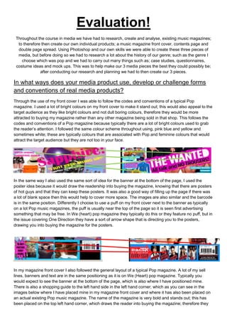
  • 1. Evaluation! Throughout the course in media we have had to research, create and analyse, existing music magazines; to therefore then create our own individual products; a music magazine front cover, contents page and double page spread. Using Photoshop and our own skills we were able to create these three pieces of media, but before doing so we had to research a lot about the history of our genre; such as the genre I choose which was pop and we had to carry out many things such as; case studies, questionnaires, costume ideas and mock ups. This was to help make our 3 media pieces the best they could possibly be; after conducting our research and planning we had to then create our 3 pieces. In what ways does your media product use, develop or challenge forms and conventions of real media products? Through the use of my front cover I was able to follow the codes and conventions of a typical Pop magazine. I used a lot of bright colours on my front cover to make it stand out; this would also appeal to the target audience as they like bright colours and not dull boring colours, therefore they would be more attracted to buying my magazine rather than any other magazine being sold in that shop. This follows the codes and conventions of a Pop magazine because typically there are a lot of bright colours used to grab the reader’s attention. I followed the same colour scheme throughout using, pink blue and yellow and sometimes white; these are typically colours that are associated with Pop and feminine colours that would attract the target audience but they are not too in your face. In the same way I also used the same sort of idea for the banner at the bottom of the page, I used the poster idea because it would draw the readership into buying the magazine, knowing that there are posters of hot guys and that they can keep these posters. It was also a good way of filling up the page if there was a lot of blank space then this would help to cover more space. The images are also similar and the barcode is in the same position. Differently I choose to use a puff on my front cover next to the banner as typically on a lot Pop music magazines, the puff is usually near the top of the page so it is seen first advertising something that may be free. In We (heart) pop magazine they typically do this or they feature no puff, but in the issue covering One Direction they have a sort of arrow shape that is directing you to the posters, drawing you into buying the magazine for the posters. In my magazine front cover I also followed the general layout of a typical Pop magazine. A lot of my sell lines, banners and text are in the same positioning as it is on We (Heart) pop magazine. Typically you would expect to see the banner at the bottom of the page, which is also where I have positioned mine. There is also a shopping guide to the left hand side in the left hand corner; which as you can see in the images below where I have placed mine in my magazine front cover and where it has also been placed on an actual existing Pop music magazine. The name of the magazine is very bold and stands out; this has been placed on the top left hand corner, which draws the reader into buying the magazine; therefore they
  • 2. are able to identify the magazine again and again. The positioning of the model also draws the reader in as they stand out and catch the target audience’s eye; the celeb image dominates the page. The use of a celeb makes the reader want to pick up and buy the magazine as they want to know more about these celebrities and find out all about their lifestyles. My contents page followed some of the codes and conventions of a typical pop music magazine contents page. In the same way as my front cover, my contents page also uses a lot of bright and pop like colours; blues, pinks and reds which make the magazine stand out and also show typical conventions of the pop genre so it is easily identified to any other magazine, I tried to use the same colours throughout all 3 of my pieces that’s why focused heavily on the colours baby blue and pink which are not only very feminine colours which will attract my target audience but very pop like colours. I used the lips imagery again to carry on a symbiotic link from my front cover onto my contents page, it also makes my contents page seem a little quirky and cheeky and not just your boring, average pop music magazine. The layout is quite similar to how you would expect to see in on a music magazine, there is a larger main image then there are smaller feature article photographs, this generally seen on a pop music magazine contents page. Then there is always a section on the page that tells you what is inside the issue this week/month, being it articles, interviews, quizzes, games and more the magazine is always cram packed full of things to do and read about drawing the reading in even more to buying the magazine because this is the first page they open; if it is not interesting or appealing the reader will not buy it. Differently I changed the positioning of my images and where the text was positioned on my contents page. Typically you would see the images placed more to the right hand side of the page or to the middle of the page, whereas I have chosen to position my images to the left hand side of the page because that is where the human eye first looks when opening a magazine. My main article photograph is also positioned here so therefore this would be the first thing that they get to see, also drawing them into buying the magazine so
  • 3. They can find out more about this article and celebrity. But both my contents page and this current existing contents page look very similar; it looks like the page has just been flipped round and is now positioned on the opposite side of the page. Using my double page spread I was able to portrait common codes and conventions that are shown throughout pop music magazines. I have used common features to show the codes and conventions of the pop genre. Each double page spread in pop music magazines have certain similarities, such as the use of balancing out the images and the text so the article/interview does not become too word heavy. I used pull quotes to draw attention to specific points in the article; I also used a pull out quote from the article as a title as it draws attention to the article. A lot of pop
  • 4. magazines typically do this as it adds to the effect of the article and is makes the article more fun as well and highlighting and stressing a certain point.A typical convention used in La Pop magazine is that the colours are very bright and friendly as the reader and target audience would expect to see on a double page spread in a music magazine. Another similarity between my double page spread and a double page spread from ‘top of the pops’ magazine, is that there is a bigger main image that dominates the page, and then smaller feature images that surround the page which make it more fun and visual. A lot of pop magazines tend to have the writing on one side of the page and the image/images on the other side, this creates a type of division or barrier between the visual side of the magazine and the informal, textual side of the magazine. How does your media product represent particular social groups? My three media pieces show the representation of different female social groups. It does slightly stereotype the typical female as loving the colour pink and enjoying mainly pop music; due to the fact La Pop magazine is predominantly featured on pop artists and bands and this is the type of target audience La Pop want to attract. A lot of feminine colours are used to show this, such as hot pink, baby blue and a soft purple, to exaggerate the type of magazine and target audience we want to achieve. Such artists that fill these brackets are people like: Katy Perry Taylor Swift CarleyraeJepsen However they are not also shown to be these typical sex objects just thrown onto a page, wearing very revealing clothing, such as Vibe and Billboard; this is because the artists La Pop like to feature are more than just a sex object they are these powerful and successful women, we know the target audience will look up to. La Pop magazine also wants to give an edge and quirkiness to the magazine that’s why the clashes and mixes of bright colours and colours such as black give a good contrast between the typical pop colours and the darker edgier colours, which also link in with the personality of my target audience. Artists that can be placed into these categories are: Jessie J Pink Lady GaGa My magazine also shows a lot of bands that are a mix between the girly stereotype and the quirky edginess. The bands that are shown are both female and male pop bands, but for the past 10 years there has not been a band that has had a mix of both female and male artists such as S Club 7. However typically the articles and fashion pages in La Pop will just be based on the female bands; whereas the posters that are featured will be predominantly male this is due to the fact that the readership of La Pop would rather have posters about these males, and therefore rather read about their role models. Through the use of bands La Pop is able to represent different ethnicity groups and gender as bands such as JLS and little mix have different ethnicities within their girl/boy bands. Pop bands that are featured throughout La Pop magazine include; Little Mix JLS One Direction Girls Aloud
  • 5. The reason I have chosen to represent these specific female social groups is because this is a typical of the type of celebrities and people that are featured in a pop music magazine such as top of the pops and we love pop magazine. Generally the readership would typically see these celebrities dressed in pink and girly clothing throughout the magazine; these celebs also reflect the type of fashion sense the readership of these magazines and the type of qualities they possess. The target audience and readership for these two magazines also possess some of the same qualities that my target audience and readership posses, so therefore I wanted to make sure that their needs were met. But in a lot of pop magazines you would not typically see much of pop artists such as pink and lady gaga due to the fact they are slightly edgier and quirkier than the typical stereotype for pop magazines. But in a lot of pop magazines you would not typically see much of pop artists such as pink and lady gaga due to the fact they are slightly edgier and quirkier than the typical stereotype for pop magazines. But I have chosen to represent this type of female social group because I wanted to publicise and broadcast my magazine to a wider audience, therefore grabbing more female attention more readership figures. Using a range of different representations of female social groups makes sure that La Pop is a magazine that is able to maintain a high level of success and keeps its readers interested and glued to their seats when reading the magazine. Most of the stereotypes that we have today are because of the media, through the uses of; Newspapers Magazines TV Internet Music Film The way an artist’s portrait themselves in a music video is able to create a very strong stereotype for him/her and their genre of music. Take an artist like pink, she sings a combination of pop and rock and through the use of her music videos, the press are able to take a song such as ‘so what’ and show pink so be this really destructive and crazy woman who is hard to control, but then through the use of a song such as ‘lady marmalade’ makes her seem like this fun and happy outgoing person. So as you can see the media can manipulate us and deceive us into thinking a different way about certain celebs. What kind of media institution might distribute your media product and why? The media institution which will own and distribute my magazine will be the BBC, (BBC magazines which are now part of the immediate media company and are merged withMagicaliaLimited which is a digital cross- media publisher and platform provider, based in London, England). The BBC are most known for their successful TV channels, BBC1, BBC2, etc, But Inaddition to programming they have many other media platforms such as radio, news, music, books and magazines. The BBC produces material to accompany programmers. The BBC currently is the third-largest publisher of consumer magazines in the United Kingdom, This institution currently own magazines such as: Radio Times Top Gear Top of the Pops Doctor Who Adventures Girl Talk I have chosen this particular institution because they own top of the pops which is one of the magazines I studied while trying to get ideas for my Pop magazine, top of the pops has also been running for almost 20 years showing that this is a very good media institution to distribute my magazine on.‘top of the pops’ is very successful in ensuring their target audiences needs are fulfilled. Having the BBC distribute my magazine will increase its popularity because it is a worldwide media institution that is very successful and own very popular well known magazines. The BBC will successfully meet and fulfil my target audiences needs and requirements, because they are very informed about the pop genre because, before the magazine ‘top of the pops’ was released in 1995; it was first a music programme thatwas originallybroadcast
  • 6. weekly between 1 January 1964 and 30 July 2006.This therefore shows that the BBC has a great understanding about the pop music industry; and what the pop target audience want.A way in which they could promote my magazine further and make it even more successful is to publicise and advertise La Pop in some of their current existing magazines, such as ‘top of the pops’ and ‘girl talk’. The fact that the BBC are a multimedia platform is able to show that, they know exactly who their target audience are and what their target audience want and are very successful in fulfilling their audience’s needs; also showing that they care about their viewers, readers, listeners and target audience’s needs. Who would be the audience for your media product? The target audience for La Pop will be focussed on females, aged between 17-24 year olds with a passion for pop music and pop artists. My target audience enjoy going to gigs and concerts that have a range of different artists, from Jessie J and Little Mix to Katy Perry she loves her feisty strong powerful artists that are predominately pop artists. My target audience are people who like to stand out from the crowd and be notice, they are not part of a typical stereotype because they like to be different and original and this is what pop music is about, having your own unique style and quirkiness to the genre of music. They aspire to be like little mix and Jessie J as you can see from the images above that both, as solo artists and a girl band they can still have their own style and edge to the genre of pop. That is why my magazine will appeal hugely to my target audience due to the fact these celebrities appear throughout my magazine; therefore my target audience are able to make the magazine their own as they can read about their idols and can feel like they can have a close relationship with their idols as well as La Pop magazine. My target audience fall into the category of E, D, and C2 on the Jicnar scale. These categories are defined as skilled or partially skilled workers. As my target audience are still in school or university trying to become the best they can be they have not yet reached the top half of the scale, but with La Pop’s help they will soon reach their full potential. This links into Maslow’s theory; who was a media theorist. He created the pyramid of hierarchy of needs. The category which my target audience will fall into is esteem and self- actualization as my magazine will make them feel good about themselves and help them become the best they can possibly be. Love and belonging could also be a category which the readers of La Pop fall into as they love their family and friends and love to be around them and spend time with their loved ones. My magazine is suitable for my target audience because it fulfils all their needs and their interests. It gives them all the latest updates about gigs and concerts and also the low down on all the celeb gossip. Due to my target audience being female my magazine focuses mainly on big, successful stars such as Cheryl Cole so they are able to relate to La Pop magazine, which highlight their success and fame and fortune. But La Pop also offers them with male pop artists and posters of ‘Hot Bods’ as this is what my target audience want to see. The use of my editors letter every issue will make La Pop magazine seem personal and exclusive for La Pop readers only, so therefore my target audience is constantly drawn in to carry on buying La Pop magazine each month, to get her monthly fix of celeb news, Goss and fashion.
  • 7. How did you attract/address your audience? La Pop magazine successfully appeals to its target audience and attracts the reader in a multiple of ways. The front cover of La Pop magazine features are the typical conventions that you'd expect to see on a music magazine front cover. The female model on the front cover of La Pop; gives a visual imagery of what the target audience and readership aspire to look and be like, the artist that is portrayed also gives of this typical stereotype of the type of artists that the pop genre portrait throughout pop magazines such as ‘We love Pop’ and ‘top of the pops’. The model is giving direct eye contact towards the audience which again draws the reader in, as the use of this make the reader feel as if the model/artist is looking directly at them, which makes La Pop more personal for the readership and the target audience. The colours that I have used are very bright and eye catching but, I have kept to a particular colour scheme so the page has a hint of sophistication as well as a fun element to it; using predominantly pink, blue, purple and yellow to again highlight that the magazine is a pop magazine. From the three images above of; La Pop magazine, top of the pops magazine and We love pop magazine, we can see that La Pop magazine follows a similar colour scheme as to the following two magazines, where they too have only used 3 or 4 specific colours to carry on this symbiotic link throughout their magazine front covers.This draws the reader in, because they know what they are getting each time, and consistently using similar colour schemes gives the magazine its own brand identity that the target audience can easily follow and therefore are able to recognise the magazine each time they go to buy it. The use of the banner across the bottom of the page is able to draw our readership into buying La Pop, because this is the type of thing the target audience want to see in their magazine, because they are the type of women that like to see a hot guy topless so they can have a gossip with their friends about who they think the hottest celebs are; it also draws them in further due to the fact that they can tear or cut the poster
  • 8. out and stick it on their walls, so it is like a kind if free gift that they get from La Pop.The mast head I have used is slightly different to your average and typical mast head that would usually be seen on the front cover of a pop magazine because, I did not want La Pop magazine to seem like it was copying any other existing pop magazines that are already outthere, I wanted La Pop magazine to shows is own brand identity and its own style and quirkiness. My content page is also very successful in attracting the readership and target audience as it gives a very visual imagery to the magazine. If the contents page was too word heavy then the readership may become bored and lose interest before even reading the magazine. I find that La Pop magazine is very similarly laid out to the above magazine ‘We love pop’ as both have the editor’s letters and the main images dominating the page. The contents page from ‘top of the pops’ magazine however I find does not attract me personally as it seem to scattered across the page as if there is no set layout which just makes the page seem messy. La Pop magazine is set out neater and tidier to make it easier to navigate through the magazine; the target audience for La Pop are also classy and sophisticated women that like to have organization in their lives and this will appeal to them. The use of just re-using the front cover as the main image on the contents page in ‘top of the pops’ magazine makes it seem slightly cheesy; it also suggest that, that is all that you will see in the magazine as it seems they are the only articles and interviews that are being shown. Typically before buying a magazine the reader would flick through to the contents page to see what is inside this month’s issue, if the contents page does not appeal to them then they will not buy the magazine. I made sure that I carried on the symbiotic link from my front cover onto my contents page by using the same colour scheme, mainly blue and pink with black text. This was so the target audience are able to constantly recognise La Pop magazine, from the already existing pop magazines. The editors letter in the top right hand corner of the magazine also appeals to the readership because it is as if, me the editor it talking directly to them personally, it also makes the magazine more personal to each individual; making her feel like she can relate to the magazine, as if the magazine is her friend; it lets her see that La Pop always has the reader in mind. Whenever she is having a bad day she can just pick up a copy of La Pop and relax, it’s her way of comfort and a way of her being able to find out all the latest gossip on her favourite celebs and pop artists. The content which is presented on the contents page of La Pop reflects the results which Ireceived from my questionnaire. I included free posters because this is what the reader wanted to see, it also makes the reader feel like they are receiving a gift from the magazine, again making La Pop a friendship figure almost.
  • 9. The content in La Pop such as my double page spread appeals and draws the readership and target audience in becauseLa Pop magazine balances out the images with the text, giving visual imagery to accompany the text. This appeals to the readership because the article/interview is not too word heavy, as this may become boring and uninteresting for the reader, and therefore make them not want to buy La Pop magazine again.Some double page spreads are much more visual and only include snippets of information, using minimal text, such as in the double page spread above from ‘We love pop’ magazine featuring the wanted. I find this effective as this informs the reader in a short summery of what is happening and going on in the images; ‘We love pop’ also use the same sort idea that La Pop uses, by balancing out the images and the text. I find that this is a good way of mixing up what sort of content the readership will see as it keeps the reader interested, informed and excited about what they will see in the magazine.Again I have used the same colour scheme throughout La Pop magazine (Blue, Pink, Black) to make sure the magazine has a constant running symbiotic link throughout so the readership and the target audience are able to identify and recognise the magazine, this draws them in because of the fact they can always just walk into a shop or supermarket and pick up a copy of La Pop straight away.The questions in the interview from La Pop are written in blue, this makes them stand out and they are easy for the reader to read and therefore the reader is able to see what the question is and what the reply from the celebrity is. At the bottom of the page the page number is written in black against the red lips background so it stands out and is easy for the readership to navigate their way through the magazine, making it easy for them to flick through to the article/interview they want to read about. The way in which I addressed the reader of my magazine was informal, but very friendly too as I used informal mode of address to attract to certain members from my target audience using certain things such as, ‘OMG’ and ‘hot bods alert’ this will attract their attention as it is as if they are talking to a friend and having a nice gossip about all the Goss they have just found out. It is very chatty and how the reader would speak. This makes the magazine more relaxed and chilled out for the reader and target audience, which also links into her personality and likes because she likes to chill out with friends and have a good old gossip. What have you learnt about technologies from the process of constructing this product? Since beginning of this project I have learnt a lot of new technical skills which I did not have before. Before starting this project I had no knowledge on how to write or create a successful blog; as I had never used one before. However since starting this project I have learnt how to create and navigate my way around a blog successfully and I am also very confident on how to use a blog I learnt how to do things such as; use embedded codes to upload files, videos and images.I also knew a few previous skills from Photoshop, as I have previously used it before, but I was able to re-access that knowledge and add to it by learning extra skills that I did not know beforehand. Another skill that I was able to pick up through the process is being able toimport new fonts into Photoshop; I did this using a font website that allows you to find a variety of fonts and download and install them onto Photoshop (http://www.dafont.com/) Through the creation of my three media pieces I have learnt a lot about different technologies that I needed to use to help me to improve my work. These technologies included things such as;
  • 10. Blogspot.com Adobe Photoshop Microsoft PowerPoint Microsoft word Youtube.com Slideshare.com dafont.com I found that using bloggerwas very easy, and after the first few times of navigating my way around my blog I picked up the skills very easily. I used slide shareso I could upload my work to, my blogso it was easy to use and read when presented on my blog. I use YouTube on a regular basis and listen and download a lot of music from this site, so it did not take me long to work out how you convert a video and embed it, so I could then put it on my blog to show conventions and representations of the genre of pop.Da font played a major role into the making of my final three pieces as, I downloaded a particular font called ‘Bubble-gum’ which was used throughout all three of my pieces and was the main font used, as I chose not to use too many fonts as it may have become overpower and make my final three pieces look amateurish. Overall I feel that the technology that I learnt how to use and already knew how to use really helped me make realistic and successful magazine pieces. Without these new skills learned I would not have been able to make such successful and well-made pieces, that filled all La Pops target audiences needs and interest. Looking back at your preliminary task, what do you feel you have learnt in the progression from it to the full product? At the beginning of my course I had to create a school magazine for the sixth form as my preliminary task. Looking back on the front cover that I created during this set task and comparing it to my current front cover I have done as well as my other two pieces I can see huge improvements in my technique, skill and ability. Looking at both front covers, I can see that I lacked a lot of skills that were needed in order to create a successful and believable looking magazine front cover. The finished product for my preliminary was very basic and rushed; although it did possess some good qualities, such as the layout was set out quite well, but was slightly rushed and the font used was not great. After this I then conducted a lot more research and planning and this was able to help me improve my skills and knowledge of how a magazine should look
  • 11. and the qualities it should possess in order to attract the reader. My front cover did stick to one particular colour scheme and I didn’t go to mad on using a variety of colours, but I do not think the burgundy red and the mint green worked well for this school magazine as it made the front cover seem slightly too Christmassy and not realistic. The model is making direct eye contact with the audience which is also another good feature for my preliminary task. I am glad that I had the chance to make a preliminary piece before conducting my final three pieces because this was able to help me learn from my mistakes and improve my capability and technique as to how I conducted my final three pieces. This also gave me the chance to learn new skills and pick up new knowledge that I did not have on the beforehand; I was able to create three visual pieces and make them seem very realistic as if they were a real music magazine. Looking back at the two of the front covers that I created and comparing my preliminary to my final front cover there are huge improvements and differences. The main sell lines and other sell lines stand out much more and are positioned a lot better making the page seem more collected rather than just thrown onto the page. The main image is also better placed on the page as you are able to see the artist clearly; whereas the image on my preliminary task doesn’t grab attention and stand out; the text is also surrounding her and over lapping onto her face which does not really draw the reader and target audience into the magazine. La Pop magazine looks realistic and professional; however Get Ready magazine looks very messy and cluttered and unprofessional. I think without my research and planning, I would not have been able to create such as well-planned out magazine that looked realistic and met all my target audiences needs and interests, through the use of my questionnaire and other things I was able to learn a lot more about my target audience and what I should include in my magazine to make them want to pick it up and buy it. Through doing this project I have learnt a lot about the magazine industry, and the different media aspects, and platforms a magazine may possess, such as having their own website etc. I also learnt a lot more about the pop genre, which is also my favourite genre of music to listen to.I found out that pop magazines are very successful with a young female audience; and that the BBC who distribute ‘top of the pops’ magazine is the third biggest distributer in the UK, who also distribute magazines such as doctor who, top gear and the radio times. I have learnt a lot more about the typical conventions of magazines and pop and also what makes them appealing to their readers and target audience. I found this whole course very enjoyable, and I liked having to build up a profile before actually making a final product. I am very pleased with the outcome of my final three pieces and the research and planning which I conducted; which was also able to give me a lot of knowledge and I enjoyed receiving negative and positive feedback to I could go back and improve my three pieces and make them even more realistic and to fit the readerships needs and interests.