
Recomendados
Más contenido relacionado
La actualidad más candente
La actualidad más candente (20)
Similar a 1st+music+magazine+powerpoint+taffy+school+13th+december
Similar a 1st+music+magazine+powerpoint+taffy+school+13th+december (20)
Más de Tafi123
Más de Tafi123 (11)
Último
Último (20)
1st+music+magazine+powerpoint+taffy+school+13th+december
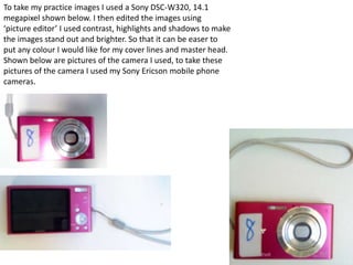
- 1. To take my practice images I used a Sony DSC-W320, 14.1 megapixel shown below. I then edited the images using ‘picture editor’ I used contrast, highlights and shadows to make the images stand out and brighter. So that it can be easer to put any colour I would like for my cover lines and master head. Shown below are pictures of the camera I used, to take these pictures of the camera I used my Sony Ericson mobile phone cameras.
- 2. Some images I took for my music magazine draft From these images I could only use one of the images as my front cover as the other ones were not focused enough, for example her face and eyes were not focused enough to use as the front cover. Therefore I may use one of these images on my contents page.
- 3. My first draft of a magazine cover on ‘fire works’ I firstly got an image of the barcode on Google, I thought having one in colour would be different to just having a black and white one. I then made my cover lines the same colour. I didn’t like this because the artist was not facing the camera.
- 4. Second round final image, for my music magazine cover. For these images I liked the lighting on them, also the colours show very well. For these images I used ‘photo editor’ for lighting and making the background darker so that the cover lines and master heads show up clearly also the images are focused. Also the image on the left relates to my master head ‘Echo’ well as it looks like my artist is screaming.
- 5. For my double page spread for my main artist. Photographer on the left and artist on the right-
- 6. I merged the colour and the black and white image in together, as I liked both of them I decided to add some colour into the black and white image, also the Mc Donald's packaging colours are bright – this image is representing the artist to still do normal things even if she is famous.
- 7. The making of my front cover To improve I have to fill out the black spaces. To do this I need to do something with my title ‘Echo’ then I have to add more images which will show what will be on the contents page.
- 8. This NME music magazine of the solo artist Florence Machine really stands out, from the image being very focused as she looking into the camera, to the main colours being red, white and black.
- 9. For my contents page, images I may use
- 10. For inspiration to the creation to my contents page, I have looked at the NME contents page magazine and I would like it to have a newspaper look to my Echo music magazine , as I want it to look different to most music magazines, also adding a modern look to newspapers. Also the layout is clear.
- 11. The making of the contents page To create my contents page I used Microsoft publisher. I think the layout I want to go for is going to apply to teens and young adults.
- 12. The making of my double page spread Artist Editor & Artist artist