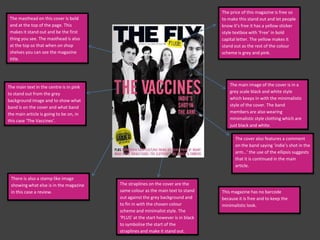
1. The price of this magazine is free so
The masthead on this cover is bold to make this stand out and let people
and at the top of the page. This know it’s free it has a yellow sticker
makes it stand out and be the first style textbox with ‘Free’ in bold
thing you see. The masthead is also capital letter. The yellow makes it
at the top so that when on shop stand out as the rest of the colour
shelves you can see the magazine scheme is grey and pink.
title.
The main text in the centre is in pink The main image of the cover is in a
to stand out from the grey grey scale black and white style
background image and to show what which keeps in with the minimalistic
band is on the cover and what band style of the cover. The band
the main article is going to be on, in members are also wearing
this case ‘The Vaccines’. minimalistic style clothing which are
just black and white.
The cover also features a comment
on the band saying ‘indie’s shot in the
arm…’ the use of the ellipsis suggests
that it is continued in the main
article.
There is also a stamp like image
showing what else is in the magazine The straplines on the cover are the
in this case a review. same colour as the main text to stand This magazine has no barcode
out against the grey background and because it is free and to keep the
to fin in with the chosen colour minimalistic look.
scheme and minimalist style. The
‘PLUS’ at the start however is in black
to symbolise the start of the
straplines and make it stand out.
2. The main image fills the majority of
the cover of the cover to make it as
notable as possible and really in
your face. The image unlike in the
The masthead on this cover is bold
last cover is in full colour.
and at the top corner of the page.
The main image goes over it slightly
as this because the main image is There is a circle type text box with
what is important. ‘WIN!’ in big white letter to attract
your attention to the compotition.
The cover features a pink sticker
like image with text on to show
what is included in the magazine
and to stand out and keep with the
colour scheme.
‘Exclusive’ is in black which stands
out from the rest of the text. This
The main text is both pink and makes people want to read it as its
white with a bold shadow type exclusive.
font. The band name is in pink and
the 2012 is in pink, the reason
‘2012’ is also in pink is so you
notice that its new.
The barcode is very small and
placed in the bottom corner to
There is also text scattered around make it as un-noticeable as
the cover to show what is include possible. It is also put there to
inside the magazine. These also fit make it the last thing that you see.
with the colour scheme with white
and pink text.
3. The masthead on this cover is big and
The text underneath the masthead
bold much like the other two covers.
is very small compared to the mast
it covers the majority of the top half
unlike the NME masthead. This head . This shows what is in the
masthead also has a change in font magazine.
type as the ‘Dazed’ part is large and
bold however the ‘& Confused’ part
is a smaller font and is tilted to the
side. As The ‘Dazed’ part stands out
this is the main part of the mast head
that you first see.
The main image on this cover is a very
The straplines on this cover are at basic photograph. The photo looks as
the side. This could be to make it though its was taken in just a normal
more noticeable or it could just be room against a wall, as you see the
to make the cover look different to edge of the room and the skirting
board at the bottom. Neither of them
others and create their own cover
are looking at the camera either.
style.
The main text on this cover is split
into two different font sizes, the
band name is in a smaller font and
then ‘Riot Here, Riot Now’ is in a
smaller font. This is also a play on The barcode on this cover is also in
words to sound like Right Here the bottom right corner to make it
Right Now. the last thing you see and be hardly
noticeable.
4. The magazine logo appears
on the contents page as well The issue number is on top
as on the cover. The right of the page along with
contents has the usual Red Q a picture of a poster that you
colour scheme with a red get with the magazine.
text boxes and lines.
The list of minor features are
on the far left and right
sides, the main features
however are in spread out
across the middle of the big
with big pictures.
The main image on this
contents page is just on the
right side of the double
page. The image is a
‘Gorrilaz’ cartoon with a
page number next to it. It
also has the largest size page
number. As it is the largest
picture this shows it will be
the main article.
5. This contents features a The contents of the
band index which gives you magazine also features the
the page number of any magazine logo. The contents
band that is mentioned on this page however isn’t
throughout the magazine. title ‘Contents’ instead is is
This is a very good feature as titled ‘NME This Week’.
readers who are looking for There is also the issue date
a particular band can find underneath the title.
them easily.
The list of other features is
on the right side spilt into
different sections with the
The main image on this sub headings: ‘News’,
contents is a photo of a ‘Radar’, ‘Reviews’, ‘Live’ and
music venue with the title ‘Features’.
underneath ‘The end of the
Astoria’ along with a page
number and a brief
description of what the
article is about.
This contents also features an
advertisement to subscribe to
the magazine. Which is good
advertise for the magazine as
everyone looks at the
contents whereas people may
miss out other pages of the
magazine.
6. This is another NME
magazine contents page. As
you can see the contents has
an extremely similar style to
the other and must be a
usual style in the magazine.
The Band index, Subscription
ad and even the titles are in
the same position as the
other issues.
The only major difference
seems to be the main article
and picture which are set
out differently. Just before
the title there is use of an
ellipsis witch builds up to the
title. This is also a large letter
M at the start of the
description to symbolize the
beginning and to add a bit of
style to it.
7. The main image on this The title of the article and
double page spread takes up also the band name is at the
the majority of the two top right and is in very bold
pages. The image shows the
black letters that fits in with
band members looking
the rest of the black, blue
straight at the camera in a
And grey style colour
quite in your face style
scheme.
fashion. They also have very
little facial expression.
There is a small description
of the band underneath the
title. The lead singers name
is in a different colour font
to the rest of article to stand
out.
The text on this double page spread
The design of the double
is spilt into 2 parts. They are split up
page spread looks very old
by two large letters at the start of the
and tatty as the colour is
two paragraphs. There is also a quote
very off white and almost
that is separated from the rest of the
grey. There is also several
paragraph. These are also in a
blue markings on both pages
different colour to the rest of the
to make it look tatty.
article as they are in blue.
8. The title of the article is
very bold and is written in In the top right
the style of the ‘Two corner of the page
Door Cinema Club’ logo there is the bands
and album cover which is logo to show who
who the article is about. the article is about
Underneath this is a small and also a caption of
insight into the band with the picture.
the band name in bold
letters to stand out so
that you know who the
article is about.
The article also has a
quote from the lead The main Image shows all
singer and guitarist that is the band members together
separated from the rest eating some sort of sweets
of the article. This quote or chocolate. This is done
is also in the font of the purposely to link in with the
bands album cover and The main article is again separated article where lead singer and
logo. with large letters at the start. The guitarist Alex says he used to
text fills the majority of the two be fat. This is in the stand
pages unlike the last double page out quote. There is also two
spread which was mostly the image. smaller pictures underneath
of the band.
9. The number ‘100’ is
There is a black banner like text box at features many times to fir
the top of the page with the magazines with the double page
slogan and a quote about the artists. spreads theme of the
century.
This double page spread
from ‘Q’ magazine is very
different from the
traditional double page
spread. It features on
large image of the biggest
artists of the century all
together. The magazine
logo also appears in the
top left corner. The main
image shows all the
artists all posing in a style
that links with their music
style.