This PowerPoint helps students to consider the concept of infinity.
Poster design process
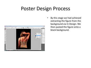
1. Poster Design Process By this stage we had achieved extracting the figure from the background via In Design. We then pasted the figure onto a black background.
2. Poster Design Process We then inserted a title and played around with the many ways we could place it along the poster.
3. Poster Design Process After we agreed on its placement, we started to address the decision on which colour to use. This light blue colour was one of the few that stood out from the black background.
4. Poster Design Process We felt that the title was still not getting its deserved attention so we decided to add a white stroke, which we felt would make it more readable.
5. Poster Design Process We now added in the tag line with the same colours and stroke measurements.
6. Poster Design Process At this point we were having a lot of debates about the sizes of the names and which colour they should be portrayed in. It was also becoming difficult to have the names at the same size.
7. Poster Design Process We now transformed the whole poster, customizing certain colours to get the right kind of red, foreshadowing the bloodshed in the movie. We made the font look much cleaner and sophisticated. The title also gained a drop shadow.
9. Poster Design Process At this juncture we removed the drop shadow to the title and replaced it with an outer glow, we felt that this made the poster pop out and became more corporeal.
10. Poster Design Process As we were getting closer to the final product, we wanted to tweak more carefully on the details and decided to make the background darker, to crimson red. It now resembles even more what blood would look like.
11. Poster Design Process We then started to test out different background effects and found that this diagonal fade in was most appealing. However the title was no longer completely visible, so we decided to change it to a more thrilling one. It now contains a white stroke again.
12. Poster Design Process For the final product we decided to change the font of the actors names also, adding a white stroke. Spontaneously we decided to change the colour of the title and incorporate a drop shadow along with the stroke. This we believe brings the poster to its full potential.