Chapter 2 developing power point pres
•Descargar como PPT, PDF•
1 recomendación•1,184 vistas


Recomendados
Más contenido relacionado
Similar a Chapter 2 developing power point pres
Similar a Chapter 2 developing power point pres (20)
Más de Vivie Chabie
Más de Vivie Chabie (18)
Chapter 2 developing power point pres
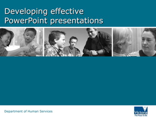
- 1. Developing effective PowerPoint presentations Department of Human Services
- 2. Effective PowerPoint presentations? Are You ExcitEd By Animations, sound and Clip art In PowerPoint?
- 3. What we’ll cover today • Do you need PowerPoint? • Outline • Slide layout • Fonts, colour and background • Graphs • Spelling and grammar • Room set up
- 4. Do you need PowerPoint? …then he said, “I can’t feel my legs” and then I said, “Stay with me Joe!” But it was too late. He was gone. It was the PowerPoint.
- 5. Do you need PowerPoint? • Consider the type of presentation: – Lecture – Discussion • Don’t make your presentation PowerPointless
- 6. The outline • 1st or 2nd slide should have an outline • Follow outline for your presentation • Place main points on outline slide
- 7. Slide layout • Use point form, not complete sentences • Maximum of six points per slide • Avoid wordiness: key words only
- 8. Slide layout This page contains too many words for a presentation slide. It is not written in point form, making it difficult both for your audience to read and for you to present each point. Although there are exactly the same number of points on this slide as the previous slide, it looks much more complicated. In short, your audience will spend too much time trying to read this paragraph instead of listening to you.
- 9. Slide layout • Showing one point at a time will: – focus attention on one point – prevent reading ahead – help keep your presentation focused
- 10. Slide layout • Do not use distracting animation • Do not go overboard with the animation • Use consistent animation
- 11. Slide layout • Slide transitions should not be distracting • Be consistent with transitions – never Random • Worst effects – ‘Checkerboard or Comb’
- 12. Fonts – good • Use different size to show hierarchy – the title font is 36-point – the main point font is 28-point – this font is 24-point • Use a standard font like Arial – Use at least an 18-point font and Bold
- 13. Fonts - bad • If you use a small font, your audience won’t be able to read what you have written • CAPITALISE ONLY WHEN NECESSARY. IT IS DIFFICULT TO READ AND LOOKS LIKE YOU ARE SHOUTING. • Don’t use a complicated font
- 14. Spacing - bad • If you have a set of points • space them out on the slide • rather than in one corner
- 15. Spacing - good • If you have a set of points • space them out on the slide • rather than in one corner
- 16. Colour - good • Use a font colour that contrasts sharply with the background • Use colour to reinforce the logic of your structure • Use colour to emphasise a point – But only use this occasionally
- 17. Colour - bad • Don’t use non-contrasting font colours • Using colour for decoration is distracting and annoying • Using a different colour for each point is unnecessary – Using a different colour for secondary points is also unnecessary • Trying to be creative can also be bad
- 18. Background - good • Use a simple background • Use backgrounds that contrast with text/imagery • Use the same background consistently throughout your presentation
- 19. Background – bad • Avoid backgrounds that are distracting or difficult to read from • Always be consistent with the background that you use
- 20. Graphs • Use graphs rather than just charts and words – Data in graphs is easier to comprehend and retain than raw data – Trends are easier to visualise in graph form • Always title your graphs
- 21. Graphs January February March April Blue Balls 20.4 27.4 90 20.4 Red Balls 30.6 38.6 34.6 31.6
- 22. Graphs Items Sold in First Quarter of 2002 100 90 80 70 60 Blue Balls 50 Red Balls 40 30 20 10 0 January February March April
- 23. Graphs 100 90 90 80 70 60 Blue Balls 50 Red Balls 38.6 40 34.6 30.6 31.6 30 27.4 20.4 20.4 20 10 0 January February March April
- 24. Other features - avoid • Avoid sound effects in PowerPoint • Embedded programs and action buttons for advanced users • Refrain from trite clip art
- 25. Other features • choose pictures that highlight your point • use a screen capture if appropriate
- 26. Spelling and Grammar • Proof your slides for: – speling mistakes – the use of of repeated words – grammatical errors you might have make • Have someone check your presentation
- 27. On the day • Get there early • Handouts • Does everything work? • Can your audience read the slides? • Keep an eye on the time • Don’t read directly from the slides
- 28. Conclusion slide • Use an effective and strong closing • Use a conclusion slide
- 29. Conclusion • Structure your presentation • Keep it simple (background, font, colour) • Minimal content on slides - 6/6 • Avoid pointless animations • Only use pictures if they assist • Ensure accuracy with content and equipment
- 30. Questions? • End your presentation with a simple question slide to: – Invite your audience to ask questions – Provide a visual aid during question period – Avoid ending a presentation abruptly
- 31. References • Wourio, Jeff, 2003, Presenting with PowerPoint – 10 dos and don’ts, http://www.microsoft.com/smallbusiness/issues/technology/bus iness_software/presenting_with_powerpoint_10_dos_and_donts .mspx • Saylor, Thomas, 2003, Creating an effective PowerPoint presentation, http://people.csp.edu/saylor/effective_powerpoint.htm • Johnston, Andrew, 2005, Presentation skills, (part of the Department of Human Services’ 2005 Communications seminar series)
- 32. Developing effective PowerPoint presentations Shane Taylor Publishing Consultant shane.taylor@dhs.vic.gov.au Questions? Department of Human Services
Notas del editor
- This presentation will be about the design and structuring of your presentation slides, not about using the PowerPoint program. However if you have some technical issues, I’m reasonably proficient at PowerPoint so can answer these queries at the end of the session. I have attended many PPT presentations this week actually as it is both Children’s Week and WorkSafe Week. Some have been good but some were not particularly effective. One of these presentations had the PPT on a loop showing images of poor work practices. The pictures were entertaining but distracted totally from anything the presenter said. Then there was another presentation where the presented repeated everything that was written on the slides without elaborating on any of the points. Just as some presenters are better than others, similarly some PPT presentations can be better than others. So, what I thought I’d show you first is an excellent example of a PowerPoint slide…
- Isn’t it great? Ok, now I probably have you pretty worried. I lied. This is far from a great slide. There are sooo many things wrong with this slide. Some of these are: Content that is of no use to anyone A background that makes the text barely legible Mixtures of fonts Over-use of clip art Confusing transitions Animated text Sound effects People usually do not produce horrendous slides like this, however there are some aspects of this slide that people do include, and that’s what we will seek to avoid. At least I hope none of you are producing anything like this.
- Today we’ll be covering the following: We’ll ask the question ‘Do you really need PowerPoint?’ The outline – which is where you let your audience know the scope of your presentation. Slide layout – where we’ll discuss the makeup of slides. Fonts – the good and the bad. Colour and background – what makes for effective and readable slides. Graphs – the best way to present these visually. Spelling and grammar – mistakes stand out like a sore thumb especially when they are blown up to this size. Room set up – some practical tips for the day of your presentation.
- We’re in quite dangerous territory here…it’s early afternoon, we have just had a filling lunch, the lights are dimmed… This is one of PowerPoint’s weaknesses, others include: Weaknesses The physical environment required to present PowerPoint slides can work against the presenter. That is, the room is dim, people cant always make out your face, people may start feeling sleepy. You are basically tethered to a podium or laptop. You can’t walk around and express yourself as you might. The PowerPoint slides may distract from you, the speaker. However, PowerPoint also has its strengths: Strengths: Providing information both verbally and visually, that is through multiple channels, will increase retention of messages Pictures can aid by making a visual connection to an abstract idea Particularly good for graphs and instructional diagrams PowerPoint can provide a framework for your presentation. PowerPoint can make it easier on the presenter (however remember to think of your audience)
- One of the first questions you need to ask yourself when you are asked to make a presentation, is whether you actually need to produce a PowerPoint presentation. These days, it almost seems obligatory that if you are doing a presentation, a PowerPoint will also be produced. So think about a few questions before you start PowerPointing: What type of presentation? If it is more of a group discussion rather than you delivering information to an audience. A powerpoint presentation may inhibit group discussion. What am I presenting in my slides that could not be conveyed with the spoken word? – Don’t just put up exactly what you are saying, otherwise you may as well not be there. How is PowerPoint aiding my presentation? Use powerpoint as a visual aid to what you are saying.
- An outline, like what you saw on an earlier slide, is a bit like an index for your presentation. An outline will give your audience a good idea of the structure of your presentation. It will also give them an idea of when you are nearing the end of your presentation. It’s a good idea to use the outline headings in your presentation as this will deliver milestones throughout the presentation.
- Don’t whack up too many words on a slide. The less is more policy works well with powerpoint. What you are trying to do is put significant words on the slide so that your message will stay with the audience and reinforce your spoken words. The 6/6 rule is a good one to follow. No more than 6 dot points and no more than six words per dot point. You won’t always be able to stick to this but it’s a good base point.
- Obviously this is not what you do. Firstly, people will be straining their eyes to read this amount of information. Secondly, your audience will be torn between reading the text and listening to what you have to say. This is where PowerPoint becomes PowerPointless, either you or the PowerPoint could be dispensed with.
- Sometimes it can be advantageous to show one point at a time. This way you can reinforce each of the points you are saying and the audience does not read ahead of what you are saying.
- Novice users to PowerPoint tend to overuse clip art and animation effects. My suggestion would be to minimise their use. People have come to hear you speak and present your ideas, not watch a multimedia display. Also, people are fairly familiar with the clip art available on Microsoft Office so presenting this artwork can give an impression that this is just a generic presentation which will make your audience switch off. If you use animation, keep it consistent, or your audience will be wondering what animation is going to happen next, rather than concentrating on what you are saying.
- When you are moving from one slide to the next, I think simplicity is the best option, however if you want to use a particular effect, use it throughout your presentation and never, ever use the ‘Random transition option’.
- I have put up some suggestions as to the size of font you should be using. In terms of what type of font, some people find Times New Roman preferable to Arial. However there has been some research into readability of fonts, especially for people with reading or vision difficulties, that san serif fonts such as Arial or Tehoma are preferable. This is also the recommendation from organisations such as Scope and Vision Australia.
- If you’re going to use a small sized font, you may as well not include that slide in your presentation. Most of your audience won’t be able to read it. Information in small font could be included in the handouts that you give to your audience. Avoid using a mixture of fonts and avoid complex fonts like comic sans or impact.
- You’ve got the whole page so why cram things in a corner…
- Space them out. The use of white space increases readability and your audience’s ability to scan slides quickly and return their focus back to you, the speaker.
- The main thing when using colour is to use high contrast. So, either a dark background with light text or light background with dark text. However, it can be difficult to read white text on black background, especially when the font size is not huge. It would probably be better to use a dark blue background if you are going to go with a dark background and light text.
- Telling you the obvious here, but you would not use yellow on white or black on blue. You don’t want anyone in your audience straining to read what is on your slides. You don’t need to be too obvious with highlighting specific words or giving each line a different colour.
- Be careful with your choice of background. Some standard backgrounds that you will find in PowerPoint can vary from light to dark therefore making the choice of font colour very difficult. In one part of the slide the contrast will be fine, while in other areas the words may be more difficult to see.
- This Austin Powers effect is obviously a little over the top but it shows how the green writing is visible against some colours but not others which is the danger with a variable background.
- Try to present visual graphs rather than numeric charts. They are much more scannable and accessible.
- Yes, this table does show how many coloured balls were sold in the first four months. But it is not particularly engaging, nor is it intuitive in showing the trends…
- Use PowerPoint for what it was originally created to do. Show graphs and charts more dynamically and allow your audience to easily understand what is occurring. They are much more scannable. We can easily see that March was a great month for blue balls. But even with graphs there are some rules…
- Minor gridlines are unnecessary Font is too small Colours are illogical Title is missing Shading is distracting
- Sound effects can go wrong. While a few people at the front of your audience may hear the sounds as they were intended, those further back may be wondering if there is a mozzie in the room. Internet connections, videos and other effects can act quite differently when they are loaded onto different PCs. You also need to be So just be prepared that if you are using advanced technology, you can also give the presentation without them, if the technology fails. Clip Art used to be a great way of making a presentation visual – particularly when computers were less powerful and every presentation had to be small enough to fit onto a floppy disk. Back in 1993 the clip art of the duck hitting the computer might have been amusing. Clip art can look very dated compared to a colour photograph specific to your presentation.
- Ensure the images that you use are good quality (clear) images. Be careful when copying and pasting images from a web page. The problem is that since they were saved as small files to make them load quickly, they do not enlarge well. They end up looking grainy and very amateur. It’s easy and tempting to just lift an image off the web. But you must obtain the permission of the copyright owner before you can use any image. Often this is obtained simply by sending an email to the web master. If you don’t, you could easily end up with legal proceedings against you. How will they ever know? Well you never know who might be in your audience, or if your presentation may be put up on a website available to everyone. The selection of images. One of the deadly sins is the most subtle of them all. It is those types of images that can be obtained from the royalty free photo CDs. These often have actors showing emotions such as surprise or happiness. The difficulty is that they can look very corny. And if the photos are a few years old, the fashions can look very dated. As with most things in life, taking a little extra time to select that right visual appearance will make all of the difference. Don’t use images for decoration. The image should help to tell your story.
- Make sure you, and maybe one of your colleagues, check through the presentation to ensure there are no typos or grammatical errors. When checking it’s good to have a breather, or go for a coffee and then come back to it. You may be amazed what you pick up on a second reading. As I mentioned at the beginning, you don’t want your mistakes magnified and projected onto a wall for all to see.
- Get there early – this will allow you to iron out any last minute issues. It may be handy to have your presentation on disk just in case, and if all the technology lets you down, be prepared to give your talk without PowerPoint. Handouts – it is your decision as to whether you give out handouts prior to the presentation or after. Reasons for giving them out prior to might be that they need to take additional notes as you present or there is other information in the handouts that they need to refer to when you are speaking. However, be aware that if you give out handouts prior to the presentation, your audience may be concentrating on the handouts rather than you. Does everything work? – Check the data projector and/or laptop. Make sure there are no passwords you need to know. See whether you will need a microphone in order to be heard. Make sure you are able to see your notes. If you require an Internet connection or are using other multimedia ensure it is all in working order. Can your audience read the slides? – Check that the light levels in the room allow for your slides to be easily seen once they are projected. Try not to make the room too dark or you may soon hear the sound of snoring, especially if a large lunch has just been consumed. Keep an eye on the time – Have a watch or look at the computer clock to make sure you are running to schedule. You will have practiced your speech several times so you should know roughly where you should be according to the clock. Try not to run over, especially if you are a part of a series of presentations. Firstly, it won’t allow enough time for questions, thereby upsetting your audience, and secondly you will annoy your next presenter, who may have to cut their presentation short. Generally those more practised in presenting will require fewer slides than newcomers to presenting. Some say that you require 1 slide for every minute of your presentation, but best to practice to determine your slide need. Don’t read directly from the slides – Avoid looking at the projection on the wall. Your audience are not that interested in looking at the back of your head. An occasional glance is ok. Also, although it can be very hard, try to avoid reading directly from your notes as you will disengage your audience. Try to make as much eye contact as possible and possibly even move away from the podium, as long as that does not upset the flow of the presentation. (You don’t want to be running back to the podium to change every slide).
- Your audience is likely to remember your last words, so a good conclusion slide should summarise the main points of your presentation and give your audience the feeling of a complete presentation.
- Structure your presentation – ensure your presentation tells a story and is structured logically Keep it simple (background, font, colour) – simplicity is the best option. It makes the slide immediately accessible Minimal content on slides 6/6 principal – less is more. Content will be easily scanned and significant messages will be understood Avoid pointless animations – avoid animations that have no purpose – they distract Only use pictures if they assist – don’t simply use them for decoration Ensure accuracy with content and equipment – make sure everything works and that there are no errors in your final slides
- I have been to presentations where the presenter has finished by saying. “And that’s it” followed by some stuttered applause and then the master of ceremonies getting up and saying “Ok…any questions?” To make a better transition it is best for the presenter to initiate the question time themselves which signifies the end of the presentation and makes for a smooth transition from the speaker to the master of ceremonies and hopefully for your applause.
- Are there any questions?