4 first class examples of responsive web design
•Descargar como DOC, PDF•
0 recomendaciones•327 vistas

Responsive web design has become the need of the hour. It has led to the development of sites that can be navigated on several devices of varying screen sizes without any hassle. It also provides enhanced user experience to the visitors.

Recomendados
Recomendados
Más contenido relacionado
Último
Último (20)
Destacado
Destacado (20)
4 first class examples of responsive web design
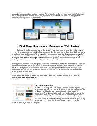
- 1. Responsive web design has become the need of the hour. It has led to the development of sites that can be navigated on several devices of varying screen sizes without any hassle. It also provides enhanced user experience to the visitors. 4 First-Class Examples of Responsive Web Design In today’s world, responding to the users’ requirements and behavior is the key to thrive in the market. As the technology grew, so did the web world. One field that has seen remarkable change because of this evolution is web designing and development. Arrival of smartphones and tablets has revolutionized the web world, and this led to the development of responsive website design. With the increasing access of Internet through these devices, responsive web design has become the need of the hour. This approach towards web designing and development has led to the development websites that can respond to the varying screen sizes of different devices. Be it a laptop, desktop, tablet or smartphone of any screen size, websites designed with responsive design can respond to the variations; therefore, providing the users with enhanced user experience with smoother navigation. Given below are four first-class websites that showcase the beauty and usefulness of responsive web development. Smashing Magazine The very first example is the site that itself works as the knowledge bank for several web designers and developers. The designers of this site have worked neatly on making it responsive. The site adjusts itself very well with the horizontal screen size and very few sites do this. You can expand your browser window as much as you can and can see that it the site also expands without getting cluttered. Another good thing about the site is even at smaller screen sizes, its menu structure and layout do not degrade.
- 2. Garret Keizer Garret Keizer’s official has been designed with high flexibility so that users won’t find problems in navigating the site on larger screens. If the screen or browser gets smaller, the font size of few portions of the text changes and becomes smaller. The noticeable thing about the website is that logos and other images of the site resize themselves proportionally. Food Sense This one has a very neat layout accompanied with beautiful photographs. The elements of the site are designed such that they adjust themselves accordingly with the screen size. You’ll certainly fall in love with this site as it is a joy to navigate it on any device, and the pictures of the recipes shall immediately make you fall in love with it. Lancaster University Maximum sites of universities and institutions are not so much into the designing trends. Surprisingly, the site of Lancaster University has been made with responsive web design. Though the site is simple, it carries a modern look. The USP of the site is that in spite of the large amount of content that it has, it can be navigated smoothly in the smartphones and tablets. Responsive design is an excellent solution for all those website owners who want to reach out to their visitors, and that is why, it has received lots of attention in the recent times. However, responsive web designing differs in many ways from traditional web designing; therefore, if you’re looking forward to go with this designing, you’ll have to hire experts who have hands-on experience on designing responsive websites. Responsive website design can help you to enhance your online presence by allowing your visitors navigate your site in various sizes. IndiaNIC offers you its responsive web development services that will help you to have websites that are easy to navigate in any device. For more details, feel free to contact us at: http://www.indianic.com/responsive-website-design-development.html Media Contact Information: IndiaNIC Info Tech 440 North Wolfe Road Sunnyvale - CA 94085 Tel: +1 (408) 940 5879 Website: www.indianic.com