Más contenido relacionado
Similar a Wfm Portfolio 2 (6)
Wfm Portfolio 2
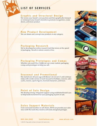
- 1. LIST OF SERVICES
Graphic and Structural Design
We review your brand's core position and then graphically interpret
or reinterpret your brand's benefits to promote recognition, create
desire, and move product.
New Product Development
We can ideate and concept new products in any category.
Packaging Research
We've developed an online research tool that moves at the speed
of packaging. Results in about a week or less.
®
Packaging Prototypes and Comps
Whether you need 10 or 10,000, we can create realistic packaging
comps and prototypes to help you sell.
Seasonal and Promotional
We started over 20 years ago with Reese's tie-ins to E.T. and continue
today with a wide variety of work focused on holidays, seasons, sales
cycles, movies, sports figures, licensed characters, and more.
Point of Sale Design
We develop strong, integrated support using established brand cues
to help build excitement for your packaging at point of sale.
Sales Support Materials
From oversized novelties to sell sheets, WFM can provide your sales
force with the tools they need to sell newly designed packages.
© 2008 WFM All logos, graphics and designs are the property of their respective owners.
- 2. Stoner Invisible Glass ® ®
…appeal to a whole new audience…
Stoner came to WFM for help with the redesign of its top-selling
automotive glass cleaner. The new design was built on its
popular forerunner, but with renewed homeowner appeal. To
communicate superior quality, stand out on a busy grocery shelf,
and appeal to a whole new audience, WFM took to the streets.
We tested the new design concepts in Design Check® – our
proprietary online research tool. With positive feedback
across the board, Stoner approved the new
graphic treatment and also launched
Invisible Glass Wipes using this new
homeowner-friendly design.
800.344.2402 www.wfoxm.com
© 2008 WFM All logos, graphics and designs are the property of their respective owners.
- 3. Bruce Hardwood & Laminate ®
…stand apart from the competition…
When Armstrong World Industries called upon WFM to redesign
its Bruce Floor Care line, the objective was to bring consistency
and to uniformly project the strength and trustworthiness of the
Bruce brand. Additionally, a stronger product presence on the
shelf was needed in order to enter the crowded grocery channel.
During the redesign phase of the project, WFM incorporated a
die cut into the Hardwood and Laminate Floor Care
System box so consumers could feel the unique
Bruce Microfiber mop cover. The use of the
established brand colors of red, black,
and deep green allows the redesigned
Bruce Floor Care Line to stand
apart from the competition.
800.344.2402 www.wfoxm.com
© 2008 WFM All logos, graphics and designs are the property of their respective owners.
- 4. Lowe’s Real Organized Line
… design portrays the home organization product within …
When asked to design a family look for a line of organizational
items for Lowe’s private label brand, Real Organized, WFM had
to consider how to graphically communicate the idea of
compartmentalizing your belongings.
To do this, we created a clean, crisp look with light, fun colors.
The on-package design portrays the home organization product
within by separating the various visual and informational areas
into neat, organized sections surrounded by clean white spaces.
With an entire wall of these products stacked in the store, this
organized feel comes across loud and clear.
© 2006 WFM All logos, graphics and designs are the property of their respective owners.
- 5. Advil PM Liqui-Gels ® ®
…lightening-fast relief…
When Wyeth Consumer Healthcare launched their revolutionary
Liqui-Gels® capsule for fast relief of nighttime aches and pains,
WFM was called upon to help them make an impact at retail.
Using designs that emphasized the lightening-fast relief of the
liquid-filled center, WFM applied graphics to PDQs, floor stands,
gravity feeds and FSIs, customizing the design for various retail
chains resulting in hundreds of POP styles.
800.344.2402 www.wfoxm.com
© 2008 WFM All logos, graphics and designs are the property of their respective owners.
- 6. Glide® Hygenist Kit Structural Packaging
… inexpensive and flexible…
Glide, then a division of W.L. Gore, needed an inexpensive,
flexible way to promote its family of Glide products to dental
hygenists. The kit had to showcase a variety of products quickly
and effectively. William Fox Munroe designed a clamshell piece
that allowed Glide a large panel to prominently display the
brand on one side. The other side was formed into multiple
compartments, sized to display the standard Glide package.
As new flavors or features were developed, products
could be replaced easily without redesigning the
kit. The clamshell provided a level of polish
and brand building that couldn’t be
achieved through gift bags, boxes or
crates of product.
800.344.2402 www.wfoxm.com
© 2008 WFM All logos, graphics and designs are the property of their respective owners.
- 7. Bed Bath & Beyond Private Label
…a perfect balance of city and country…
Like many retailers, Bed Bath & Beyond is focused on expanding
the breadth and quality of its store exclusives. These cheese
knives were just the first of a broad line of stainless steel items
that embraced a sleek, urban aesthetic without being cold or
inaccessible.
For this line of products, William Fox Munroe wanted to
emphasize the beauty of stainless steel and decided to limit
packaging graphics to black, white and gray. We used classic,
sophisticated fonts and countered our spare, contemporary
graphic treatment with warm photography. The photography uses
diffused light, selective focus and distressed antiques to balance
the minimalist graphic treatment. The result is a perfect balance
of city and country.
© 2006 WFM All logos, graphics and designs are the property of their respective owners.
- 8. Woodscapes Art Kits
… a powerful shelf presence …
Because shelf space in craft stores is becoming more and more
premium, the Woodscapes Company was faced with a
challenge: how to get their story across without the POP displays
they relied on in the past. While they needed the consumer to be
able to see the parts of the kit, they were concerned with the
various components of the kit falling out of the new packaging.
WFM designed a box structure that enables the customer to open
the flap to view the product and additional information about the
product. The structure also holds all of the pieces of the kit in
enclosed areas. Color coding on the package differentiates the
various lines and an inset photo on the face panel shows a real
life placement of the finished item. An updated logo gives the line
a more contemporary feel. And, most importantly, we gave
Woodscapes a powerful shelf presence that needs no POP!
© 2006 WFM All logos, graphics and designs are the property of their respective owners.
- 9. Hershey’ s Syrup Redesign ®
…sales increased an average of 50%…
Hershey’s found they needed to create a branded packaging
program for their family of flavored syrups. The redesign needed
to highlight flavor differences while still clearly communicating
the product's membership in the Hershey’s family.
William Fox Munroe synchronized brand placement on-pack,
created consistent visual cues and regulated product
presentation. While each product and flavor had unique
characteristics, the new package guidelines ensured each
product would reap the full benefits of the core brand.
Consumers took notice. When the redesigned
product hit the shelf, sales increased an
average of 50% without the benefit
of any additional promotions
or incentives.
800.344.2402 www.wfoxm.com
© 2008 WFM All logos, graphics and designs are the property of their respective owners.
- 10. Hershey’ s Pot of Gold Packaging Design ® ®
…smaller and more convenient…
When Pot of Gold was transformed from the gift box format into
smaller, more convenient packages, William Fox Munroe
designed the new package. These stand-up pouches needed to
remain suitable for gift giving, while maintaining consistency
with the upscale feel of the Pot of Gold line. The new pouches
would also make Pot of Gold more accessible for self purchase
and self indulgence.
William Fox Munroe started by incorporating all the established
visual cues for the Pot of Gold brand. We maximized the space
on the stand-up pouch by creating an intricate, formal, almost
lace-like pattern to place on the sides of the packs. We also
added a graphic ribbon down the front. While the ribbon seems
inconsequential, it’s one of the hardest working elements on the
package. It ties horizontal elements (logo, product display)
together to give a cohesive and pleasing face to the package.
The ribbon also adds another element of formality and provides
a very flexible and prominent means of incorporating
flavor signifying colors.
© 2004 WFM All logos, graphics and designs are the property of their respective owners.
- 11. Cool Factor ™
…keep chocolate from melting…
Cool Factor is a convenient, stylish package with a
self-contained passive cooling system to prevent chocolate
from melting.
Chocolate sales traditionally decline during the hot summer
months. Cool Factor provides a stylish and convenient way to
keep chocolate from melting, allowing chocoholics to indulge
their sweet tooth and candy makers to sell chocolate, even on
the hottest days. It uses passive cooling technology based on
evaporation and temperature distribution. WFM adapted
technology currently available for beverage containers
and home comfort products to chocolate
packaging, allowing for reductions in size
as the technology advances. The
package is designed to fit existing
candy bar sizes, and can be
reused or recycled because
of its passive technology.
800.344.2402 www.wfoxm.com
© 2008 WFM All logos, graphics and designs are the property of their respective owners.
- 12. Reese's NutRageous ® ®
…substantially exceeded the aggressive sales projections…
William Fox Munroe was asked to design a logo and package
for NutRageous, a Reese's brand. We needed the new bar to
stand out on the shelf while still using familiar colors and flavor
cues. While yellows and oranges are used to allude to the
Reese's brand heritage, a distinct, high-contrast blue logo was
developed to draw the consumer's eye to the NutRageous logo.
The package's on-shelf impact was undeniable. NutRageous
substantially exceeded the aggressive sales projections and
exploded onto the confectionery scene. The packaging
played a key role in that success. Today,
NutRageous still stands out on the shelf
and remains one of Reese's most
popular items.
800.344.2402 www.wfoxm.com
© 2008 WFM All logos, graphics and designs are the property of their respective owners.
- 13. Hershey® Kisses® You Go Girl!
’s
… understanding how kids think…
William Fox Munroe understands how kids think and what influences
their decisions. Over the past 35 years, we’ve worked with numerous
kids’ brands and youth oriented products sold throughout the US. We
leveraged our knowledge of quot;tweenquot; girls and created You Go Girl!
giftable Kisses boxes. This new Hershey’s item incorporated a
structural modification to the common box with a new and modern
graphic approach. You Go Girl! speaks to the American tween by
incorporating six relevant character types - All American
Girl, Drama Girl, Fashion Girl, Funny Girl, Social
Girl, and Sporty Girl. The resulting designs
reached the retail shelves just in time for
Valentine’s Day 2008. In addition, this packaging
design was honored with a Paperboard
Packaging Council Excellence Award.
800.344.2402 www.wfoxm.com
© 2008 WFM All logos, graphics and designs are the property of their respective owners.
- 14. The Silver Palate®
…a dynamic evolution…
A leading gourmet specialty food brand needed a refresh to
convey its high quality without losing its core customers. The
overall goal was to add sophistication while still focusing on the
logo for brand recognition. Each label consists of a two-tone
Victorian-style pattern. For the organic line,
we modified our pattern to be more leafy,
using green shades to highlight organic
goodness. The result is a dynamic evolution
of the brand identity and a bold
statement on the shelf.
800.344.2402 www.wfoxm.com
© 2008 WFM All logos, graphics and designs are the property of their respective owners.
- 15. ™
Simple Servings
…the solution for portion distortion…
Simple ServingsTM, a socially responsible solution for portion distortion. Today's
consumer research indicates a need for portion-controlled breakfast cereal products
that also simultaneously solve environmental issues.
The goals were to develop a package that eliminates the need for an inner bag,
controls the serving-size, and keeps the remaining product fresh. Could we reduce
the carbon footprint of the largely popular American cereal box, while also allowing
consumers to eat one single serving of their favorite breakfast cereal? We think so.
Our new box design, Simple ServingsTM, incorporates pull-back tabs that open just
one single serving chamber for your daily dose of morning goodness, and uses
environmentally responsible, recyclable, and compostable materials.
Material options include starch and/or cellulose fiber based
materials, paper pulp with a PLA laminate, and PLA
films, just to name a few.
Essentially, the concept may result in a 20
percent reduction in the carton’s footprint
by volume of material usage. The
package redesign, along with the
use of environmentally conscious
materials, will reduce the use
of virgin paper fiber, lower
greenhouse gas emissions,
and eliminate harmful
by-products of the
manufacturing
process.
800.344.2402 www.wfoxm.com
© 2008 WFM All logos, graphics and designs are the property of their respective owners.
PATENT PENDING
- 16. Murry’s French Toast Sticks
…a kid-focused design with action built in…
The breakfast food market is very kid-oriented, but in the case of
Murry’s French Toast Sticks, our design had to appeal to teens as
well (who also enjoyed this product). To compete with Eggo,
Aunt Jemima, and Pillsbury in the freezer case, this package had
to show French Toast Sticks as convenient, fun and delicious.
The new package is a kid-focused design with action built in. It
kicks up the motion value with dynamic photography and fun
typography. The package has a fun convenience food feel that is
sure to boost sales.
© 2006 WFM All logos, graphics and designs are the property of their respective owners.
- 17. Tom Sturgis ®
…gain a competitive edge at retail…
To help gain a competitive edge at retail, Tom Sturgis
commissioned WFM to create a fresher, more refined bag for
three of their unique flavors. WFM needed to retain core
recognition cues while simultaneously enhancing the brand's
natural, wholesome appeal.
The recognizable Sturgis character was given a “smart update”
and the bag window was eliminated in favor of photography
to enhance appetite appeal. A matte substrate was chosen
to showcase the premium, artisan quality of the product.
800.344.2402 www.wfoxm.com
© 2008 WFM All logos, graphics and designs are the property of their respective owners.
- 18. Murry’s Classic Pizzas
…a sophisticated update …
Murry’s presented WFM with a classic redesign project on their
personal size pizza package. The challenge was to take a box
that had served them for many years and give it a sophisticated
update for a market that had become very competitive in
its packaging.
In order to go up against the big brands in this category, our
package focuses on a dramatic design incorporating a black
background. Emphasizing a traditional Italian graphic feel with
attractive product photography and incorporating illustrations of
the fine ingredients yields a package that stands up to any pizza
product in the freezer case today.
© 2006 WFM All logos, graphics and designs are the property of their respective owners.
- 19. Kunzler Authentic Selects Line
… appeal to a more sophisticated audience …
Kunzler’s new line of flavored items, Authentic Selects, needed
that special something which could appeal to a more
sophisticated audience. WFM had a parallel project to redesign
the Kunzler logo to update the look, yet keep with the Kunzler
Pennsylvania Dutch heritage. This logo was adapted for the
Authentic Selects line and incorporated on the packaging.
Next we worked on giving the package appetite appeal with
flavor cues to differentiate the various types of bacon and
sausage. The L-board configuration was changed from a
top-down to a bottom-up to give maximum shelf presence in the
refrigeration case. The result? A high end, sophisticated package
that can run with the competition.
© 2006 WFM All logos, graphics and designs are the property of their respective owners.